User Onboarding: How To Get The Little Things Right
12 MIN READ
|
Updated on July 3, 2023
Great user onboarding does three things: it educates users on the problem, showcases the features of your solution, and drives users to take action.
Collectively, the hope is that these three things (perfectly balanced as all things should be) get users to the promised land—that better life they signed up for.
Between balancing these elements and making them work for your context, however, it’s difficult to figure out where to start and how to build an onboarding flow (or three).
There are big overarching questions like how long an onboarding flow should be, what design approach to take, which parts of it to make mandatory, and where to draw the line between user onboarding and customer success.
Here’s the thing: all the examples of great user onboarding that we’re devouring—the teardown, breakdowns, case studies, and lessons—can’t add much to how we answer those big questions.
There might be a ton to learn from Slack’s onboarding but Chargebee’s context is entirely different, and just because Slack has an onboarding flow that ends with the slackbot doesn’t mean we should end ours at a similar point in the user journey.
“Before you start making changes to your onboarding process…you want to know what intentions [your customers are] bringing, what they’re frustrated with in their current situation, and what they’re hoping that your product or service will resolve for them.”
He’s right.
What can user onboarding examples give us, though?
The answer is they can give us something just as valuable. Like a perfectly balanced mandala, beauty is as much in the form as in the details. The fundamental form our onboarding takes will come from our customers, we know. When it does, there’s Groove’s personal touch that we ought to bring to it. Asana’s attention-grabbing coach marks. Pipefy’s intuitive defaults.
A deep dive into examples of great user onboarding can tell beautiful stories of how to get the small details right so that when you
do put them in context, they bring smiles of delight to every person who signs up.
By itself, asking for permission can be a huge point of friction in user experience (Think ‘Uber would like to use your location’ or ‘MyFitnessPal would like to access your contacts’).
An ask
Yet, mobile apps cannot avoid permissions any more than bad guys can avoid maniacal laughs in the movies.
So how do they deal with this unavoidable thorn in their side?
Permission priming.
Essentially, permission priming is letting a user know that you’re going to need to ask them for permission or access. Nestled within a permission strategy, priming a user for permission turns an ugly ask into a thoughtful request.
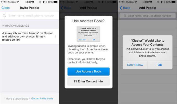
Consider Bitmoji, an app that allows users to create a cartoon version of themselves that they can share with their friends in Snapchat.
Asking permission to connect with Snapchat has to be a part of Bitmoji’s onboarding flow. It’s inevitable.
Yet, when it happens, it is far from obtrusive.
There are no annoying permission requests when you sign up, and none when you start creating your cartoon. Bitmoji waits until you’ve finished, you’re invested, and you want people to see what you’ve made. Only then does the question come up: ‘Want to share this with your friends on Snapchat? Allow Bitmoji to connect with Snapchat’
Permission priming, when executed thoughtfully, can have undeniable advantages:
As Elizabeth Ballou from UX Planet writes: “Ultimately, you want your users to feel comfortable — and permission priming can help you accomplish that.”
Cluster is another great example worth mentioning:
And there’s a lesson here for web-based apps as well. Many B2B SaaS companies require information from users to tailor experience and appropriately cater to intent. Here’s how B2B SaaS can turn good questions into good asks.
Getting to success is messy.
This is true of onboarding the same way it is with everything else.
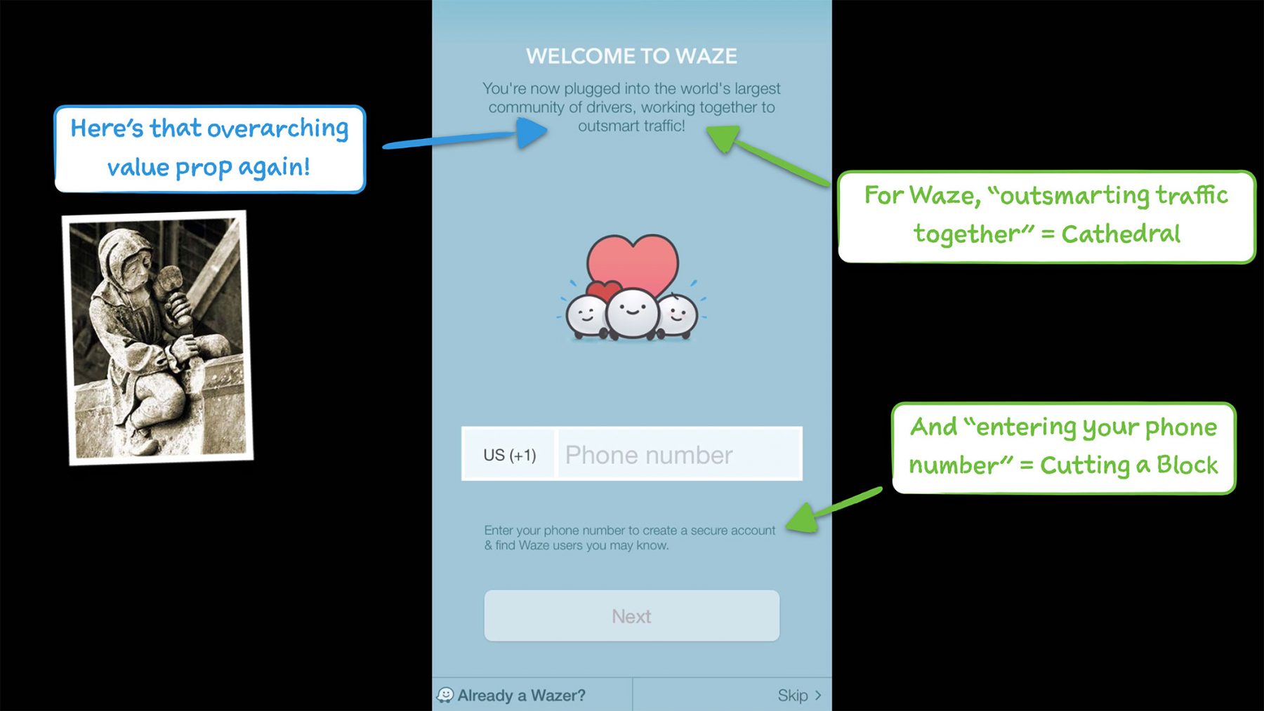
There’s no getting around small, tiny actions like providing a phone number or inviting a colleague.
But they’ve made it to your onboarding flow for a reason. And the best way to help your users through them is to let them know what that reason is.
Tie them to your common goal and suddenly these small actions are infused with meaning and relevance.
Every action is a means to an end and it makes sense to let users know about that during onboarding.
“Presenting the ‘big why’ with each ‘little how’ helps both come to fruition” Samuel Hulick writes, in his teardown of an app that gets this spot on, Waze.
Richard Thaler won 2017’s Nobel Prize in Economics for a theory that’s built around a simple idea: when it comes to decision making, people are terribly bad at planning for the future.
Since Thaler’s book “Nudge” has come out, the repercussions have been enormous. Governments are implementing his theory. And so are businesses around the world.
The idea has a place in user onboarding as well:
if you want people to do something, make it easy.
Making things easy means
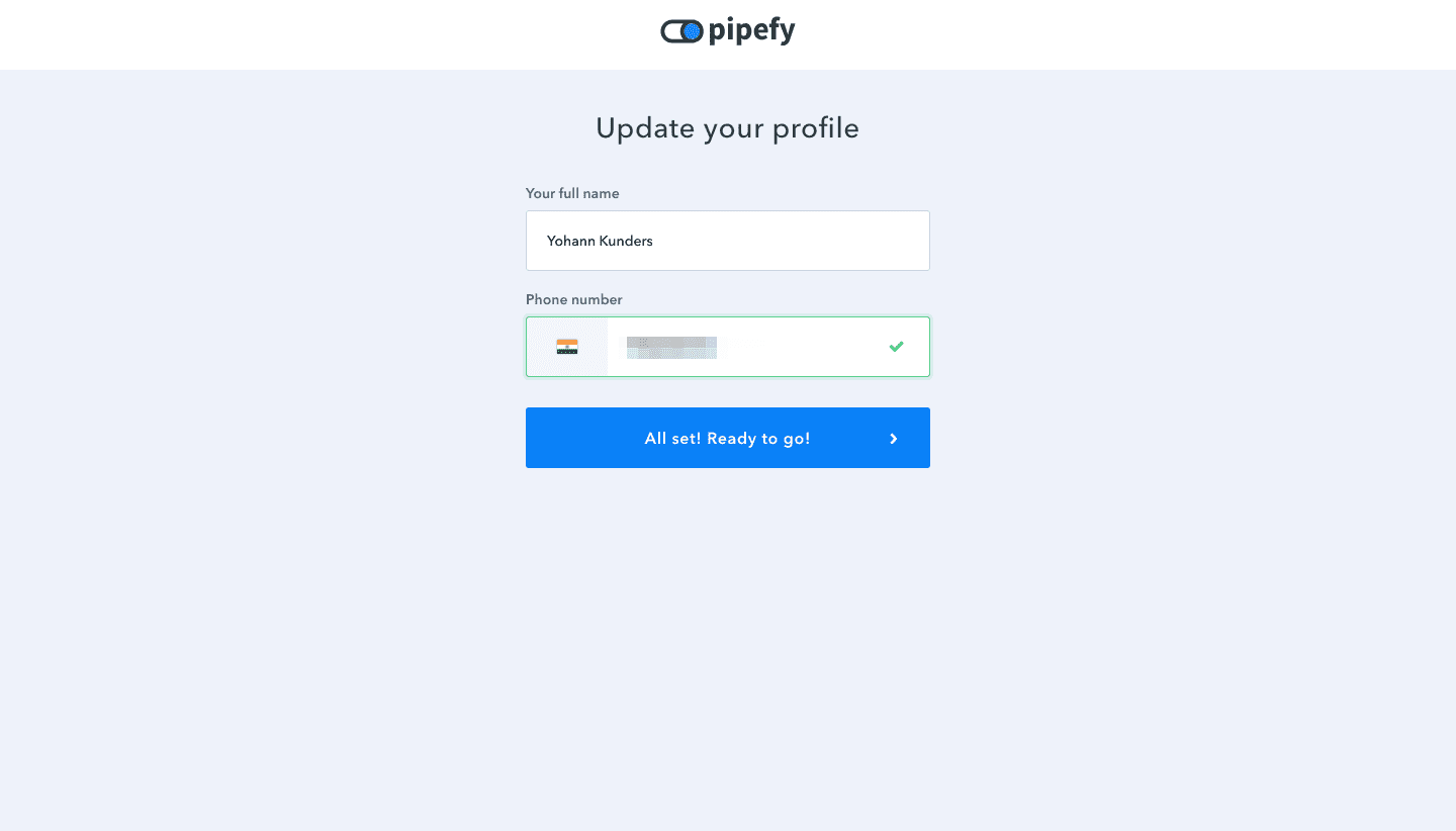
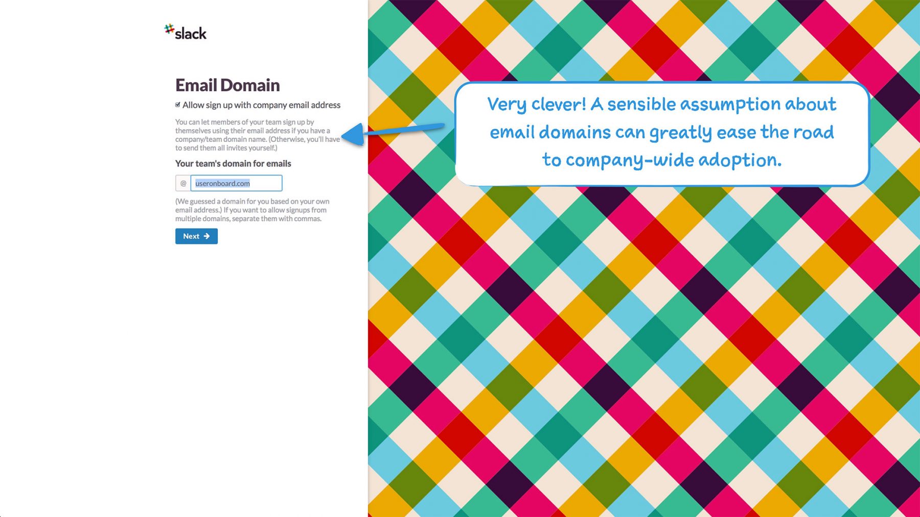
Here’s Pipefy, for example, recognizing my IP address and auto-filling the ‘country’ field so it’s easier for me to enter my phone number during onboarding. A (simple) nudge:
They also prepopulated their app with content tailored to my specific intent without asking me too many questions. A (slightly less simple) nudge to help me visualize what planning in content marketing looks like:
And here’s Slack, delighting Samuel Hulick with a default opt-in. A (complex) nudge to help him onboard people he might be working with onto Slack:
The user onboarding tutorial is a versatile tool that can either educate users on the problem or showcase the features of your solution. They are usually introductory, short, and built around benefits (whether they’re showcasing or educating).
Once in a while, though, there’s the rare (mind-blowing) tutorial that does both.
Here’s the key to making the most of your onboarding tutorial: Use your features to frame the problem.
This is best explained with an example and a counterexample.
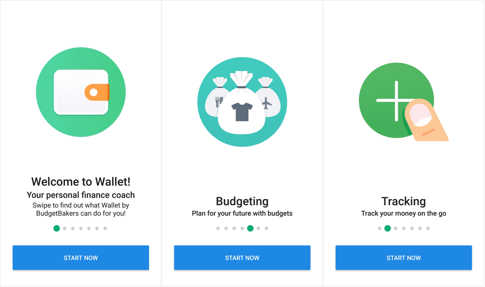
Here are a few screens from Wallet’s introductory tutorial.
It is simple and straightforward—a list of everything I can hope to achieve with it behind me.
It looks great and it’s a good showcase of the possibilities.
It is, however, a counterexample because this tutorial could be doing so much more.
Caveat: Level was acquired in September last year, they’ve since shut down. Yet, they make this list because they remain an example of stellar user onboarding.
Here are a few screens from their onboarding tutorial.
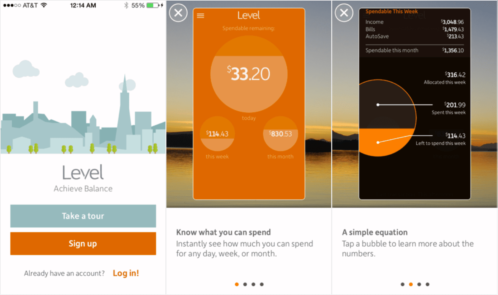
What Level pulled off beautifully was marrying its features to the problem.
Its tutorial is benefit-driven, just like Wallet’s. The way they’ve designed their features, though—what an intuitive way to think about how much I have left to spend every month, every week, or every day. With the intuitive design working so well for them, what’s supposed to be a feature showcase works as a ‘how to approach thinking about financial balance’.
It’s really difficult for me to imagine financial balance, one year after Level is gone, without that bubble bobbing around in the background.
We’ve talked about asking for permission, getting users to complete small actions, and effectively using tutorials.
Clearly, there’s a lot that makes it into an onboarding flow.
It’s important to make sure, then, that your onboarding never feels like a block sitting between the promise on your homepage and the delivery of that promise inside your app.
How?
Tying every action to the larger why of it is half the puzzle.
The other half of the puzzle is to reinforce your value prop or promise at every opportunity possible.
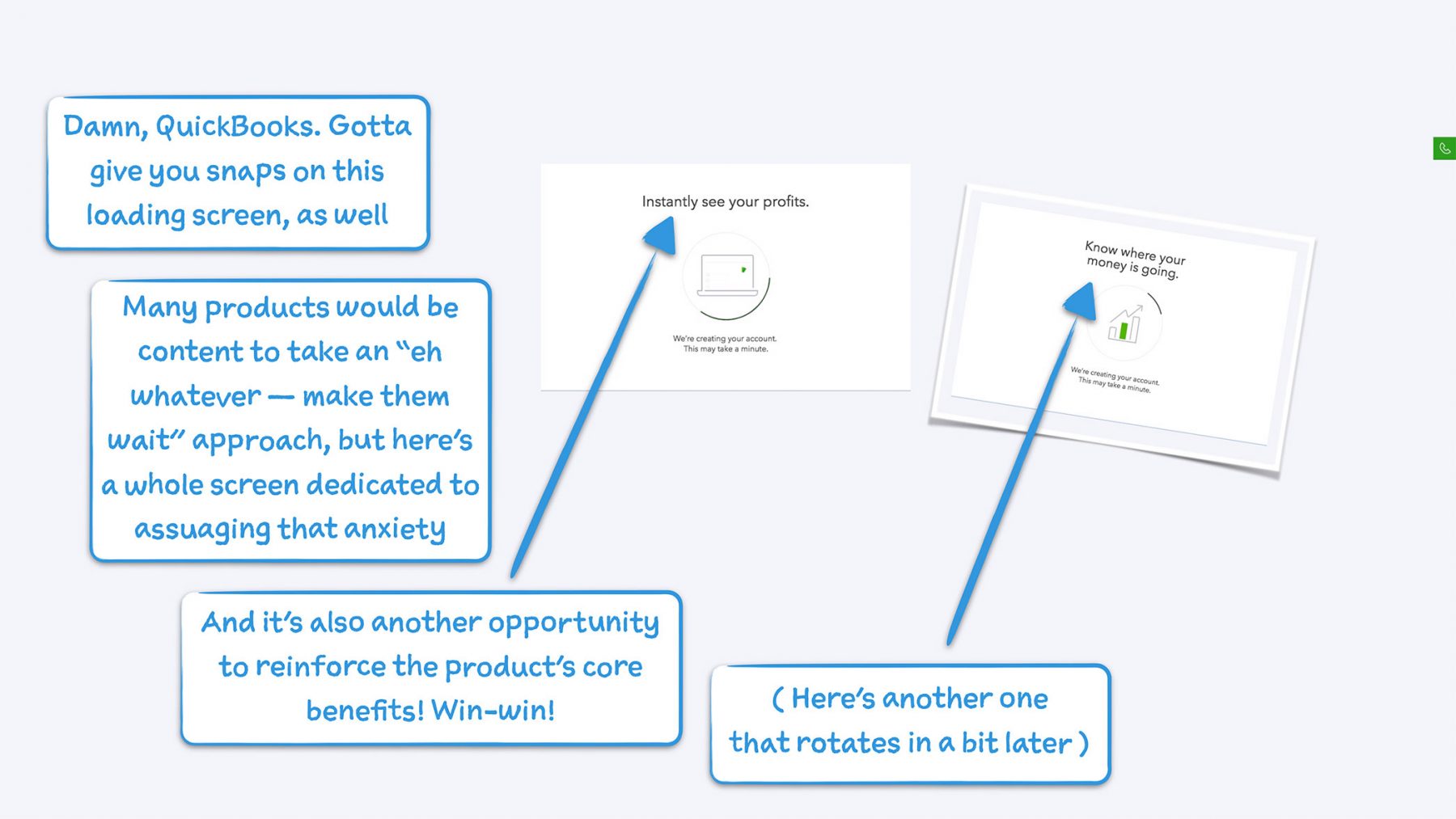
Here’s how Quickbooks takes advantage of a loading screen, for example, from Samuel Hulick’s teardown. Needless to say, he loves the reinforcement:
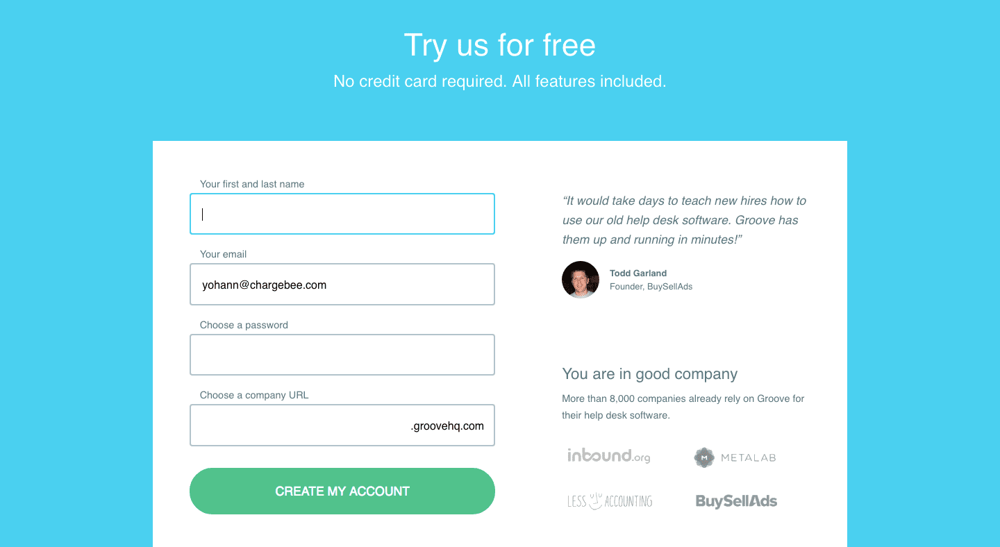
Here’s Groovehq with a testimonial on the sign-up page:
Small reminders like these can serve onboarding in big ways, prompting users to remember that better life they signed up for and how your onboarding flow is preparing them for it, rather than delaying its arrival.
I don’t think there’s an app that’s featured as much as Duolingo is in lists of great user onboarding. Slack, maybe.
I adore Duolingo’s gamified onboarding too.
But there’s a nuance here—gamification is the very fabric of their product. And that’s the reason it works so well.
Because of how tightly gamification is knit with the product, gamified onboarding ticks all three onboarding boxes—it showcases features, educates users on how they can (with Duolingo) approach learning a language, and boy, does it drive action.
Adapting gamified onboarding to a more complex problem, a more complex solution, or more generally, a product that isn’t so tied to the concept can be tricky.
This is because:
1. It’s easy to ostensibly reward action (with points, or badges, or whatever). Less so to reward a showcase-focused or an education-focused onboarding flow. This means that if you are working with a complex problem or a complex solution, and have to rely on education or showcasing in onboarding, your rewards will have to be more abstract.
2. Gamification works if your product can deliver value fast. In Duolingo’s case, a lesson is a unit of measure—the more lessons you finish, the more you know a new language. Onboarding as a first lesson is a beautiful way to wed the two ideas.
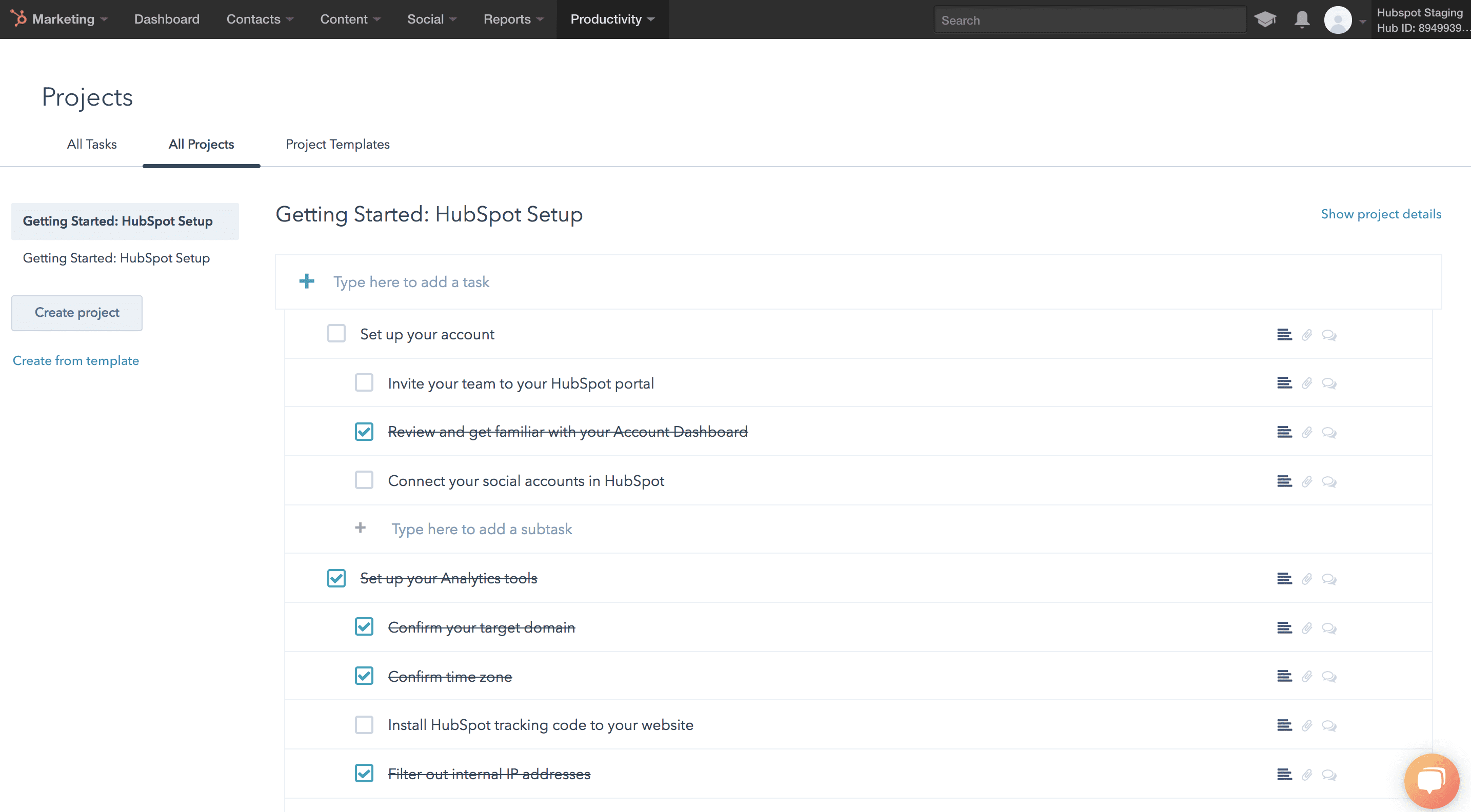
What if your value delivery is contingent on configuration, though? What if it requires a sales touch? What if it requires a demo?In these cases, gamification might look less like a badge or a point scored, and more like this:
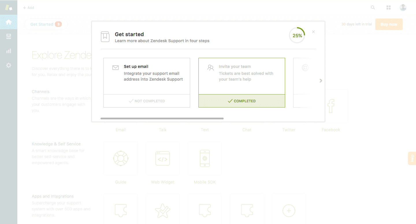
That’s an image from Zendesk’s onboarding flow. They’ve gamified their ‘Get started’ guide so it’s easy to track doing everything you need to get the helpdesk off the ground.
It’s worth noting that this gamified approach doesn’t work by itself, though. Zendesk has too many bits and pieces in the air to rely on an approach like this by itself.
While we’re on the subject of gamification and why it’s so hard to facilitate rewards in an education-focused or a feature-focused onboarding, there’s one action that many apps forget to reward. Signing up.
Seriously. Seems like such a given, right? Like adding a first name to an automated email.
I’ve hardly ever received a high-five for signing up.
Here’s why rewarding signing up feels amazing:
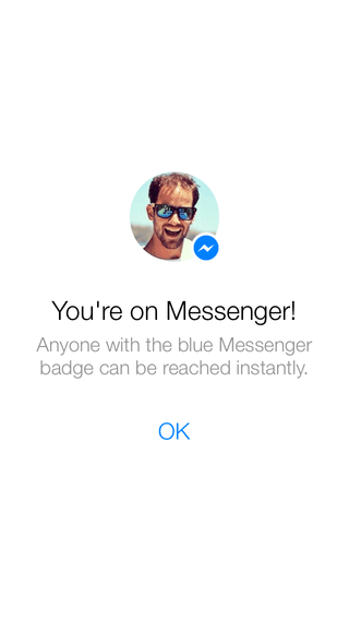
Here’s Facebook Messenger’s welcome screen, for example. Apart from congratulating me for signing up, it lets me know who I can reach once I’m in the app (a critical piece of information for my success with it).
Here’s Groove, on the other hand.
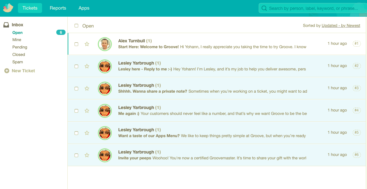
In welcoming me, Groove
One of the biggest disappointments in onboarding is learning something amazing (that you want to put to use later), forgetting what it was, and realizing it’s gone forever.
This is a complex problem to solve, though. Because:
This is not to say that a middle ground isn’t possible. Here are a few examples of apps that facilitate the transition from the warm fuzzy blanket of onboarding to reality with user success in mind:
There’s more to be said here about where the line is between user onboarding and customer success. I’ll leave that for another post.
There are some questions that examples of great user onboarding cannot help with. Big, overarching questions about how to structure your onboarding flow, how to approach facilitating aha moments, and which actions to begin with. Answers to these questions can only come from customers.
Examples can help with something equally important, though—the small details that take user onboarding from good to great.
Whether you’re priming for permission or information, building an onboarding tutorial, or experimenting with gamification, there’s no doubt that in SaaS we stand on the shoulders of giants. What a privilege to.