Reports explorer is a one-stop solution for any Chargebee user looking for subscription analytics and reporting needs. Users can search and consume 80+ predefined reports that help to discover required insights and aid in decision-making.
The following are the salient features of the Reports Explorer:
Login to your Chargebee Site and click RevenueStory > Reports Explorer.

The Reports Explorer has two kinds of views:
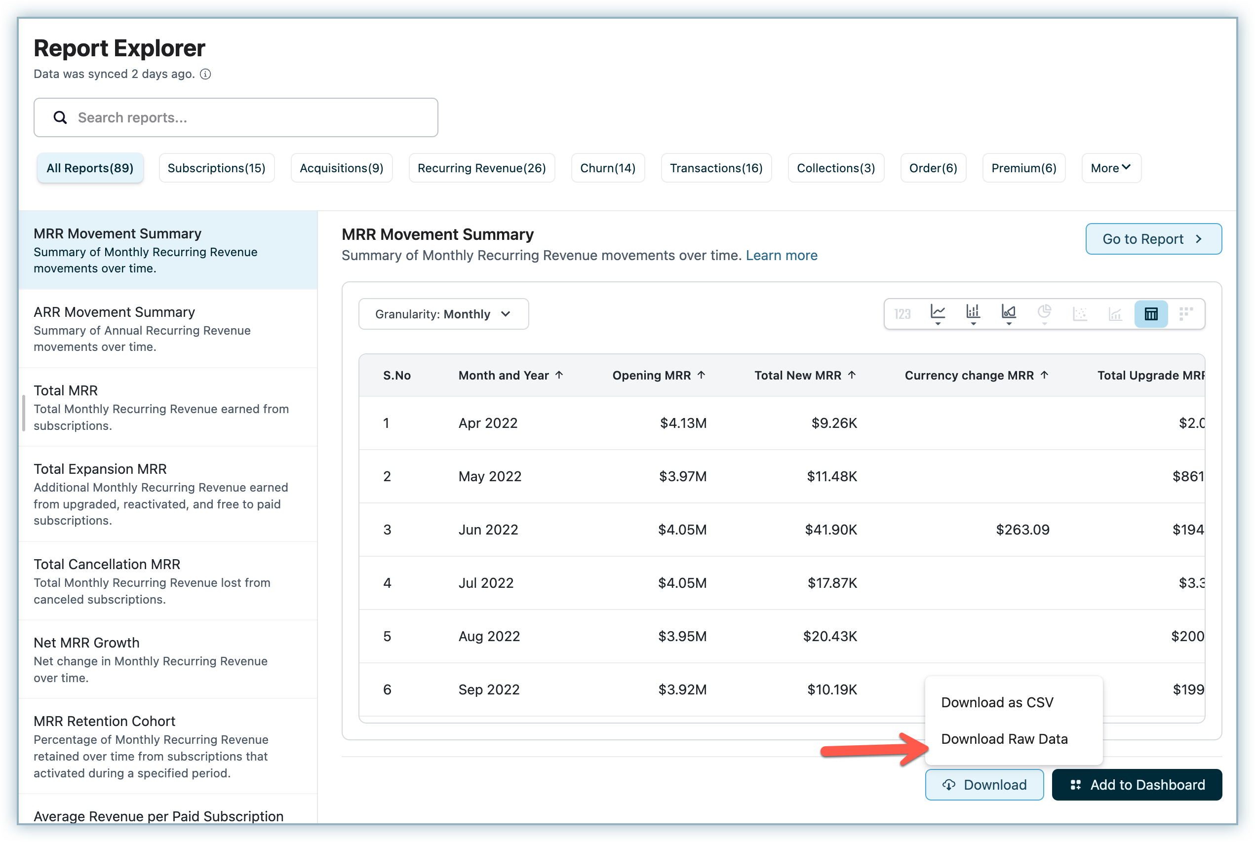
Quick View as the name suggests is meant for quick discovery and consumption of the reports. The reports are distributed into various categories and readily available on the left panel. You could scroll down to see the entire list of reports or search for a specific report using its name or keywords such as MRR, ARR, etc. When you select a particular report a preview appears on the page on the right-hand side. Here you can interact with the reports and review the values being shown. You could additionally select the following options within quick View.
You can select the granularity in the Quick View before choosing to add the report to the dashboard or previewing it inside Report Explorer.

There are multiple visualization options available to choose. You can visualize the report as Metric Summary, Bar (Side by Side, Stack Bar, 100% Stack Bar), Line (Line / Spline), Area (Area / Area Spline), Table etc. Based on the report, certain advance visualizations such as Combo charts, Cohort etc may also be enabled for selection. Below are the details of various visualization options supported within Report Explorer.
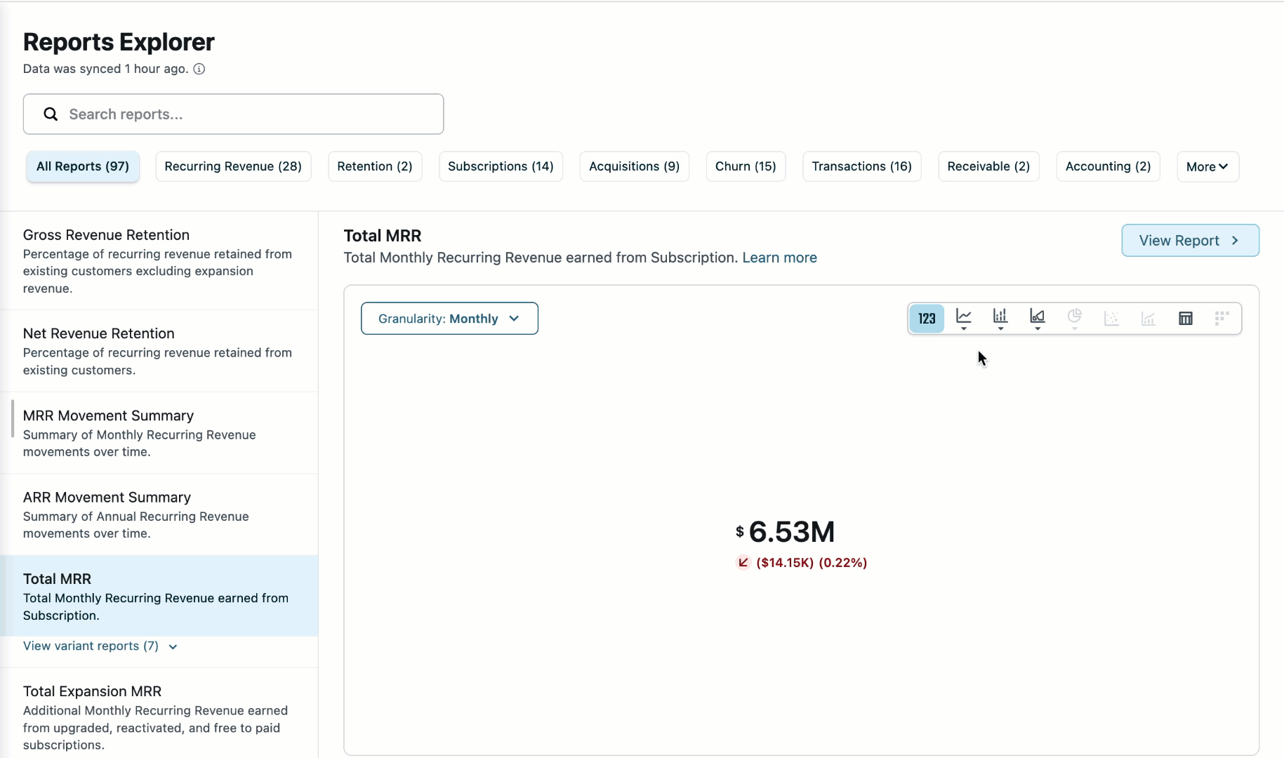
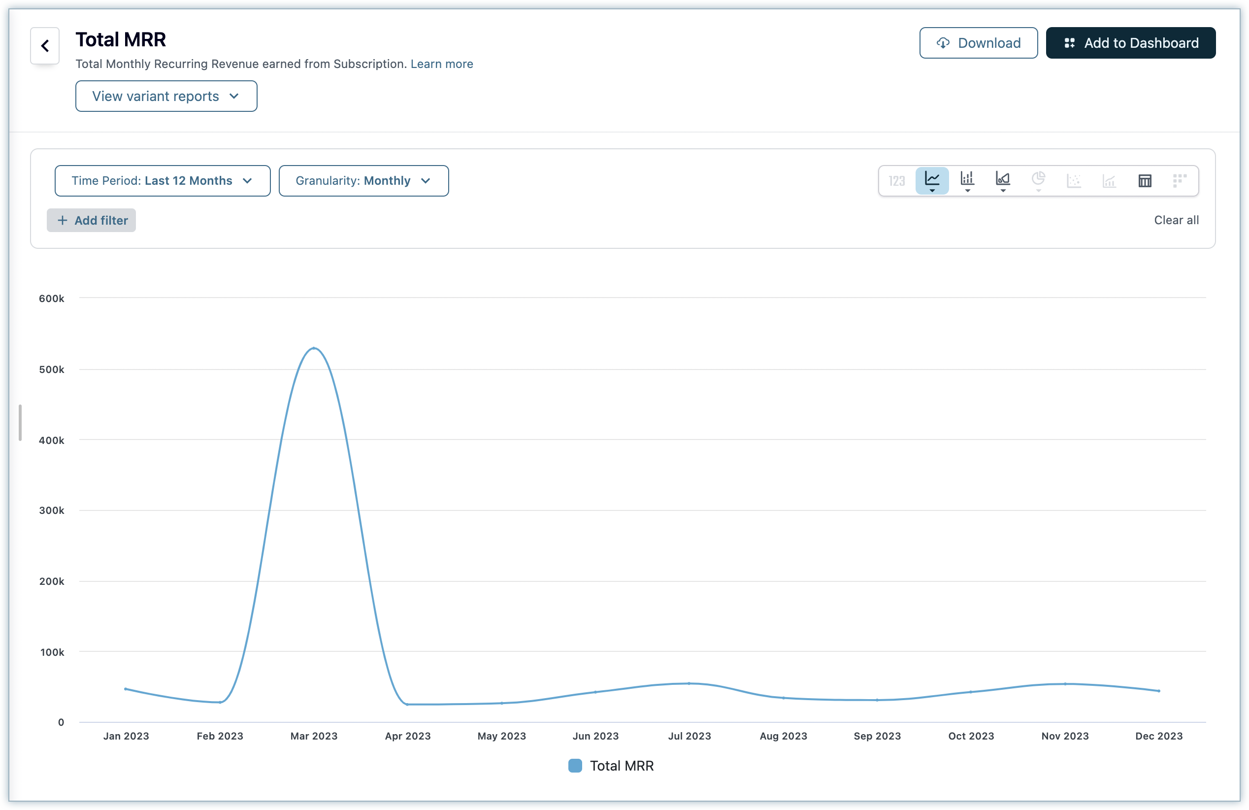
The available visualisation options and the default visualisations for each report vary according to the information being shown in the report. For example, a report for e.g. Total MRR representing one metric across a single dimension as time (Default: Spline Chart), can be represented as a Metric Summary, Bar Chart, Line chart, Table etc. Whereas for a report e.g. Total MRR by plan (Default: Spline Chart) representing one metric across two dimensions such as time and plan, Metric Summary option is disabled.
To add the reports to your dashboard, you could follow the steps below.
Login to your Chargebee Site and click RevenueStory > Reports Explorer.
Click Add to Dashboard from the Reports Explorer Quick View page.

The popup window appears with Executive Watch as the first option. This is the default option for all users but it could show a different dashboard in case you have chosen a different dashboard as your default. The dashboard list is sorted based on the last modified date of the dashboard for you to easily find your most recent dashboard for report addition. You can also choose to add the same report to multiple dashboards at the same time as per your requirement.
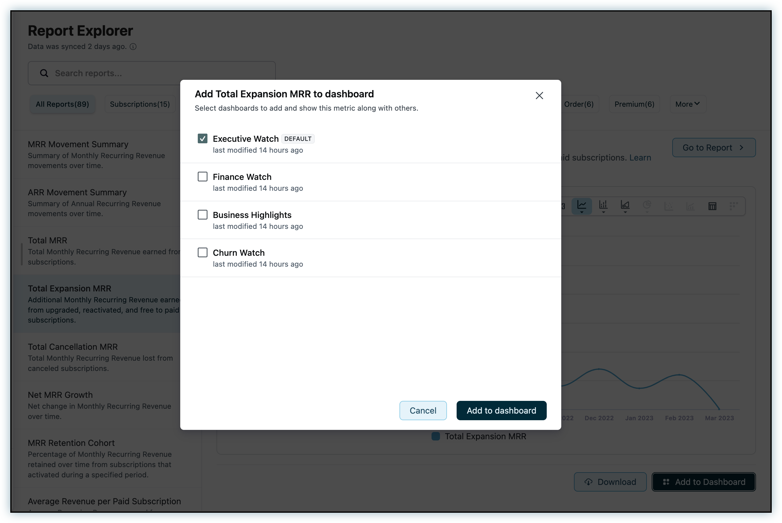
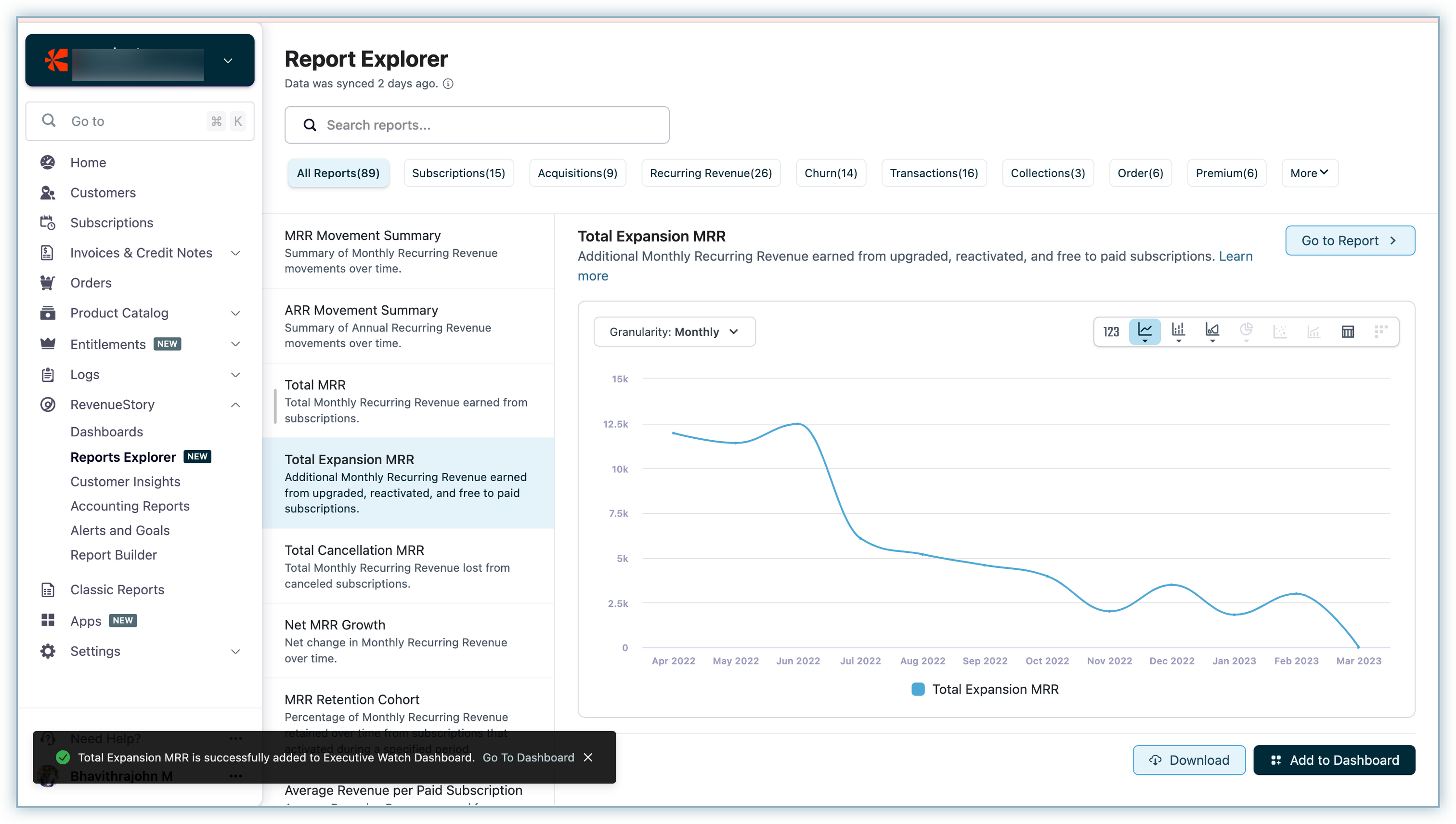
Once you select the desired dashboard(s) and click Add to dashboard, the reports gets added to the selected dashboard(s). You can choose to view the dashboard or add other reports to the dashboard using the notification message that appears as soon as the reports are successfully added to the dashboard.
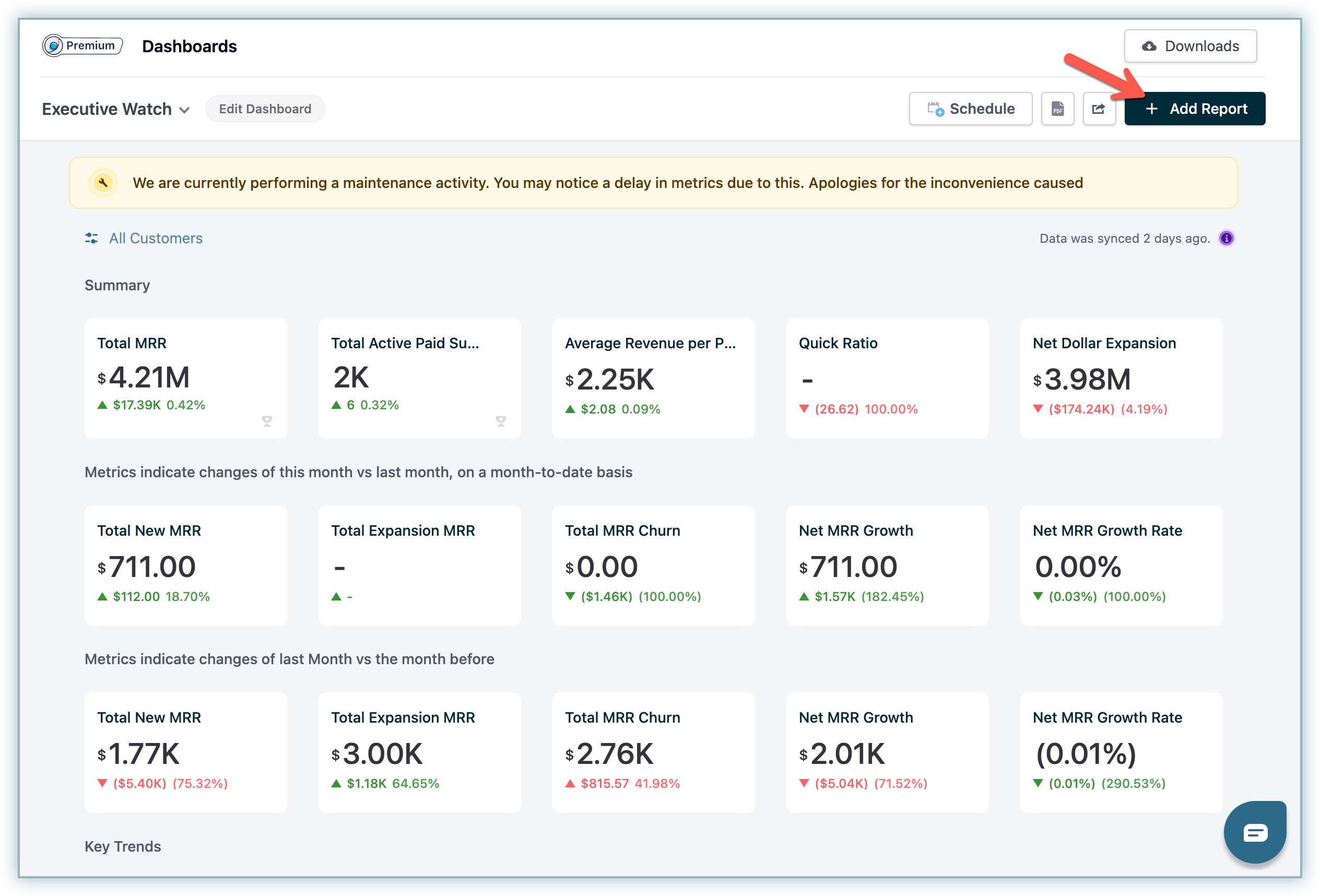
You can also add reports using the Add Report button on the dashboards.
Reports can be downloaded from the Quick View mode as CSV files using the Download as CSV option. You can also choose to download the raw data behind the report using Download Raw Data options. (Note that option to download the raw data is not available for all reports e.g. Net Billing, Net Cashflow, Total Subscription Quantity etc).
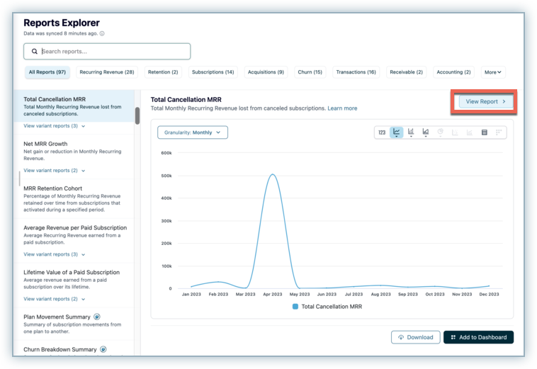
Reports Explorer provides options to helps users perform a more detailed analysis on a specific report in its Report View. Using Report view, you can perform more advance actions on the report and perform detailed analysis as per your requirement. For e.g. you could aggregate your data using specific attributes, apply report-level filters, or filter reports for specific time ranges as per your requirement. Other options such as granularity selector and visualisation switcher available in the Quick View section are also available in the Report View.
To access the Report View, click on the View Report button available on the top right corner of the report.
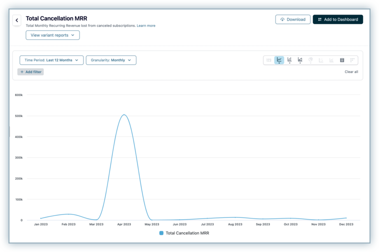
The report opens up in the full page preview with the below additional options.
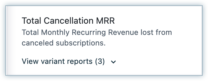
As part of an enhanced experience to help you discover reports with ease, we have introduced variant reports. You can view all reports grouped by the same parent metric as a variant report. For example, if the parent report is a Total Cancellation MRR report, then reports such as Total Cancellation MRR by Churn Type, Total Cancellation MRR by Country, etc. will be the variant reports. You can view them by clicking on View variant reports.

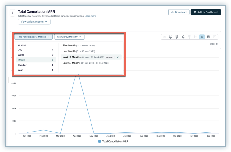
Report View also allows users to filter the report with a specific time period as per the requirement. The report preview changes as the user navigates through various time period options for the selected granularity.
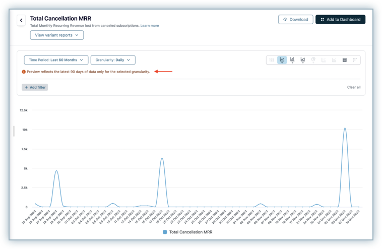
Reports Explorer supports limited time period range for each report based on the granularity selected. The below table provides a summary of the maximum available data for each granularity in reports explorer.
The above time limits are also applicable when some one tries to download the report as a .csv option. Time period restriction applicable on a report is displayed to the user using the message below for each granularity selection.
This table provides additional details about the supported time periods for various granularity options in the quick preview for Charts, Tables, and Cohort visualization types.
| Time Granularity |
Description |
|---|---|
| DAILY |
For past reports report preview shows values for last 30 days including today. For future reports, report preview shows values for the next 30 days including today. For instance if today is 15 October 2022 then,
|
| WEEKLY |
For past reports report preview shows values for last 12 weeks including current week. For future reports, report preview shows values for next 12 weeks including current week.
|
| MONTHLY |
Report preview show values for the last 12 months or next 12 months including current month based on whether it is a past or a feature report. |
| QUARTERLY |
Report preview loads with the trend of values for the last 4 Quarters including latest quarter. |
| YEARLY |
Report preview loads with the trend of values for the last 4 Years including latest year. |
In case the time period selected by the user is within the selected granularity, reports explorer automatically intercepts this and provides option to the user to switch to the closest available valid combination for the report.

If you chose monthly granularity and last 12 months as the time period for a chart visualisation, the report loads with last 12 months of data. Now let's say you select the last 30 days in the time period without changing the monthly granularity option, the report will load with last 30 days of data aggregated at monthly granularity. However since last 30 days of data is best viewed at daily granularity, the user will be prompted to switch to daily granularity option instead.
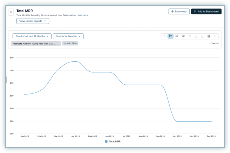
Report View also provides users with granular level filter options to slice and dice the data within a specific report. Let's see how we can use this option to see the aggregated MRR from subscriptions having specific Plan(s) as the primary line item.
To filter for data within the report choose the +Add filter option.
Search for the Name attribute under the Products data source.

Select the required Plan(s) as per your requirement.

Click Add filter. The report preview loads to reflect the filters applied to the report.