Payments
This section of AR Analytics provides you with a 360-degree view of your customers' payments. It is divided into four sub-categories that offer insights in the form of funnels across multiple aspects of payments and payment failures. These categories are as follows:
- Overall Payments
- Outstanding Payment Failures
- Payment Successes - Post Retries
- Payment Failure Based Churn
Chargebee Receivables allows you to customize the dashboard and the displayed metrics according to your preference. You can find more details in this document.
Let's dive into the sub-categories and review the significance of each chart:
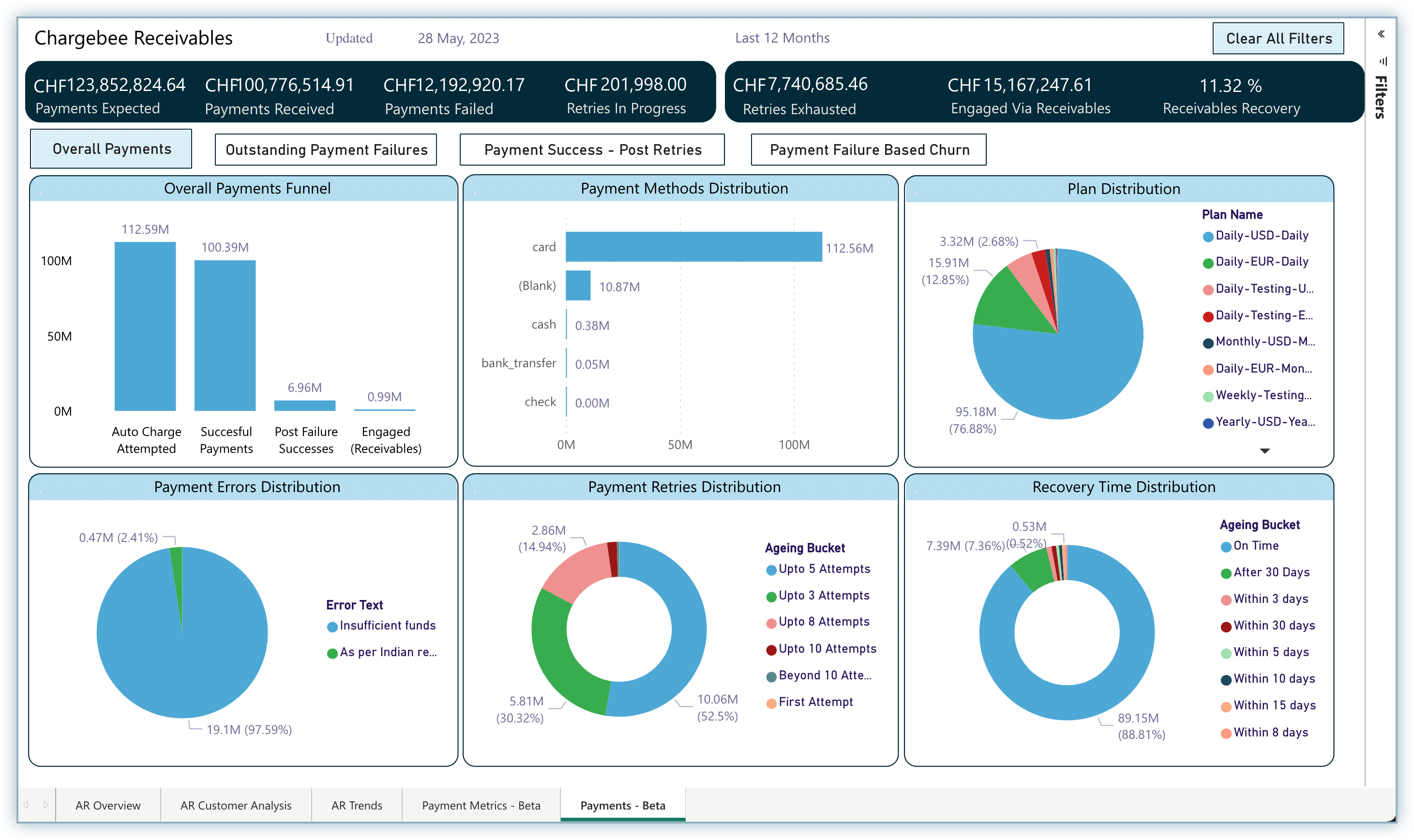
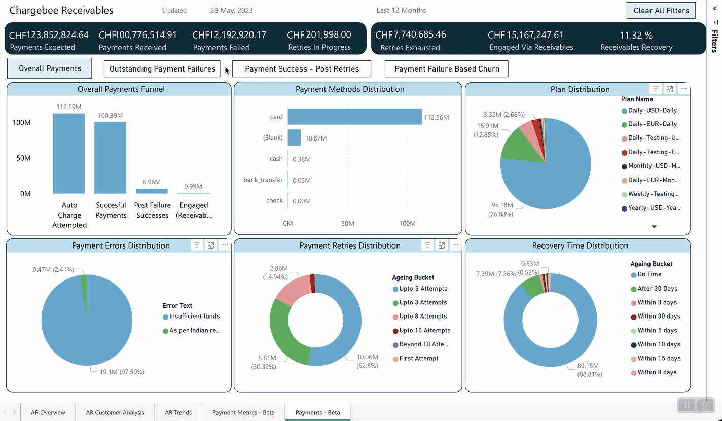
Overall Payments
This dashboard is designed like a funnel that starts with a macro view of the payment-related data such as auto payments attempted, successful payments, and post-failure successes in the first chart, and then breaks down into four different distributions that focus on the micro elements related to payment such as payment methods, plans, errors, and more.
This dashboard contains the following charts:
| Chart | Description |
|---|---|
| Overall Payments Funnel | A customer funnel that provides a straight away insight into successful payments & post failure successes. |
| Payment Methods Distribution | A distribution of all the unique payment methods used by the chosen cohort of customers to make payments. |
| Plan Distribution | A distribution of various subscription plans across the chosen cohort of customers. |
| Payment Errors Distribution | A distribution of unique payment errors suffered by a chosen cohort of customers. |
| Payment Retries Distribution | A straight-away insight into the payment retries distribution across a chosen cohort of customers. |
| Recovery Time Distribution | A distribution of recovery period of invoices for the chosen cohort of customers. |

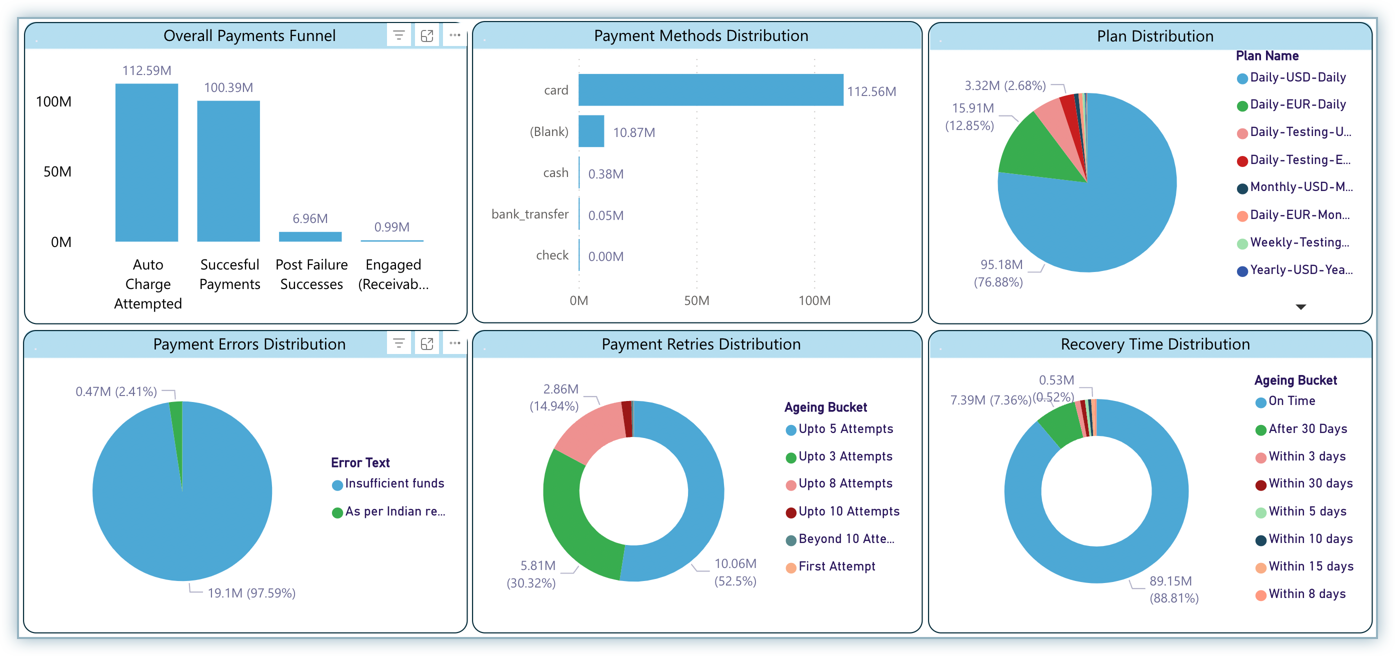
Overall Payments Funnel
This chart contains the following metrics:
- Auto Charge Attempted - Sum total of invoice amounts that were auto-attempted for payment during the last 12 months including the current month.
- Successful Payments - Sum total of invoice amount that was successfully paid during the last 12 months including the current month.
- Post Failure Successes - Sum total of invoice amounts that were successfully paid during the last 12 months including the current month with at least one failure.
- Engaged (Receivables) - Sum total of invoice amounts that were successfully paid during the last 12 months including the current month with at least one failure and later engaged via Receivables.
Payment Methods Distribution
This chart indicates the payment methods used for the payments with respect to the selected cohort of customers/invoices. Through this chart, you can understand the payment methods that were mostly used by the customers and how you can take necessary action for them to prevent payment failures (if required).
Plans Distribution
This chart provides you with a list of plans associated with the invoices/customers. Using this chart, you can understand which plans your customers mostly subscribe to and how it is affecting the overall payment experience for you and take necessary action if required.
Payment Errors Distribution
This chart helps you to find out the errors responsible for payment failures. If a particular error is responsible for most of the payment failures, then you can take necessary action to prevent such errors by engaging with the customers.
For example, if the error is Insufficient Funds, you can send emails to your customers with payment failure history to keep their funds in check before the upcoming payment dates.
Payment Retries Distribution
This chart helps you to find out how many attempts an invoice consumes on average after a payment failure before it is successful. This can help you understand how efficient are the automatic retries and if you should intervene and make them more efficient.
Recovery Time Distribution
This chart helps you to find out how many days it took to recover a failed payment on average per invoice. If the higher number of days has a higher percentage in the chart, it indicates that you should engage with your customers to prevent this and make the recovery time faster.
How to Interpret the Charts?
While each of the charts displays a specific set of data, these metrics are linked to each other in more ways than one. As discussed briefly at the beginning of this document, these charts are customizable and can provide a tailored view of all the charts collectively as per your preferences. You can apply multiple levels of filters to get data specific to the selected filter in all the other charts automatically.
Let's take an example to understand it better.
In this example, as shown below in the first chart, the amount for Auto Charge Attempted was 112.59 million, out of which 100.39 million was from Successful Payments, out of which 6.96 million was from Post Failures Successes and eventually 0.99 million was from engaging via receivables - Engaged (Receivables).
Example
Jack is the admin from ACME Pvt. Ltd. and he wants to dive deeper and view the other distributions specific to the Post Failure Successes (which is 6.96 million).
Jack clicks the bar for Post Failure Successes and the entire dashboard gets customized automatically. The Post Failure Successes is highlighted and other distribution metrics are tailored with respect to Post Failure Successes.
Now, Jack can understand the following from the distribution charts:
- Payment Methods Distribution: 6.95 million out of the 6.96 million was paid using Card as the payment method
- Plans Distribution: 93.64% belongs to the Daily-USD plan, 3.93% belongs to the Daily-EUR plan, followed by the rest.
- Payment Errors Distribution: 94.93% of the total invoice amount that faced a payment failure was because of the Insufficient Funds error and 0.41% because of the As per Indian regulations, export transactions require customer name and address error.
- Payment Retries Distribution: 38.58% of the successful payments consumed up to 8 attempts, 35.09% consumed up to 5 attempts, and 20.34% consumed up to 3 attempts, followed by others.
- Recovery Time Distribution: 50.13% of the payments were recovered after 30 days, 10.58% within 3 days, followed by others.
Now, Jack wants to dive deeper by selecting one of the errors (i.e., As per Indian regulations, export transactions require customer name and address). He presses the command key from the keyboard and clicks on the portion of the desired error from the chart. All other metrics are tailored again with respect to the selected payment error.
Note:
To select a filter under another filter, make sure to press the Command (for MAC OS) or Control (for Windows) key while clicking on the desired chart element. If the key is not pressed, all previous filters will be reset and only the current element that you click on will be applied as a filter.
Now, Jack can note the following observations from the dashboard:
- Payment Methods Distribution: 0.40 million out of the 0.41 million was paid using Card as the payment method.
- Payment Retries Distribution: Most of the payments took Upto 10 Attempts. This indicates that he needs to take action to reduce the number of attempts and make the retries more effective by engaging with the customers.
- Recovery Time Distribution: Most of the payments were recovered After 30 Days. This indicates that he needs to focus on the efficiency of the recovery process to prevent unnecessary delays.
Similarly, you can select multiple parts of the dashboard as individual filters or sub-filters and customize the data as per your preference.
Outstanding Payment Failures
This dashboard represents outstanding payment failures and is designed like a funnel that starts with a macro view of the payment-related data such as failed payments, unrecovered payments, and retries exhausted in the first chart and then breaks down into four different distributions that focus on the micro elements related to payment such as payment methods, plans, errors, and more.
This dashboard contains the following charts:
| Chart | Description |
|---|---|
| Outstanding Payment Failures Funnel | A customer funnel that provides a straight away insight into failed payments and unrecovered failures |
| Payment Methods Distribution | A distribution of all the unique payment methods used by the chosen cohort of customers to make payments. |
| Plan Distribution | A distribution of various subscription plans across the chosen cohort of customers. |
| Payment Errors Distribution | A distribution of unique payment errors suffered by a chosen cohort of customers. |
| Payment Retries Distribution | A straight-away insight into the payment retries distribution across a chosen cohort of customers. |
| Recovery Time Distribution | A distribution of recovery period of invoices for the chosen cohort of customers. |
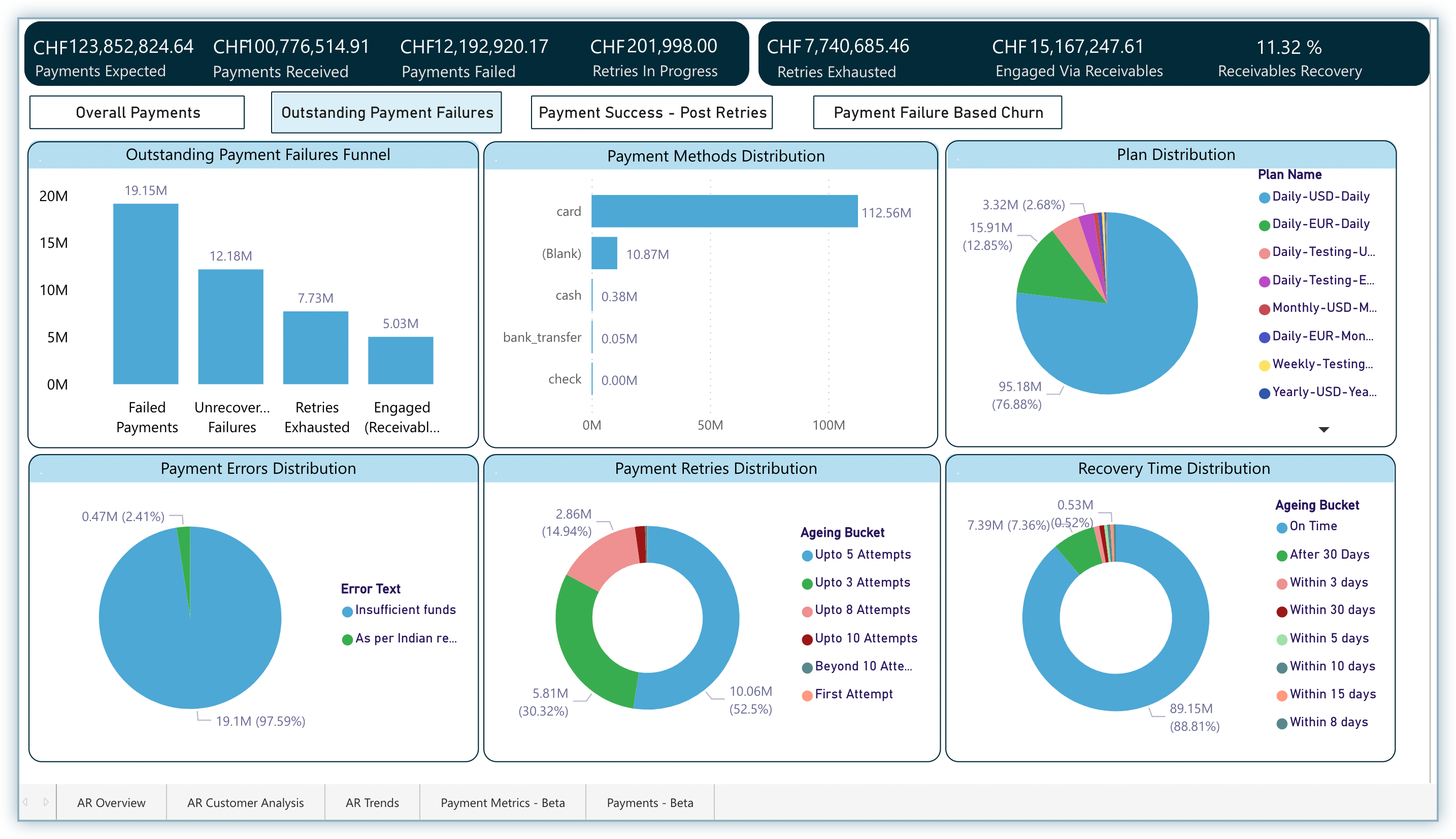
Overall Payments Funnel
This chart contains the following metrics as bars:
- Failed Payments: Sum total of invoice amounts that were attempted for payment during the last 12 months including the current month with at least one failure.
- Unrecovered Failures: Sum total of invoice amounts that were attempted for payment during the last 12 months including the current month and still remain unrecovered.
- Retries Exhausted: Sum total of invoice amounts that were attempted for payment during the last 12 months including the current month that still remain unrecovered with retries already exhausted.
- Engaged (Receivables): Sum total of invoice amounts that were attempted for payment during the last 12 months including the current month that still remain unrecovered with retries already exhausted and being engaged via Receivables.
How to Interpret the Charts?
As explained in the example for the Overall Payments dashboard, you can customize the charts by clicking on the relevant elements from the charts and getting the required data out of them.
Note:
The five distribution charts (Payment Method Distribution, Plans Distribution, Payment Errors Distribution, Payment Retries Distribution, and Recovery Time Distribution) other than the first funnel are the same in all the dashboards.
Follow these steps for a guided interpretation:
- You can start off by assessing the errors with major distribution.
- Compare the recoverability factors in the previous funnel (i.e., Overall Payments Funnel) with the unrecoverability factors in the current funnel to understand the errors that are majorly going unrecovered.
- Assess the retry buckets for major and minor errors to understand the number of attempts before which an error goes into the dark unrecovered.
Payment Success - Post Retries
This dashboard represents payments that succeeded once retries were exhausted. The dashboard is designed like a funnel that starts with a macro view of the failed payment-related data such as failed payments, post-failure successes, and post-retries successes in the first chart, and then breaks down into four different distributions that focus on the micro elements related to payment such as payment methods, plans, errors, and more.
This dashboard contains the following charts:
| Chart | Description |
|---|---|
| Payment Success - Post Retries | A customer funnel that provides a straight away insight into failed payments and post retry successes. |
| Payment Methods Distribution | A distribution of all the unique payment methods used by the chosen cohort of customers to make payments. |
| Plan Distribution | A distribution of various subscription plans across the chosen cohort of customers. |
| Payment Errors Distribution | A distribution of unique payment errors suffered by a chosen cohort of customers. |
| Payment Retries Distribution | A straight-away insight into the payment retries distribution across a chosen cohort of customers. |
| Recovery Time Distribution | A distribution of recovery period of invoices for the chosen cohort of customers. |
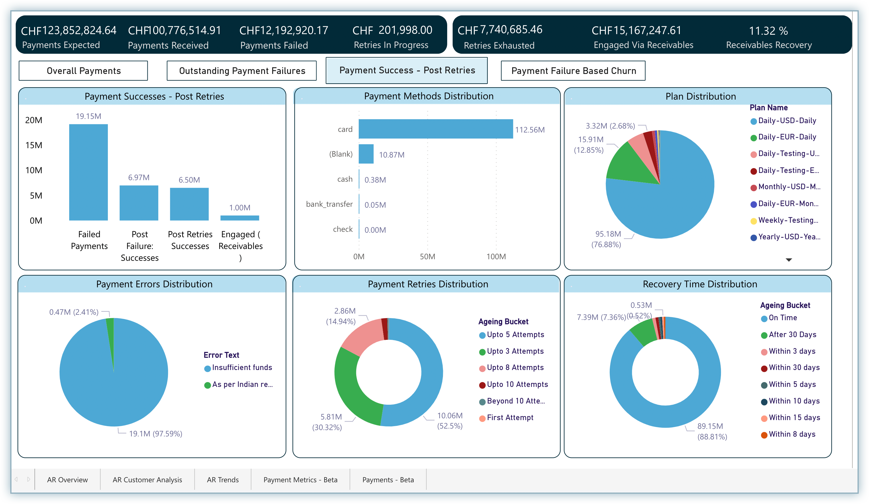
This chart contains the following metrics as bars:
- Failed Payments: Sum total of invoice amounts that were attempted for payment during the last 12 months including the current month with at least one failure.
- Post Failure Successes: Sum total of invoice amounts that were attempted for payment during the last 12 months including the current month and were successfully paid after suffering a one or more failures
- Post Retries Successes: Sum total of invoice amounts that were attempted for payment during the last 12 months including the current month, suffered at least one failure & were eventually paid after retries were exhausted or stopped.
- Engaged (Receivables): Sum total of invoice amounts that were attempted for payment during the last 12 months including the current month, suffered at least one failure & were eventually paid whose retries were exhausted or stopped and were engaged via Receivables.
How to Interpret the Charts?
This chart allows you to take a 360-degree look at the payments which got successful after failing and whose retries were exhausted in the last 12 months.
As explained in the example for the Overall Payments dashboard, you can customize the charts by clicking on the relevant elements from the charts and getting the required data out of them.
Follow these steps for a guided interpretation to understand past failure successes:
- You can start off by assessing the errors with major distribution
- Dig a little deep into errors that seem involuntary, that is, not a customer's fault
- Assess the retry buckets for this segment of errors where payments were successfully recovered. This indicates the number of attempts beyond which payment recovery becomes more & more difficult.
- Focus on the recovery time for such errors to understand the tolerance limits before which suitable actions are to be taken.
Payment Failure Based Churn
This dashboard is different from the others as it presents the metrics with respect to customers, while the other dashboards show the total invoice amounts.
This dashboard is designed like a funnel that starts with a macro view of the related data such as failed payments, unrecovered payments, and retries exhausted in the first chart and then breaks down into four different distributions that focus on the micro elements related to payment such as payment methods, plans, errors, and more.
This dashboard contains the following charts:
| Chart | Description |
|---|---|
| Payment Failure Based Churn Funnel | A customer funnel that provides a straight away insight into failed payments & post failure churn. |
| Payment Methods Distribution | A distribution of all the unique payment methods used by the chosen cohort of customers to make payments. |
| Plan Distribution | A distribution of various subscription plans across the chosen cohort of customers. |
| Payment Errors Distribution | A distribution of unique payment errors suffered by a chosen cohort of customers. |
| Payment Retries Distribution | A straight-away insight into the payment retries distribution across a chosen cohort of customers. |
| Recovery Time Distribution | A distribution of recovery period of invoices for the chosen cohort of customers. |
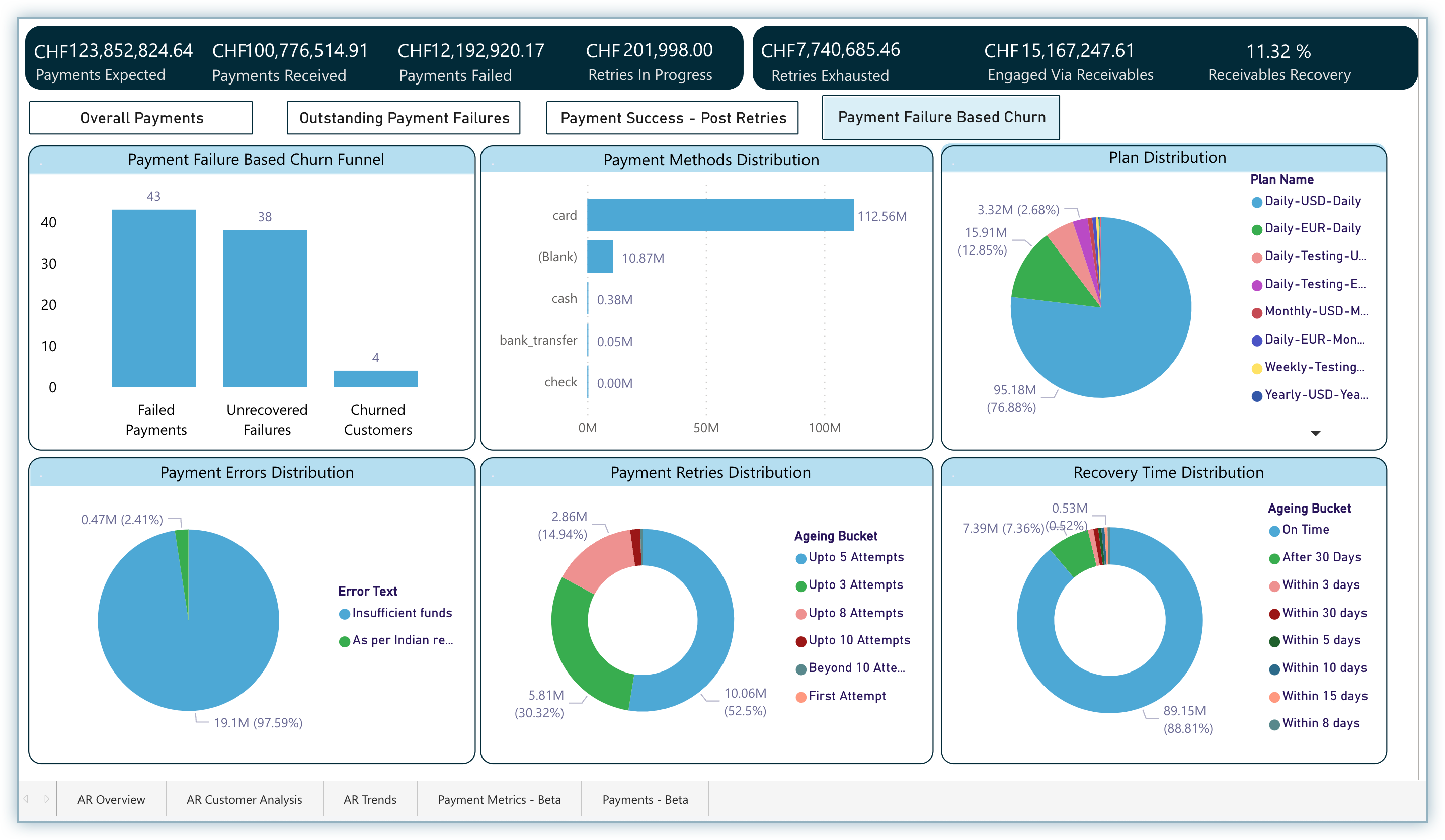
Payment Failure Based Churn Funnel
This chart contains the following metrics:
- Failed Payments: Sum total of unique customers that attempted payment during the last 12 months including the current month with at least one failure.
- Unrecovered Failures: Sum total of unique customers that attempted payment during the last 12 months including the current month & still remain unrecovered.
- Churned Customers: Sum total of unique customers that attempted payment during the last 12 months including the current month and eventually churned out.
How to Interpret the Charts? This chart allows you to understand various metrics related to unrecovered failures and how those payments led to customer-churn eventually. This enables you to take the required action in time and keep a better payment recovery process in place to avoid churn at all costs.
As explained in the example for the Overall Payments dashboard, you can customize the charts by clicking on the relevant elements from the charts and getting the required data out of them.
Was this article helpful?