Payment Metrics
The Payment Metrics dashboard provides merchants with a visual representation of their customers' payment data, emphasizing payment failure recovery, including the Chargebee Payment Failure Recovery process. Merchants can analyze patterns to determine the success of their payment failure recovery using various charts and data sets.
The dashboard includes the following sections:
Top stats
- Graph 1: Customer Invoice Funnel for Failed Payments (Auto Collect ON)
- Graph 2: Revenue Leakage due to Failed Payments (Auto Collect ON)
- Graph 3: Failed Payments Recovery via Retries
- Graph 4: Failed Payments Recovery - Post Retries
- Graph 5: Offline Payments Recovery (Auto Collect OFF)
The Top Stats, graphs, and legends include tooltips that are viewable on hover.
| Metric | Description |
|---|---|
| Payments Expected | Sum total of invoice amount that were due in the last 12 months including the current month. |
| Payments Received | Sum total of invoice amount that were paid in the last 12 months including the current month. |
| Payments Failed | Sum total of invoice amounts that failed and remained unrecovered in the last 12 months including the current month. |
| Retries in Progress | Sum total of invoice amounts whose payments have failed & retries are currently in progress. |
| Retries Exhausted | Sum total of invoice amounts whose payments remain failed & retries are exhausted in the last 12 months including the current month. |
| Engaged via Receivables | Sum total of invoice amounts that were engaged via Receivables in the last 12 months including the current month. |
| Receivables Recovery | The percentage of invoice amount that was recovered through Receivables out of the total engaged in the last 12 months including the current month. |
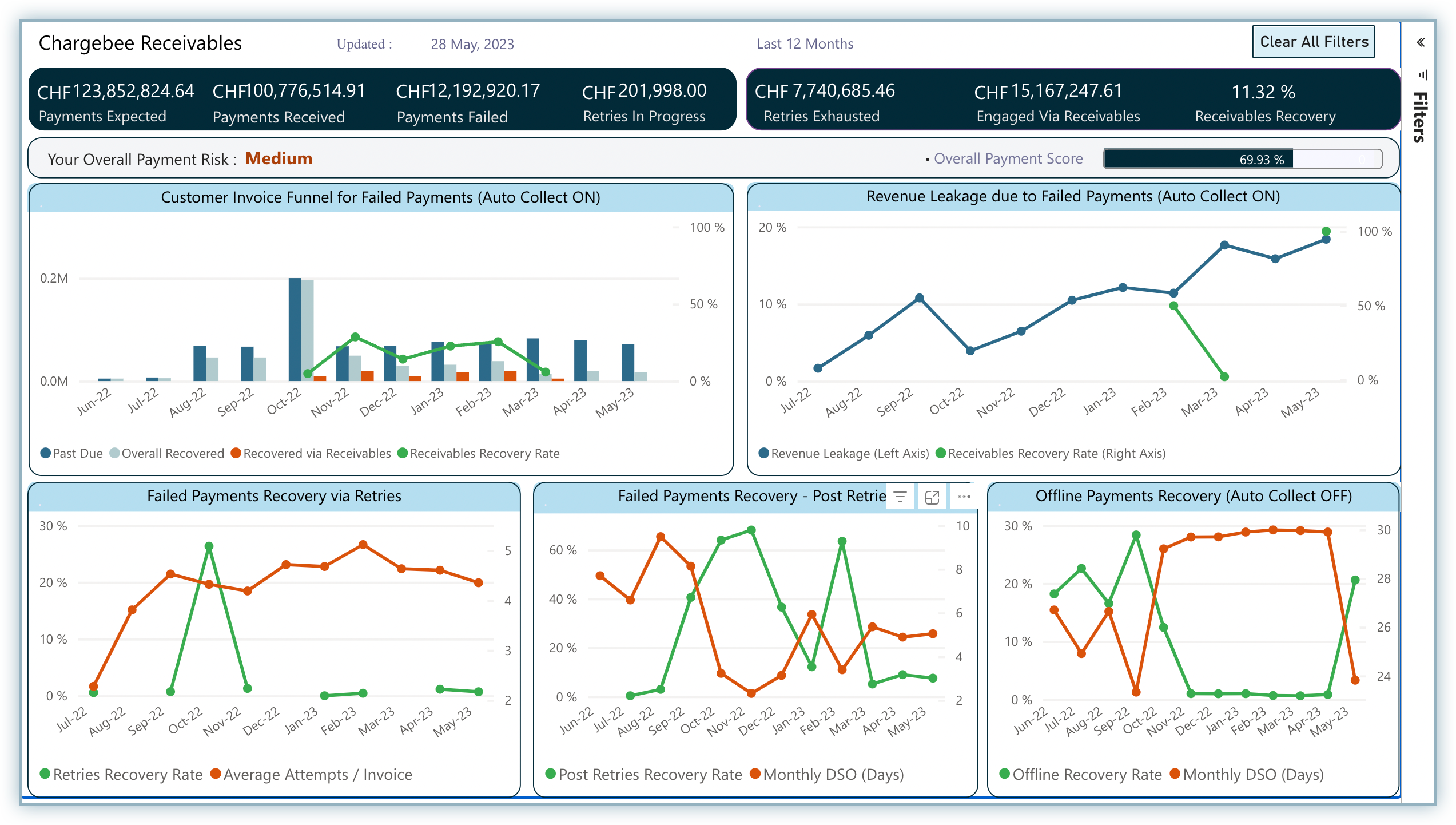
Customer Invoice Funnel for Failed Payments (Auto Collect ON)
This graph represents a funnel that contains failure and recovery-related metrics that displays the number of invoices that crossed the due date due to payment failures, followed by their recovery and finally, the contribution of Receivables towards the overall recovery.
The graph contains legends as described below:
| Legend | Description |
|---|---|
| Past Due | Amount of invoices that crossed the due date due to failed payments during a month. |
| Overall Recovered | Amount of invoices that were recovered after they had crossed the due date due to failed payments during a month. |
| Recovered via Receivables | Amount of invoices that were engaged via Receivables and recovered successfully after suffering payment failures during a month. |
| Receivables Recovery Rate | The rate at which Receivables was able to recover the amount of invoices that had crossed the due date during a month. |
How to Interpret the Graph?
While the funnel focuses on the recovered set of invoices, it primarily highlights the effectiveness of the payment failure recovery process in place.
Hover over each legend to view data that helps you dive deeper into the metrics for a particular month.
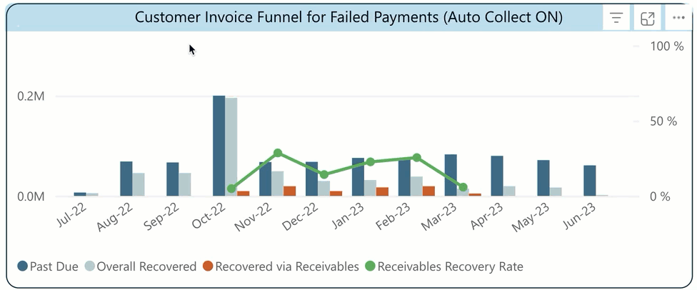
Revenue Leakage due to Failed Payments (Auto Collect ON)
The graph represents the revenue leakage caused due to payment failures over a period of 12 months. It highlights the after-effects of payment failures on actual revenue leading to stunted growth.
| Legend | Description |
|---|---|
| Revenue Leakage | The percentage of invoice amounts that ended up unrecovered after suffering a payment failure against the total invoices whose payments were attempted during the given month. |
| Receivables Recovery Rate | The percentage of invoice amounts that were recovered via Receivables after suffering a payment failure against the total failed invoices that were engaged via the platform. |
How to Interpret the Graph?
Ideally, the blue curve indicating revenue leakage should show a decreasing trend, meaning leakage is decreasing each month. The green curve, indicating the rate of recovery via Receivables, should be increasing, which means Receivables is recovering failures effectively.
While the blue curve highlights the net leakage the company is suffering over the last 12 months due to payment failures, the green curve indicates the contribution of Receivables towards keeping the blue curve (net leakage) as low as possible.
Hover over each legend to view data that helps you dive deeper into the metrics for a particular month.
Failed Payments Recovery via Retries
This graph shows the efficiency of retries in recovering failed payments over the last 12 months after suffering a failure.
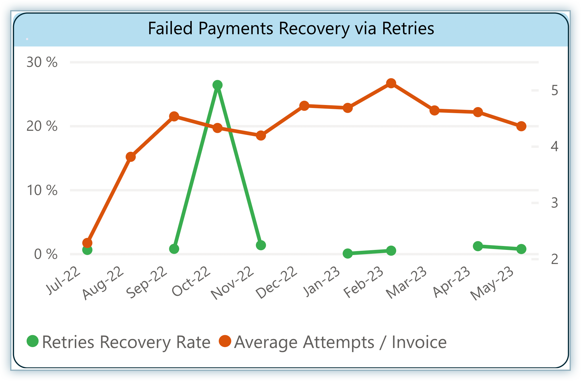
The graph contains legends as described below:
| Legend | Description |
|---|---|
| Retries Recovery Rate | The percentage of failed payments that were recovered through retries against the total amount of invoices that suffered payment failures during the month. |
| Average Attempts/Invoice | Average number of payment attempts an invoice consumes before it becomes successful. |
How to Interpret the Graph?
In this graph, the red curve indicates the percentage of failed payments that were recovered through retries during a month. On the other hand, the green curve indicates the number of attempts consumed per invoice before it was successfully paid.
While the green curve shows the rate at which payments have been recovered monthly through retries, the orange curve indicates the attempts that have gone into recovering the same, thereby signifying the need for retries optimization.
Failed Payments Recovery - Post Retries
This graph shows the efficiency with which failed payments were recovered over the last 12 months once retries were exhausted or stopped. It throws light on how efficient the manual recovery process has been after the retries failed to recover the failed payments.
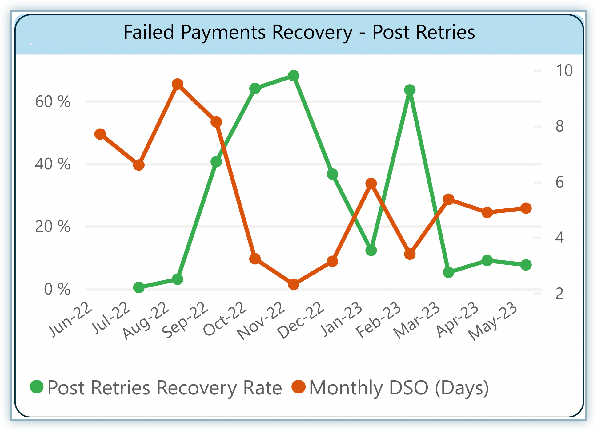
The graph contains legends as described below:
| Legend | Description |
|---|---|
| Post Retries Recovery Rate | The percentage of failed payments that were recovered post retries against the total amount of invoices that suffered payment failures & had their retries exhausted during the month. |
| Monthly DSO (Days) | The number of days it takes for a failed invoice to be recovered post retries during the month. |
How to Interpret the Graph?
In this graph, the red curve represents the number of days consumed on average to recover failed payments during a month. On the other hand, the green curve represents the percentage of the recovered failures post-retries during a month.
While the green curve showcases the rate at which payments have been recovered after retries give up, the orange curve depicts the number of days on average it takes for such an invoice to be recovered after retries get exhausted.
Offline Payments Recovery (Auto Collect OFF)
This graph shows the efficiency with which offline payments were recovered over the last 12 months.
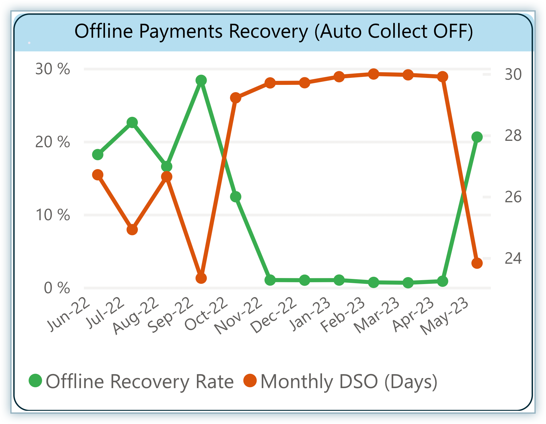
The graph contains legends as described below:
| Legend | Description |
|---|---|
| Offline Recovery Rate | The percentage of invoices that were recovered whose payments were not on auto-collect. |
| Monthly DSO (Days) | The number of days it takes for an offline invoice to be recovered during the month. |
How to Interpret the Graph?
This graph is straightforward with the green curve indicating the recovery rate of offline payments after facing a failure and the red curve indicating the number of days consumed for recovery through the manual process.
Ideally, the red curve should be falling and the green curve should be rising, indicating an increasing rate of recovery and a decreasing number of days per offline invoice. If these curves do not follow the ideal pattern, it indicates that you need to improve your offline recovery process.
Was this article helpful?