Branding
Overview
See also
Branding is the face of your company and plays a key role in building a recognized and reputable business. Effective branding helps you stand out from competitors and positions your business as a trusted establishment in the marketplace.
With Chargebee Billing, you can ensure that your checkout pages, customer portal, emails, and invoices consistently reflect your brand using your company logo, icons, and color schemes.
Prerequisites
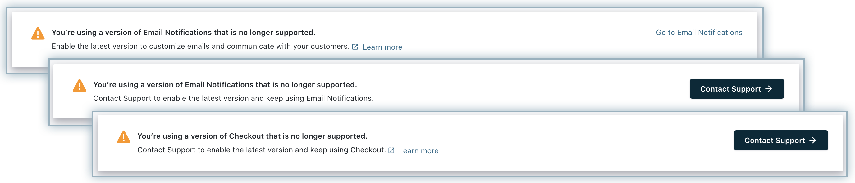
Ensure that you have enabled the following features on your Chargebee Billing site before setting up your brand elements:
If not already done, you will be prompted to configure the above features before setting up the brand elements in your site as follows:
Setting up Brand Identities
Setting up your branding elements in Chargebee is easy. Follow these steps to configure your brand styles:
-
Log in to your Chargebee Billing site and navigate to Settings > Configure Chargebee > Brand Styles.
-
On the Brand Styles page, click the tabs Logo & Color, Email, Invoice, Checkout, and Self-serve Portal to customize your brand styles for each of them respectively.
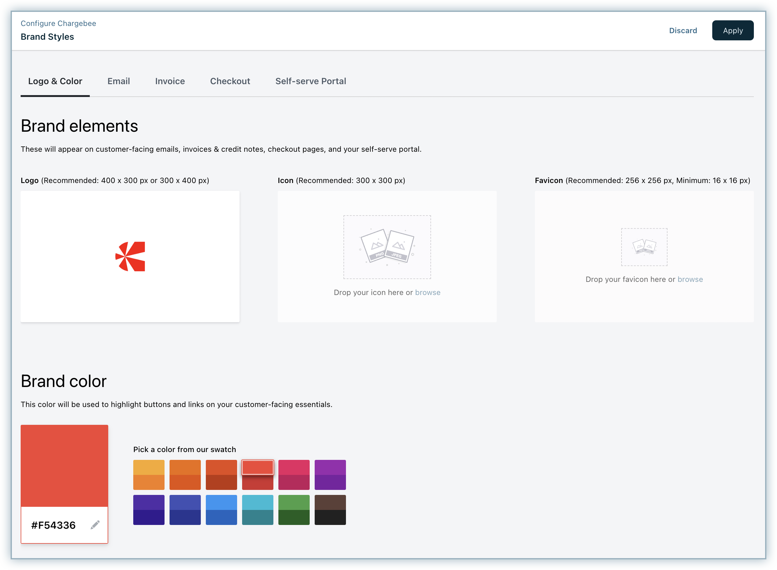
Logo & Color
To configure the logo and color of your brand, follow these steps on the Brand Styles > Logo & Color tab:
-
Brand elements: These elements appear on all your customer-facing emails, invoices, credit notes, checkout pages, and self-serve portal. You can drag and drop or browse to add your brand elements such as Logo, Icon, and Favicon.
- Logo: You can upload your brand's logo. Logo is a unique symbol or a design that is used to represent your organization's brand. We recommend the image resolution to be 400 x 300 px or 300 x 400 px.
- Icon: You can upload your brand's icon. Icon is a small symbol or a pictogram that represents your brand. We recommend the image size to be 300 x 300 px(square image). Note: Icon is for standby while designing Invoice, in case Logo is not present.
- Favicon: Favicon is an icon attached to a particular website, usually displayed in the address bar while accessing your site or next to your site name in a user's list of bookmarks. We recommend the image size to be 256 x 256 px, the minimum image size should be 16 x 16 px(square image).
-
Brand color: This color appears to highlight buttons and links on your customer-facing essentials. Pick a color from the range of given options. The color you pick will be brought in to play in buttons, links, and other highlights in customer-facing elements like Email, Invoice, Checkout page, and Self-serve portal. If the color is not available in the pallet, you can add your custom color in HEX code format.
-
Click Apply to save your changes.
To configure the brand style of your email, follow these steps on the Brand Styles > Email tab:
-
If you want to update your brand elements and color, click Add/Manage Logo & Color to customize your brand elements and color.
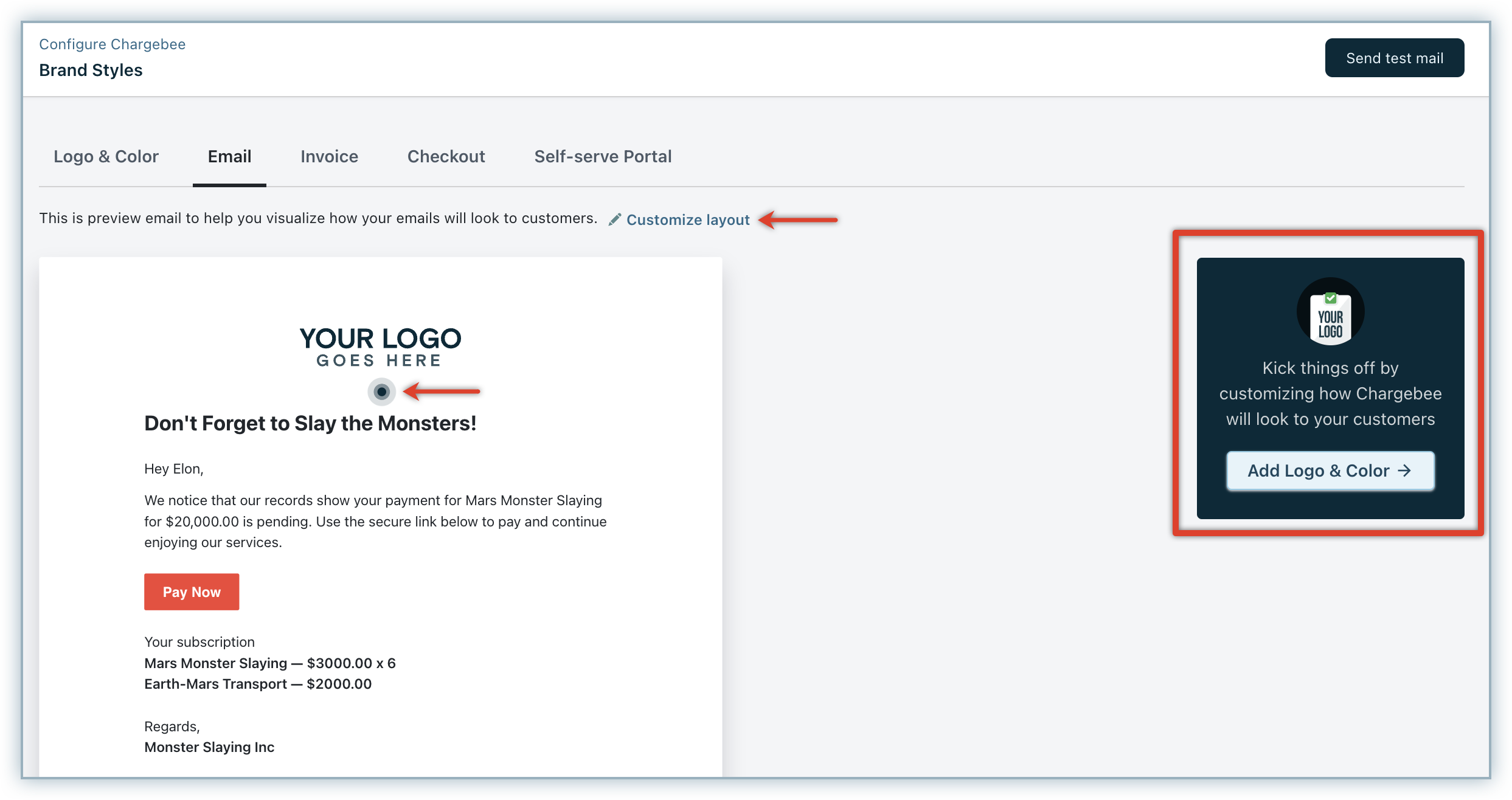
You will be redirected to the Logo & Color tab, where you can add or update your elements and brand color. Click Apply.
-
On the Email tab, click Customize layout or the animated blue icon, and Choose a logo type to be displayed on your emails with desired properties. You can select from the following options:
- Logo: The logo image that you uploaded will be displayed on your emails.
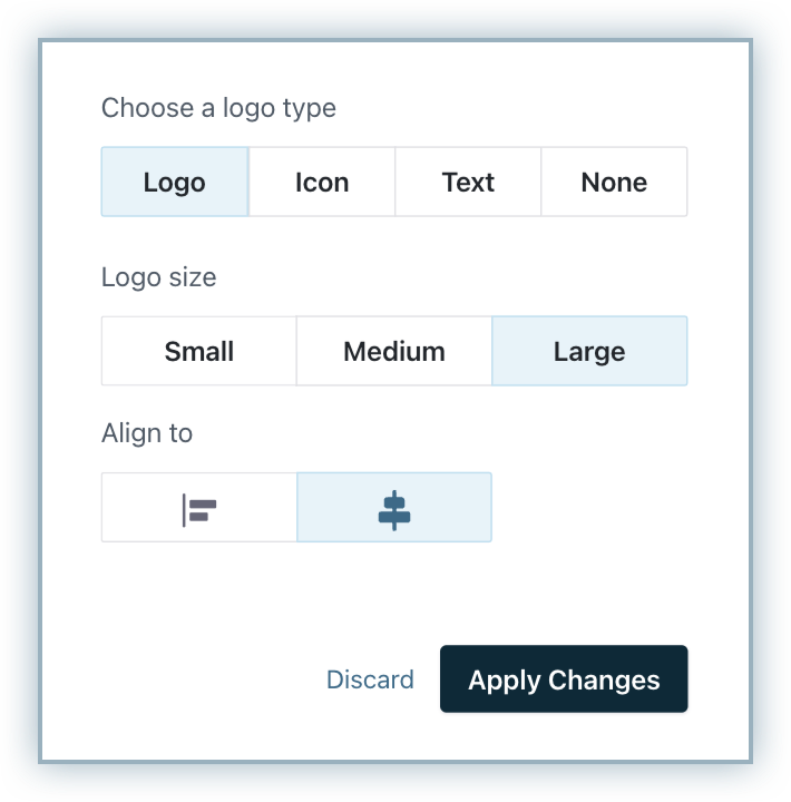
- Select the Logo size from Small, Medium, or Large.
- Select the Logo alignment to be Left, or Centered.
- Icon: The icon image that you uploaded will be displayed on your emails.
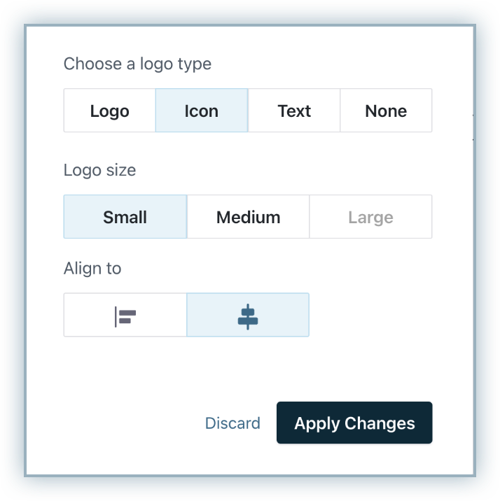
- Select the size from Small, Medium, or Large.
- Select the Icon alignment to be Left, or Centered.
- Text: You can display a text content on your email headers.
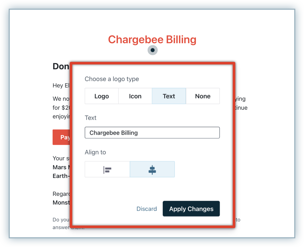
- Enter the Text that you want to display.
- Select the Text alignment to be Left, or Centered. Note: If Icon is not added, the Text you add here will be given preference.
- None: Select this option if you don't want anything to be displayed on your email headers.
- Logo: The logo image that you uploaded will be displayed on your emails.
-
Click Apply Changes to create a custom brand style for your brand's email.
-
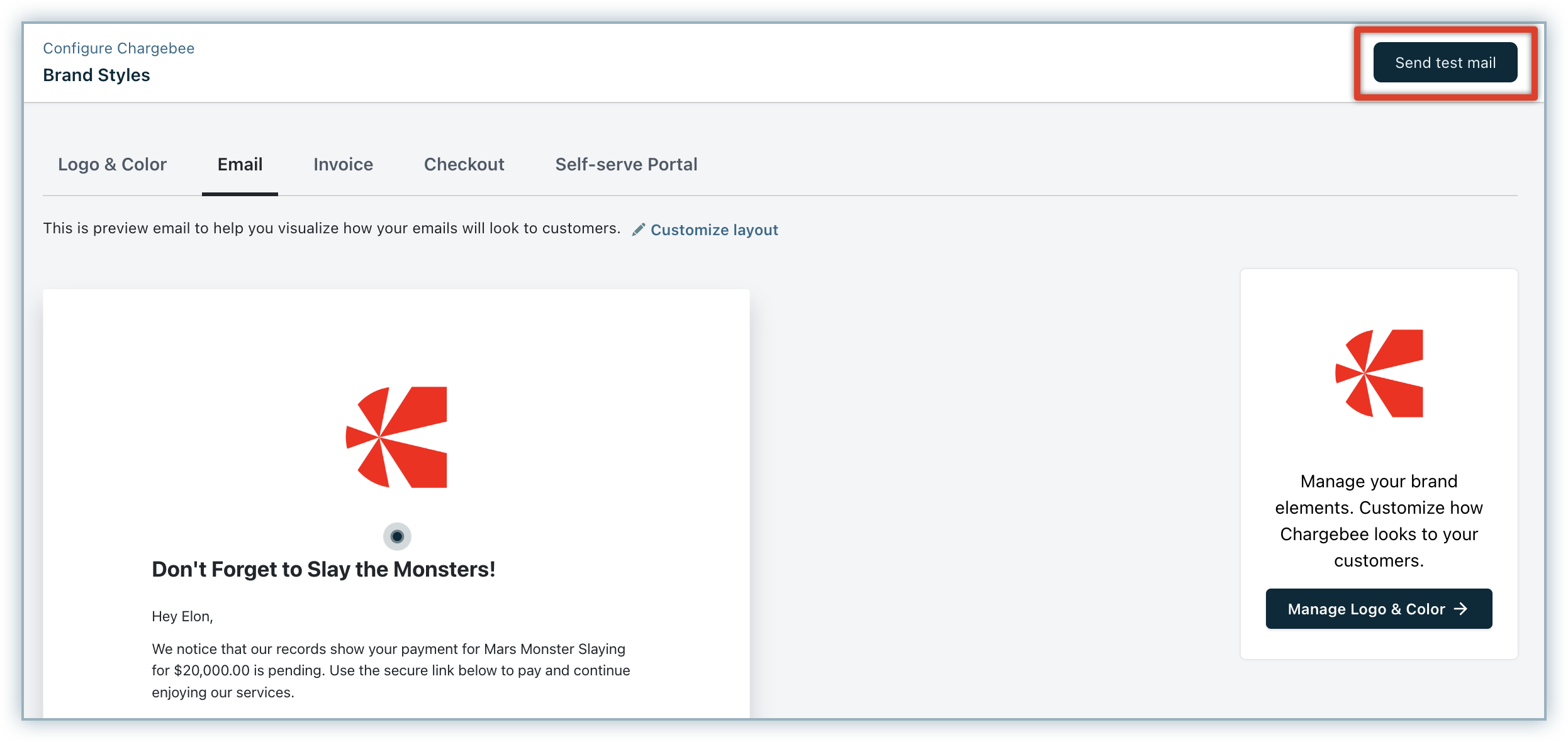
Click Send test mail, verify your email address, and click Send Email to send an email to your preferred email address for email template verification.
-
Preview the sample email to verify your configuration.
Invoice
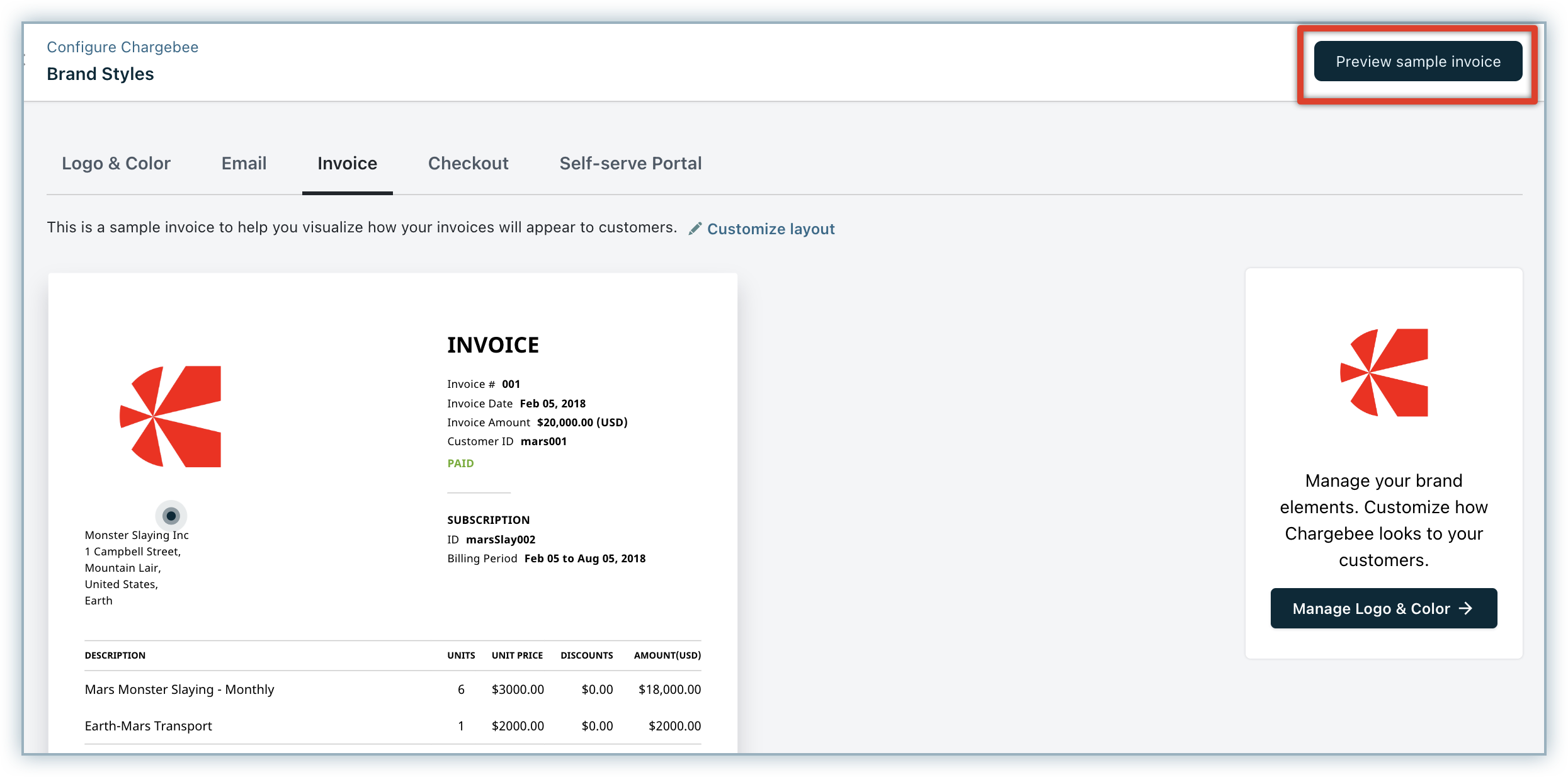
To configure the brand style of your invoice, follow these steps on the Brand Styles > Invoice tab:
-
If you want to update your brand elements and color, click Add/Manage Logo & Color to customize your brand elements and color.
You will be redirected to the Logo & Color tab, where you can add or update your elements and brand color. Click Apply.
-
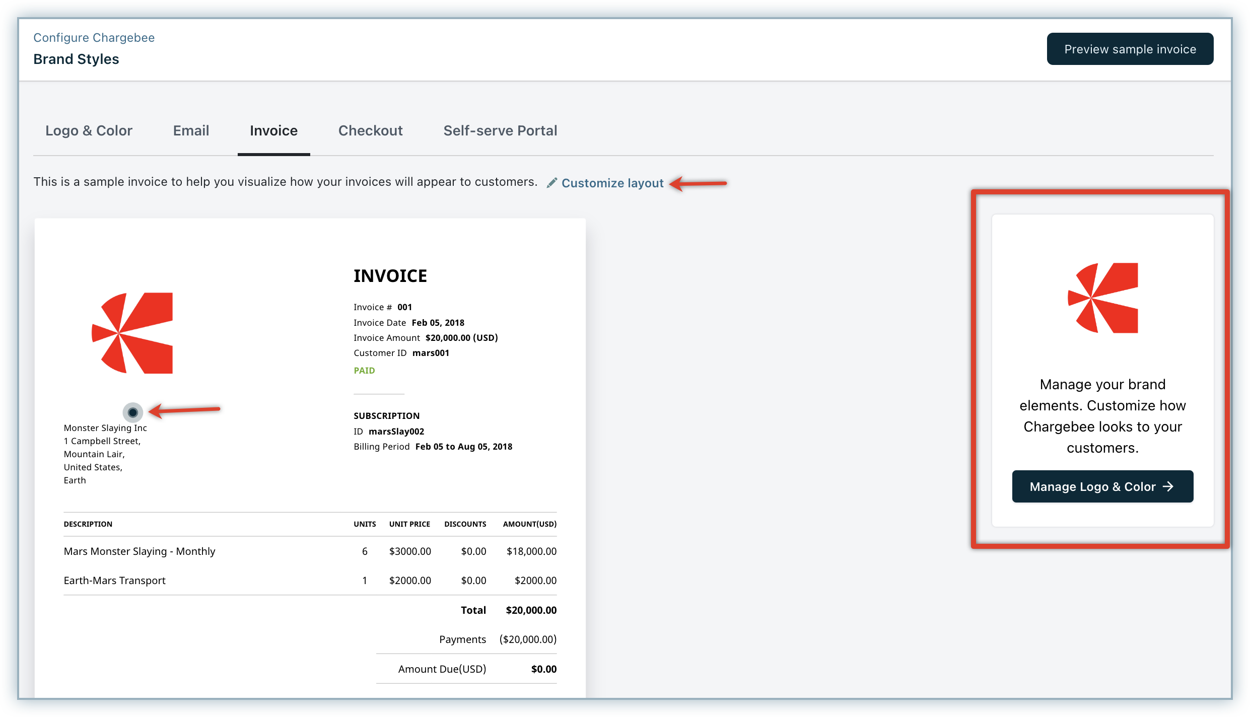
Click Customize layout or the animated blue icon, and Choose a logo type to be displayed on your invoices with desired properties. You can select from the following options:
- Logo: The logo image that you uploaded will be displayed on your invoices. Select the Logo size from Small, Medium, or Large.
- Icon: The icon image that you uploaded will be displayed on your emails. Select the Icon size from Small, Medium, or Large.
- None: Select this option if you don't want anything to be displayed.
-
Click Preview sample invoice to verify your invoice brand style configuration.
-
Preview the sample invoice PDF to verify your configuration.
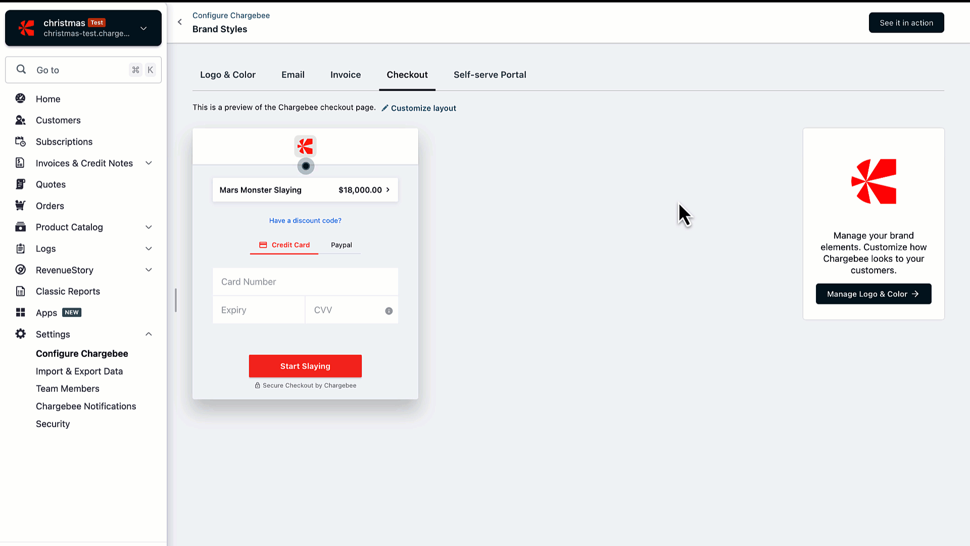
Checkout
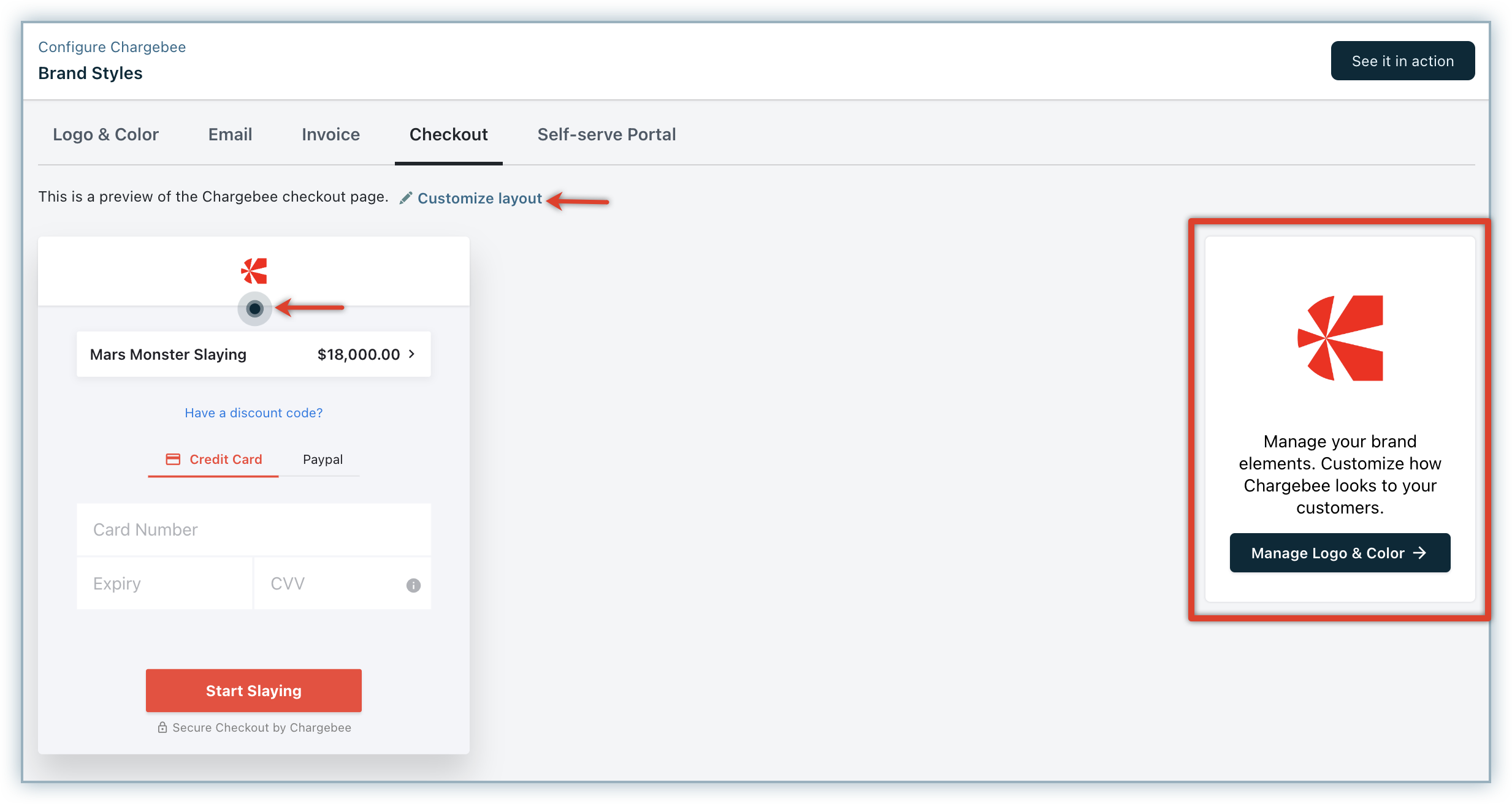
To configure the brand style of your Checkout page, follow these steps on the Brand Styles > Checkout tab:
-
If you want to update your brand elements and color, click Add/Manage Logo & Color to customize your brand elements and color.
You will be redirected to the Logo & Color tab, where you can add or update your elements and brand color. Click Apply.
-
Click Customize layout or the animated blue icon, and Choose a logo type to be displayed on your brand's checkout page. Whatever you select here will be applied to both Checkout and Portal. You can select from the following options:
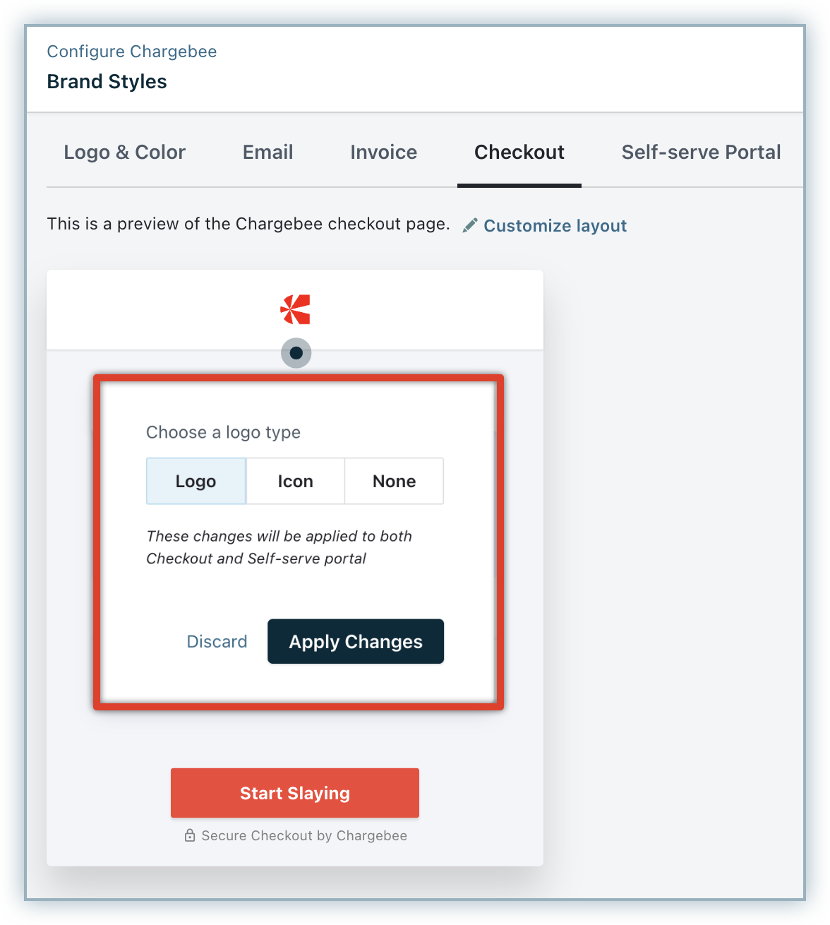
- Logo: The logo image that you uploaded will be displayed on your checkout and portal.
- Icon: The icon image that you uploaded will be displayed on your checkout and portal.
- None: Select this option if you don't want logo or icon to be displayed.
-
Click Apply Changes.
-
Click See it in action to preview your checkout workflow.
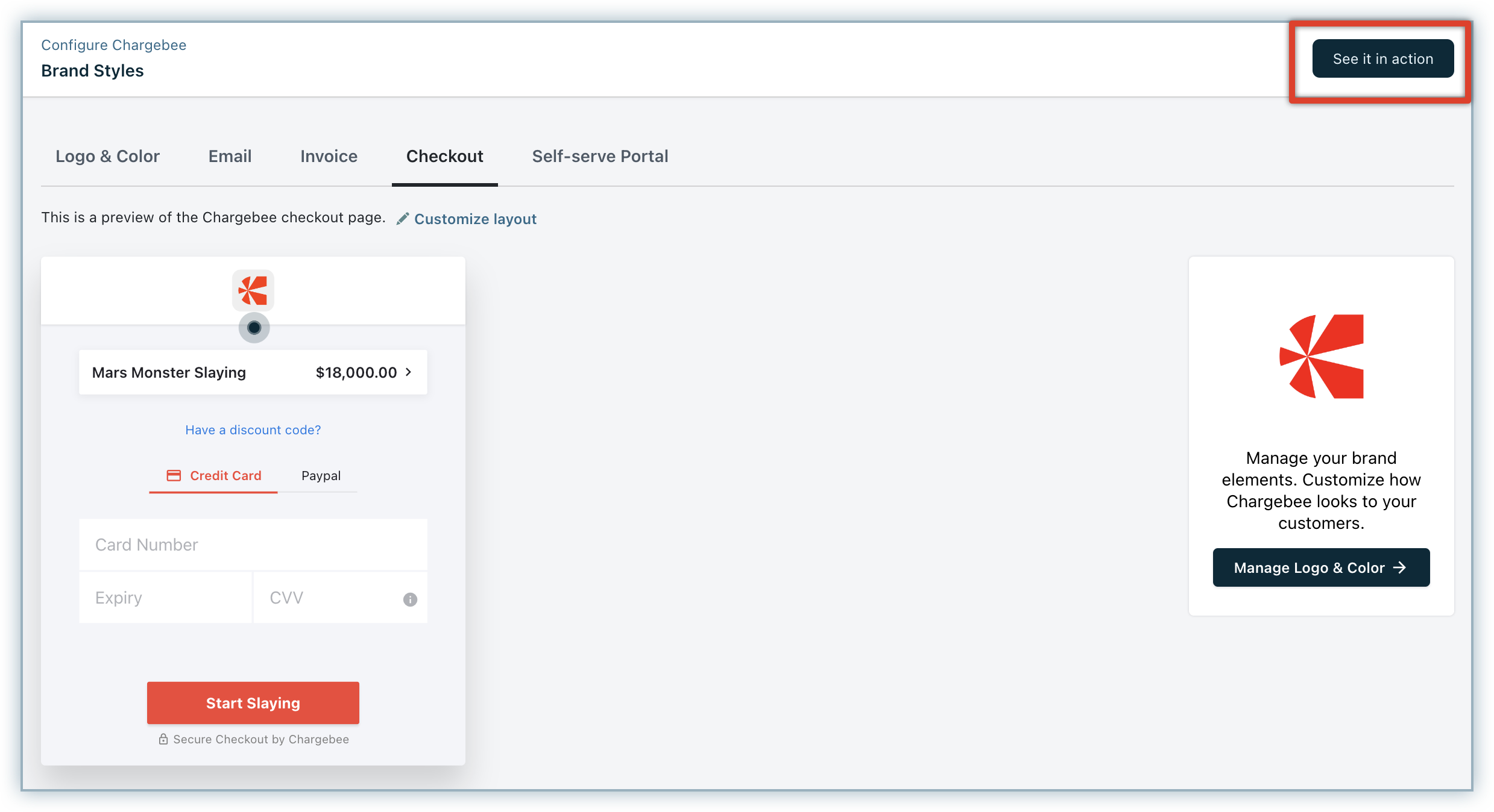
A preview of your end-to-end checkout workflow gets displayed right here, where you can verify your brand style configuration.
Self-serve Portal
Checkout and Self-serve Portal has the same configuration. Hence, applying changes to Checkout or Self-serve Portal will be effective for both.
After adding your brand styles to the Self-serve Portal, click See it in action to preview your portal workflow. (Note that if you are using Checkout or Self-serve Portal via API, you will not be able to see below screens, and an error will be displayed.)
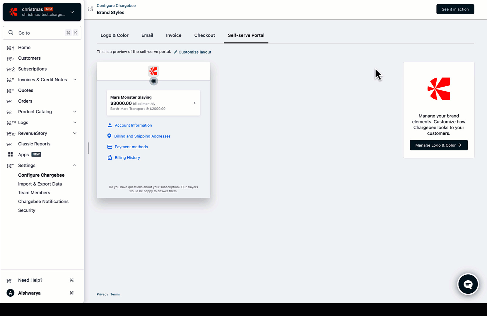
A preview of your end-to-end portal workflow gets displayed right here, where you can verify your brand style configuration for all portal actions.
Was this article helpful?