Dashboards & Trends
Overview
The Dashboards and Trends features in Chargebee Growth provides a centralized view of the performance of all Plays, enabling teams to monitor, analyze, and improve customer behaviour during the subscriber journeys. It is designed for product, growth, and customer success teams who need visibility into how effective your plays are and how it influences their revenue outcomes.
Dashboards and Trends are currently available only for Retention Plays. This functionality will be extended to other play types in upcoming releases.
The Dashboards offer a real-time, high-level snapshot of performance, while the Trends reports provide deeper, time-based insights to help you track patterns and make informed decisions.
Navigating the Dashboard
The Growth Dashboard includes five pre-built reports that together provide a comprehensive view of Cancel Page performance: Save Performance, Deflection Funnel, Saves, Cancels, Retained Revenue, Active Watch List, Benchmarks, Retention Lift, and Cumulative Retained Revenue. Each report highlights a different stage of the customer journey, from initial cancellation intent to eventual retention or churn.
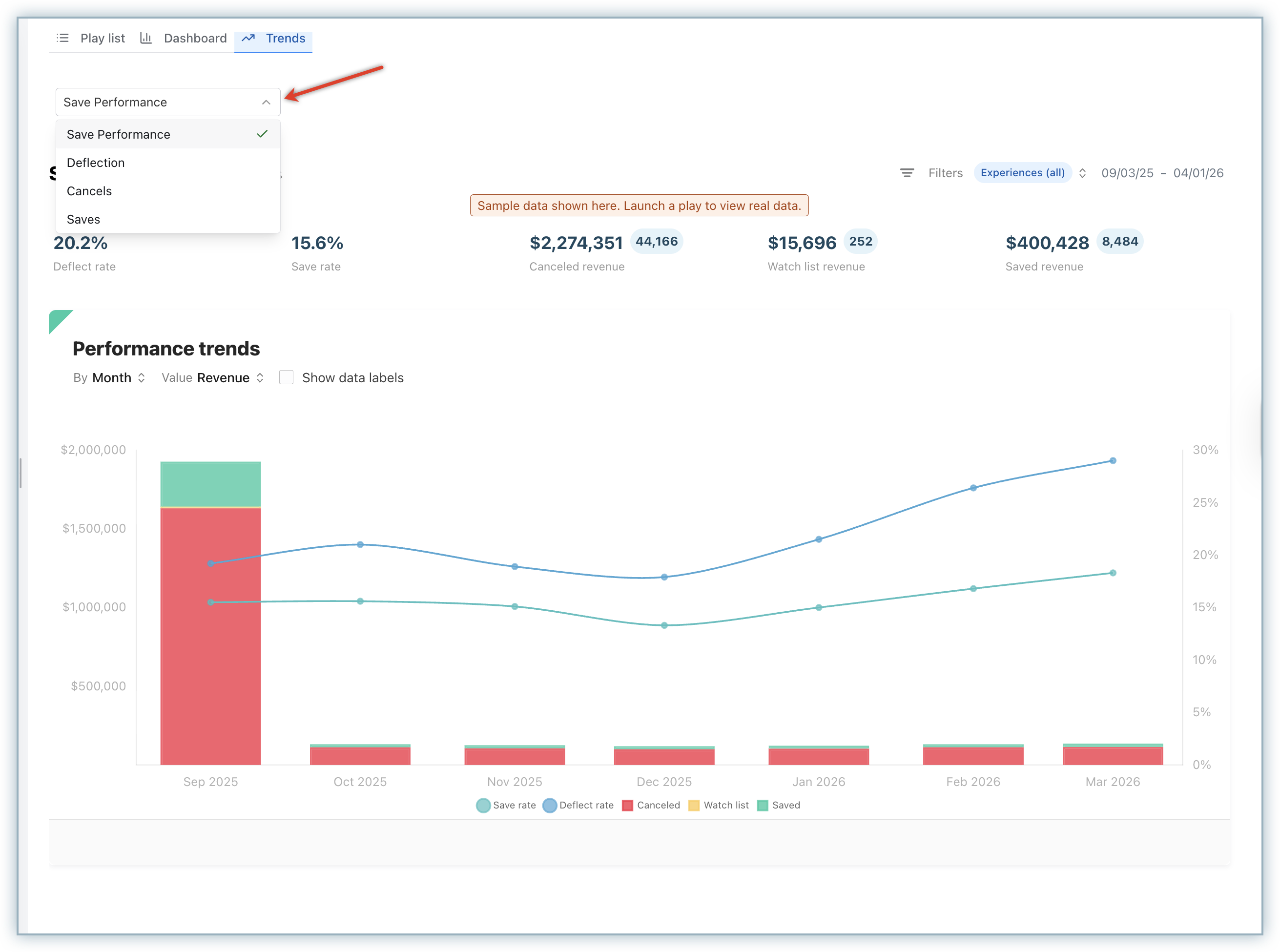
Save Performance
The Save Performance report allows you to track how your Save Rate and Deflect Rate change over time, making it easier to evaluate the effectiveness of your retention strategies. The data is visualized across a selected time range and automatically grouped by day, week, or month.
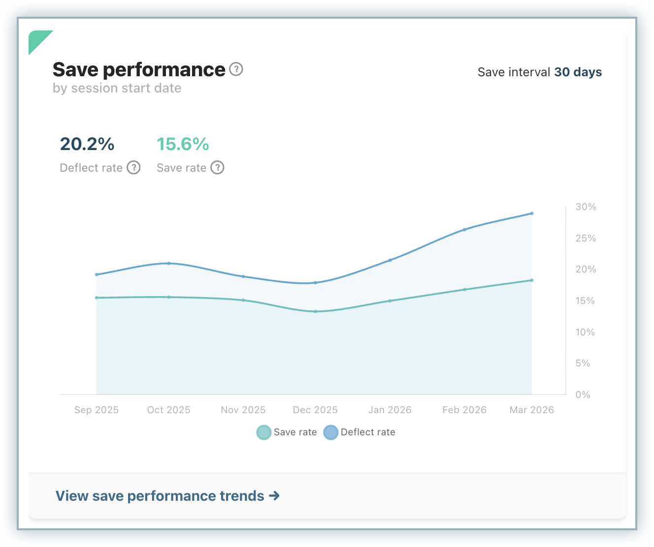
This chart is particularly useful when assessing the impact of updates to your cancel flow, such as introducing new offers or modifying messaging. By comparing performance before and after changes, you can clearly measure their effectiveness. You can also hover over individual data points to view precise values for a given period.
The save rate is only available for time ranges beyond the configured save interval. If you are not seeing any save data in this chart, it is mostly because your time range configured is less than or equal to your save interval.
Deflection Funnel
The Deflection Funnel report provides a detailed breakdown of how users interact with your Cancel Page and what outcomes result from those interactions. It shows how many users visited the page, how many chose not to cancel immediately (deflected), and how many proceeded to cancel.
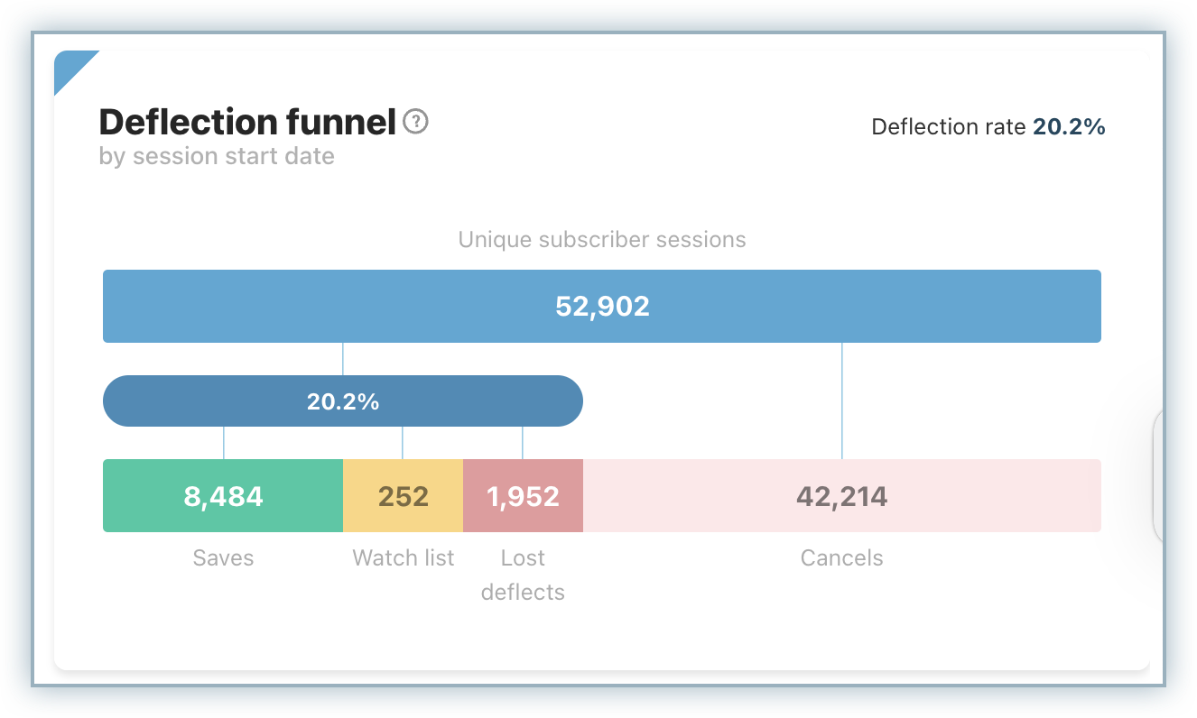
An important aspect of this report is the visibility into “Lost Deflects,” which represent users who initially chose not to cancel but later churned. These users typically appear on the Watch List before canceling. Because of this behavior, the Save Rate is always slightly lower than the Deflect Rate, as not all deflected users are ultimately retained.
By analyzing this funnel, you can better understand user behavior and identify opportunities to improve retention at different stages of the cancellation journey.
Note
Lost deflects account for the difference between Deflect Rate and Save Rate.
Cancels
The Cancels report helps you understand why customers are leaving by presenting a percentage-based breakdown of cancellation reasons over a selected time period. It also highlights the total number of canceled accounts, giving you both relative and absolute context.
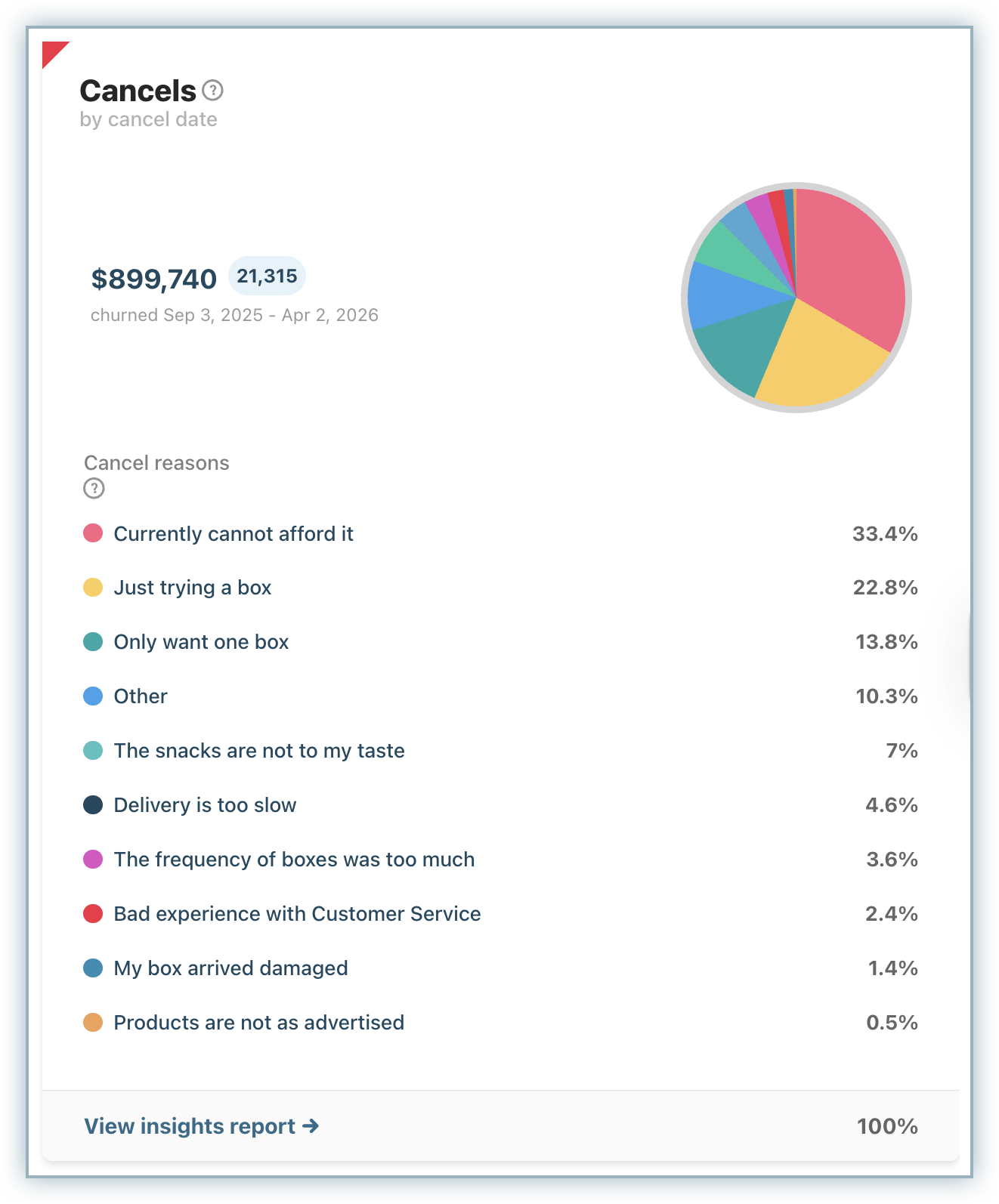
The report is interactive, allowing you to hover over segments to highlight specific reasons or click into them for deeper insights. From there, you can navigate to more detailed reports that provide customer-level data and allow exports for further analysis.
You can also click the View insights report to explore more details. This report is particularly useful for identifying recurring issues, validating hypotheses about churn drivers, and prioritizing improvements.
Retained Revenue
The Retained Revenue report focuses on customers who were successfully retained. In Chargebee Growth, a customer is considered saved if they remain active 30 days after visiting the Cancel Page.
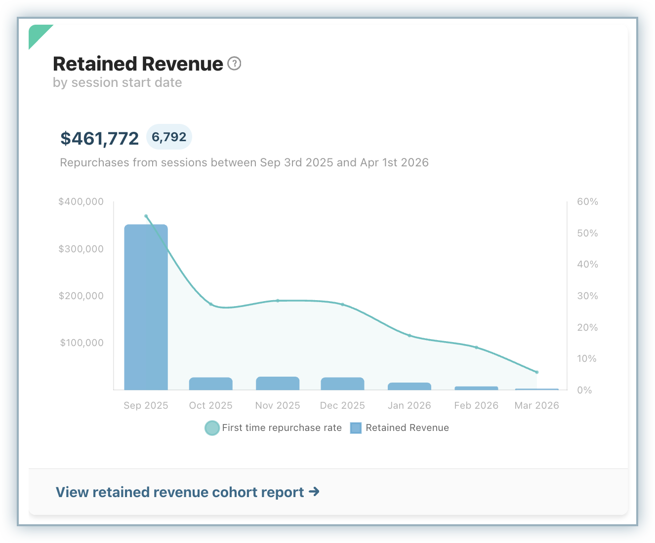
This report shows how saves evolve over time, with the visualization adapting to the selected date range. Longer timeframes group data monthly, while shorter periods provide more granular weekly views. This flexibility allows you to analyze both short-term changes and long-term trends.
You can use this report to evaluate which retention strategies are working, and then drill down further to understand what reasons, offers, or actions contributed to successful saves.
Active Watch list
The Active Watch List provides visibility into customers who have shown intent to cancel but have not yet completed the process. It displays a real-time count of such users along with a snapshot of the most recent entries.
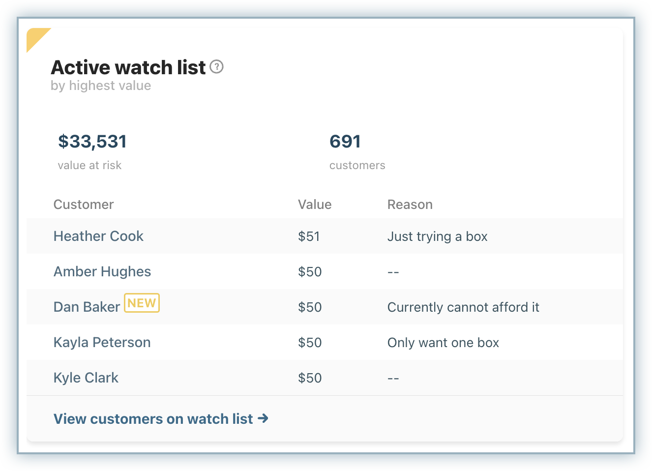
For each customer, you can see how many times they have attempted to cancel, whether they have since been saved, and how much time has passed since their last visit to the Cancel Page. Unlike other reports, the total count here reflects the current state and is not affected by date filters.
Clicking View customers on watch list takes you to the detailed report, where you can export the list.
This report is especially valuable for identifying at-risk users and enabling proactive engagement before they churn.
Benchmarks
Chargebee Growth also includes benchmarking capabilities that allow you to compare your retention performance against similar subscription businesses. These benchmarks cover key metrics such as Deflect Rate, Save Rate, Active Deflect Rate, and Passive Deflect Rate.
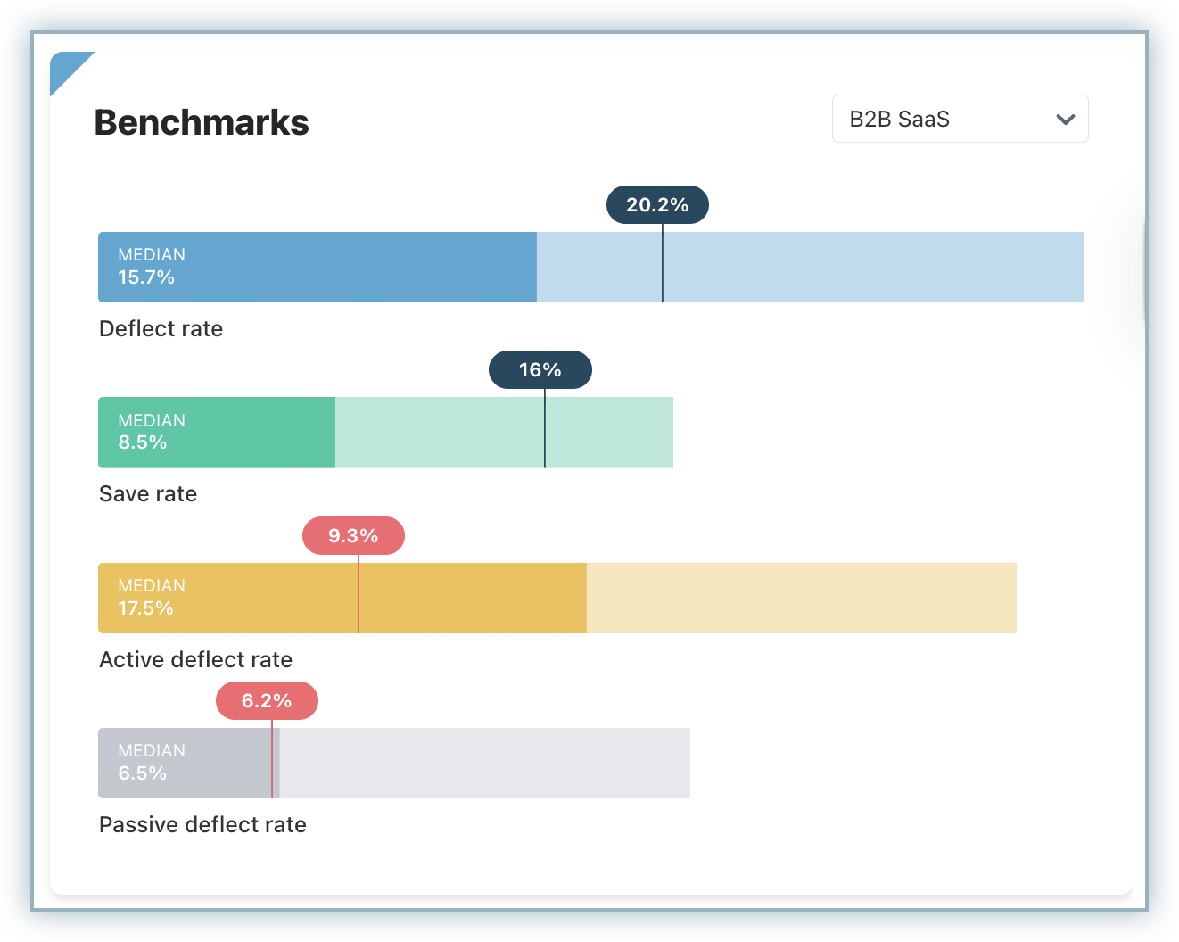
By comparing your performance to industry peers, you can better understand where you stand and identify areas that require optimization. To enable the Benchmarks report on your site, follow these steps:
- When you log into your Growth Dashboard, you will see the Benchmark widget with a message prompting you to Enable. Click Enable.
- You will be taken to a form where you need to select your Subscription Business Model and Vertical. This information helps with classifying your data for benchmarking, so it is important that you select the options that most represent your type of subscription business.
For Subscription Business Models, you can select from the following options:
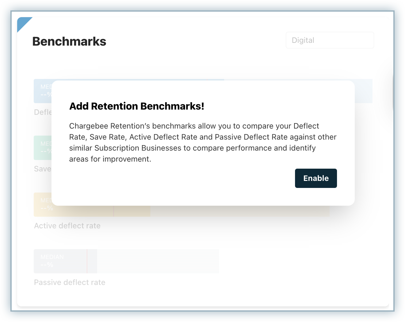
- eCommerce B2B SaaS
- Digital
- In the next step, select the Vertical based on the type of product or service you are selling. You can select from the following options:
- Apparel & Beauty
- Consumer Services
- Education
- Fintech & Insurance
- Food Delivery
- Health & Wellness
- News & Publishing
- Pets
- SaaS
- Streaming Media & Services
- Transportation
- Finally opt in to include your data in our Benchmarking calculations going forward. When you opt in, you are agreeing to include your aggregate rates for each of the metrics that are benchmarked in overall calculation. Your sensitive customer information is not shared with anyone, or any specific rates from your application is not shared with any other customers. You simply will be contributing your data to our calculations for Benchmarks in return for getting access to said Benchmarks. The Benchmark data will be recalculated and updated periodically (~weekly) as relevant changes to the metrics occur.
- Click Submit.
Once enabled, the Benchmarks widget will allow you to see how your rates relate compare to the low, median and high for each of the following four metrics:
- Deflect rate
- Save rate
- Active deflect rate
- Passive deflect rate
Retention Lift
If you have configured the Global control option on your Growth site, the Retention Lift helps you measure the incremental impact of your Retention Plays by comparing how different audiences behave within the same time window. It breaks down performance across three groups:
- Control audience: Users who did not experience the retention play
- Test audience: Users who were exposed to the retention experience
- Bypassed audience: Users who were eligible but did not go through the experience due to rules or exclusions
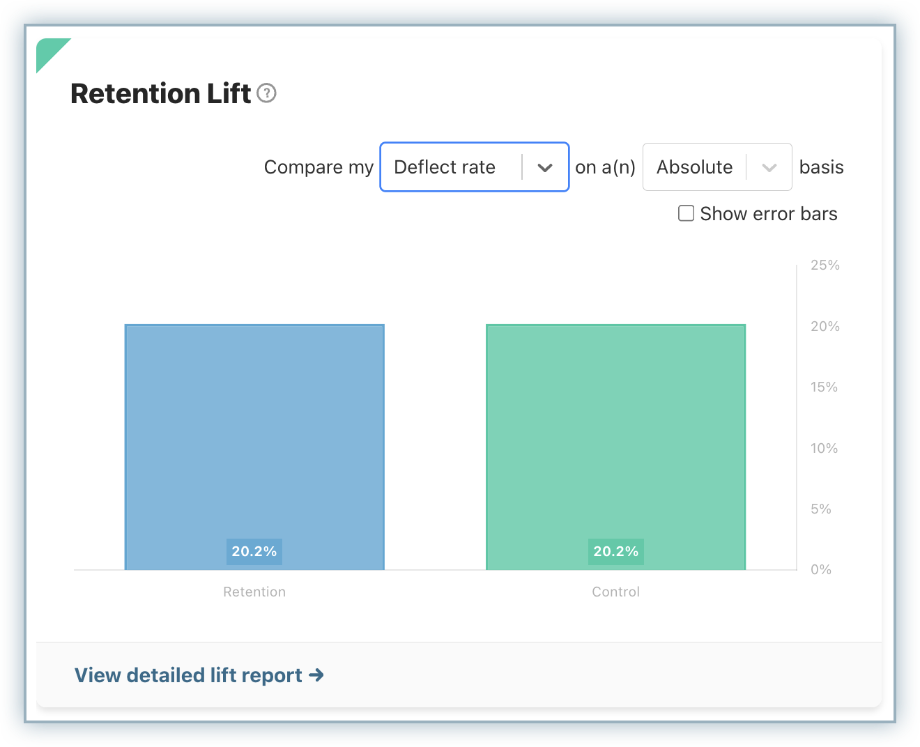
The chart shows the percentage lift driven by the retention experience, based on key outcomes such as deflections or repurchases. The visualization updates dynamically based on the selected date range, helping you analyze both short-term experiments and long-term performance trends. By comparing audiences side by side, you can determine whether your retention strategies are delivering meaningful improvements.
Cumulative Retained Revenue
The Cumulative Retained Revenue shows the total revenue retained over time as a result of your retention efforts. It aggregates cumulative revenue over time, broken down by the control audience, the test audience, and the bypassed audience.
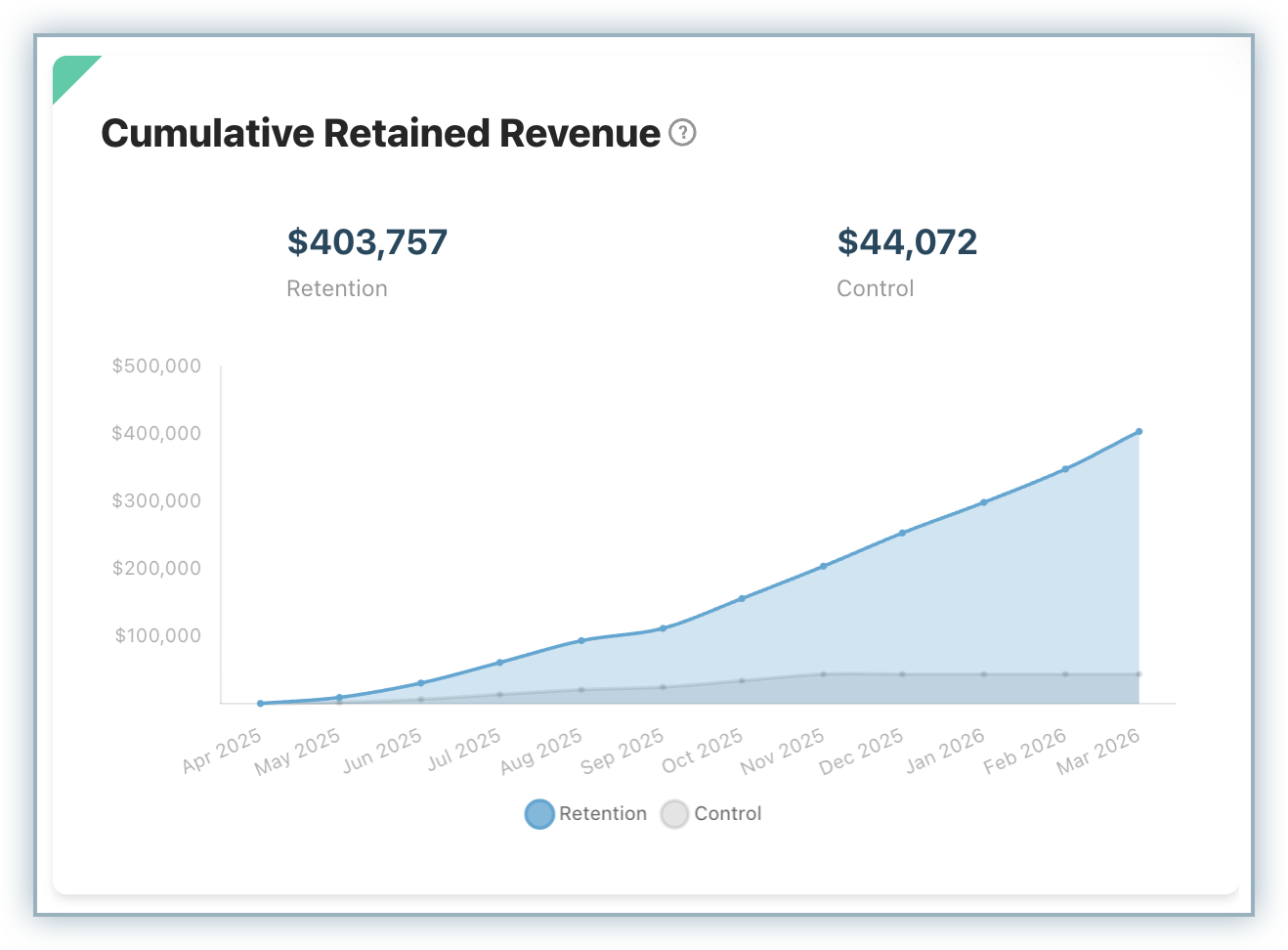
This chart helps you understand the financial impact of your Retention Play by illustrating how retained revenue builds over time. Unlike point-in-time metrics, the cumulative view highlights the long-term value generated by preventing churn. This makes it easier to assess whether your retention strategies are not only improving rates but also driving meaningful revenue outcomes.
Discovering Trends
The Trends reports provide a deeper, more flexible way to analyze how customer behavior evolves over time. While the dashboard offers a snapshot, Trends reports allow you to explore patterns across different time ranges and dimensions.
You can view how Saves, Deflections, and Cancels change over time, with data grouped by day, week, month, or quarter, depending on your selection. The reports also support detailed breakdowns by attributes such as category, reason, sentiment, competitor, and whether customers left comments.
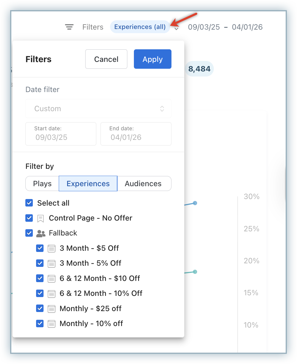
In addition, you can apply filters using dropdowns for more reporting flexibility. Filter report by Customer count or Revenue, and group by Reason, Return Likelihood, Competitor, Commented, and Category.
Click any section of the chart to see a list of the specific customers within that section, where you can also export a CSV from the customer list. You can see a quick summary of the list or expand the list for a full view. Choose the drop down to select appropriate trends reports to view.
- Save performance report: View deflect rate, save rate, and cancel page outcomes (cancels, saves, watchlist) over time.
- Deflection report: Get a breakdown of deflect rates, number of deflects, and revenue from deflects based on deflection types (modal offer accepts, loss aversion offer accepts, passive deflects).
- Cancels report: View canceled revenue or number of canceled customers over time. You can also break out the data by cancel reason, audience, experience, and other attributes.
- Saves report: View saved revenue or number of saved customers over time. You can also break out the data by cancel reason, audience, experience, and other attributes.
Was this article helpful?