Overview
The Branding tab in Chargebee Growth allows you to customize the look and feel of your Growth experiences to align with your company’s brand guidelines. The Branding Manager enables you to deliver fully branded, consistent experiences across your subscriber journey, without requiring developer involvement for most styling needs.
Branding configurations are applied at the app level, meaning any changes you make will automatically apply across all experiences within that Growth application.
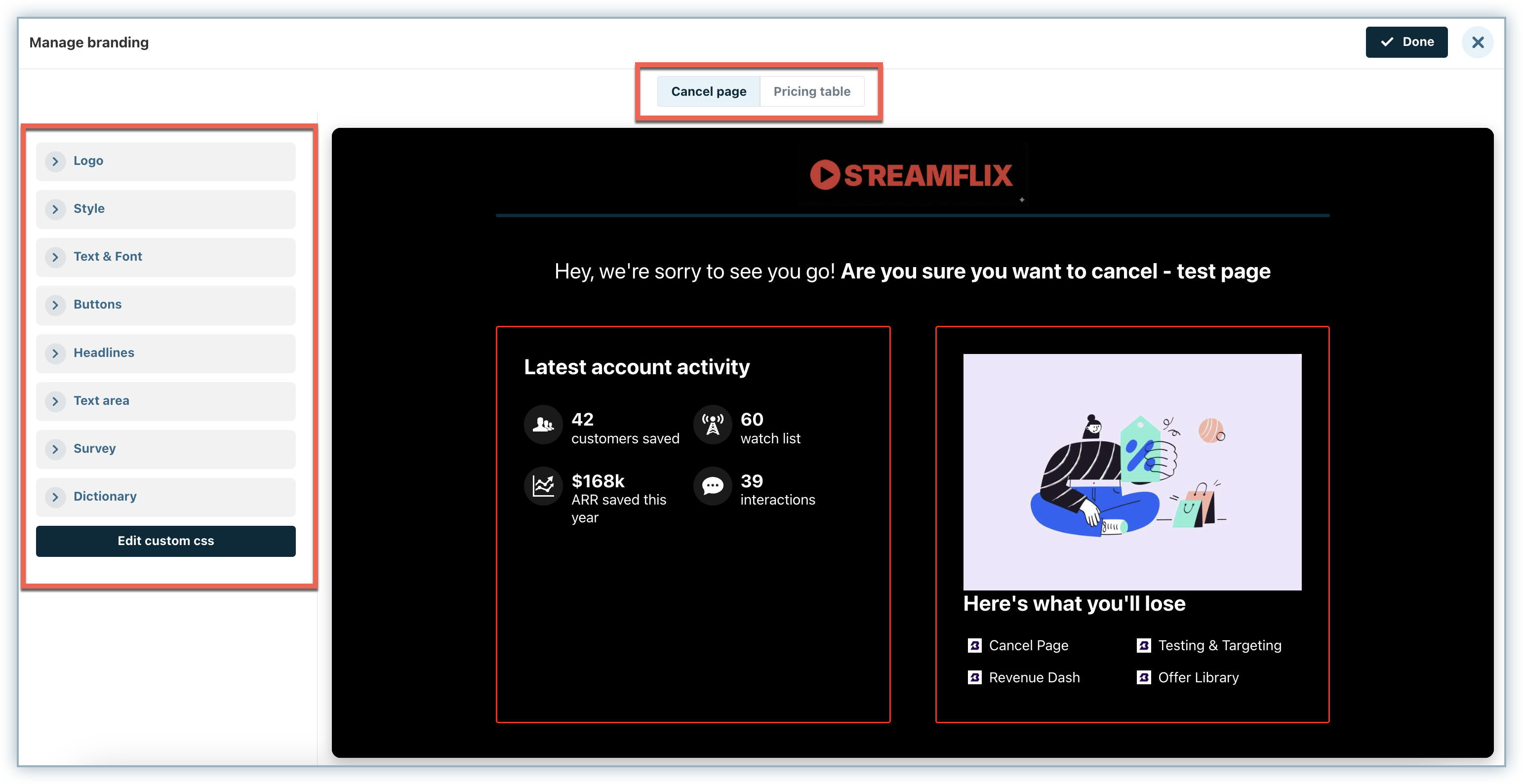
Below is an example of a fully branded Chargebee Growth page:
You can manage all visual customizations by navigating to the Branding tab. As you update the configurations, you can preview the changes in real time for both the Cancel page and the Pricing table.
Branding Configurations
The Branding Manager provides multiple configuration options to help you align your Growth experiences with your brand identity.
The following customization tools are available:
- Logo
- Style
- Text & Font
- Buttons
- Headlines
- Text area
- Survey
- Dictionary
- Custom CSS
Logo
Use the Logo tab to configure the header section of your Growth pages.
You can upload your brand logo in one of the following supported formats:
- SVG
- PNG
- JPG
If you upload a PNG or JPG file, you may enable compression to optimize load performance.
Note
Compressing PNG files may remove transparency.
You can define the logo width to match your brand guidelines. The image will automatically scale proportionally. The maximum supported width is 500px.
You can also configure:
- Logo alignment - Left or Centered
- Header style - Underline or Full-width header
If left unchanged, the underline will inherit the accent colour configured in the Style tab. You may override this colour if required.
If you select the Full-width header option, the header background will inherit the accent colour. You can override the background colour if it does not complement your logo.
Style
The Style tab controls global styling attributes that cascade across the entire experience.
This includes:
- Accent colour
- Background colour
- Base corner radius
- Default styling behaviors
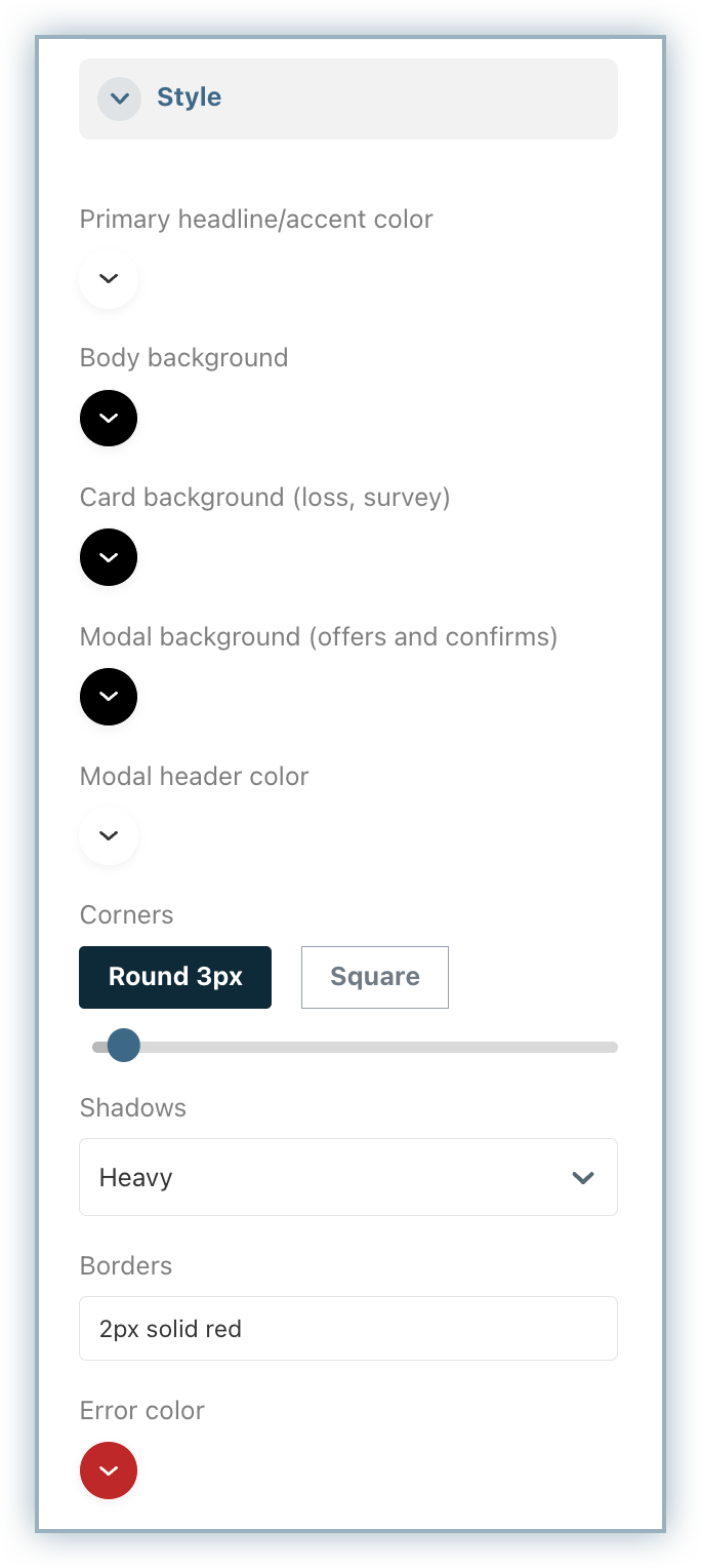
Changes made here serve as the foundation for other visual elements unless overridden in specific sections.
Note
Required field error message colours are also configured within the Style tab.
Text & Font
The Text & Font tab controls typography settings across your Growth experiences.
You can:
- Select from standard fonts
- Add a link to a hosted CSS file to use custom fonts
- Configure font size (px, em, rem)
- Set font weight (Normal or Bold)
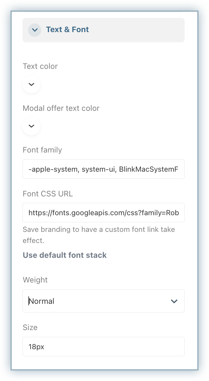
If you add an external CSS file, you must Publish your branding changes before the fonts become available.
Note
Most changes in the Branding Configurations update in real time within the preview. External CSS files require publishing before they can be previewed.
Buttons
Buttons inherit base styling from the Style tab but can be further customized within the Buttons section.
You can configure:
- Corner radius
- Background colour
- Font style and size
- Text transformation (e.g., uppercase)
- Button order (e.g., primary vs. secondary action placement)
- Cancel button styling
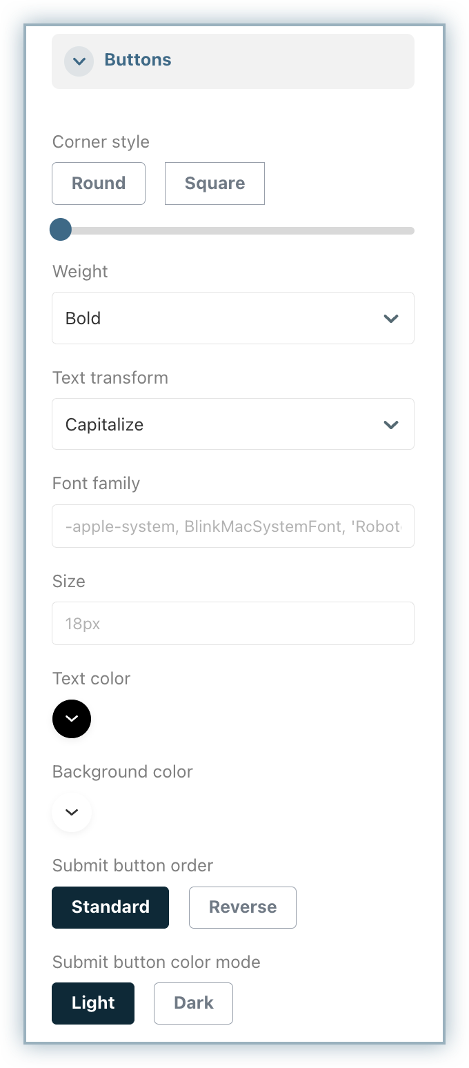
Settings applied here override global Style configurations.
Headlines
The Headlines tab allows you to override styling for headings used across modals, cards, and key content sections.
You can configure:
- Text colour
- Font style
- Text transformation (e.g., uppercase)
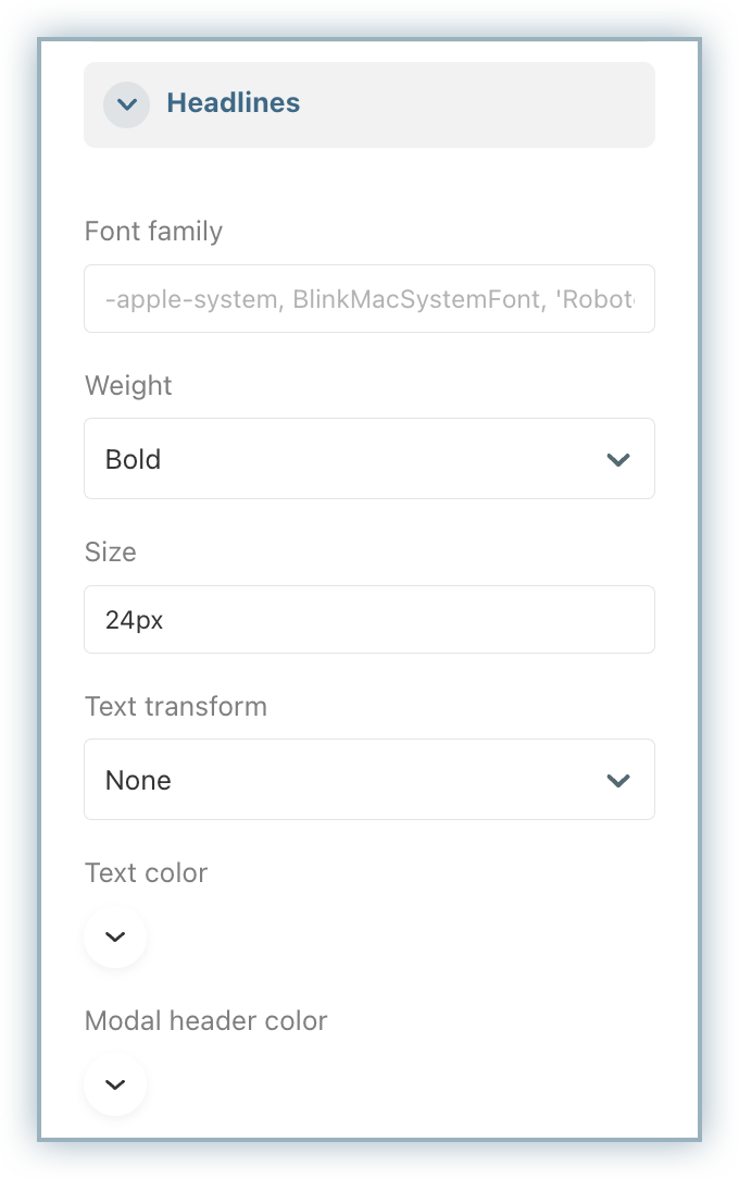
These changes apply consistently across all applicable components within your Growth experiences.
Text Area
The Text Area tab controls the styling of input fields, such as:
- Additional feedback boxes
- “Other” selection fields
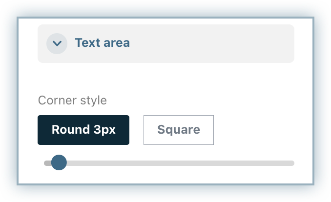
By default, input fields inherit the corner radius defined in the Style tab. You can override this setting to match your brand (e.g., square corners instead of rounded).
Survey
The Survey section allows you to configure labels and messaging related to required fields and validation errors across all experiences.
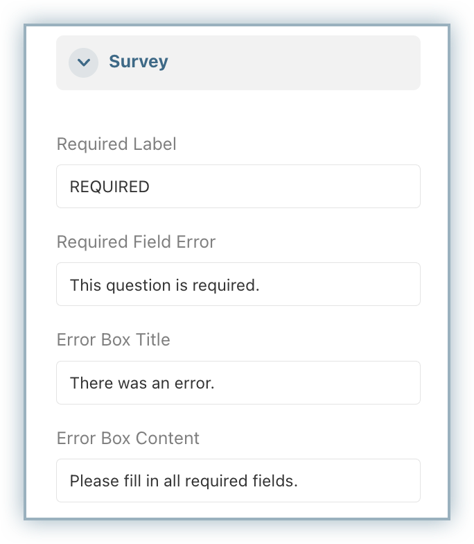
These settings ensure consistency in user prompts and form behavior.
Dictionary
Use the Dictionary tab to customize default text values such as:
- “Other”
- “None”
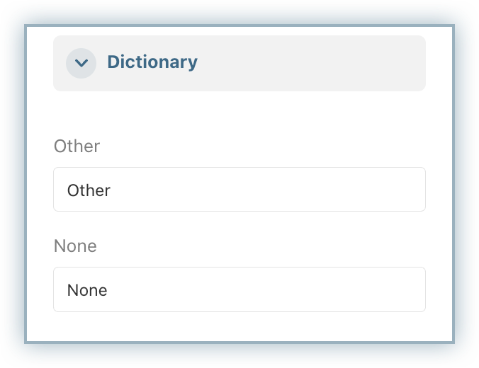
This is particularly useful for standardizing terminology used in survey questions across your Growth experiences.
Custom CSS
The Custom CSS section allows you to apply advanced styling customizations beyond the available configuration tools.
Custom CSS is injected into the experience at runtime and can be used to:
- Add or remove shadows
- Apply borders instead of shadows
- Override specific component styles
- Apply advanced brand styling rules
We recommend using the built-in configuration tools first. If further customization is required, refer to the CSS reference documentation for a complete list of supported classes.
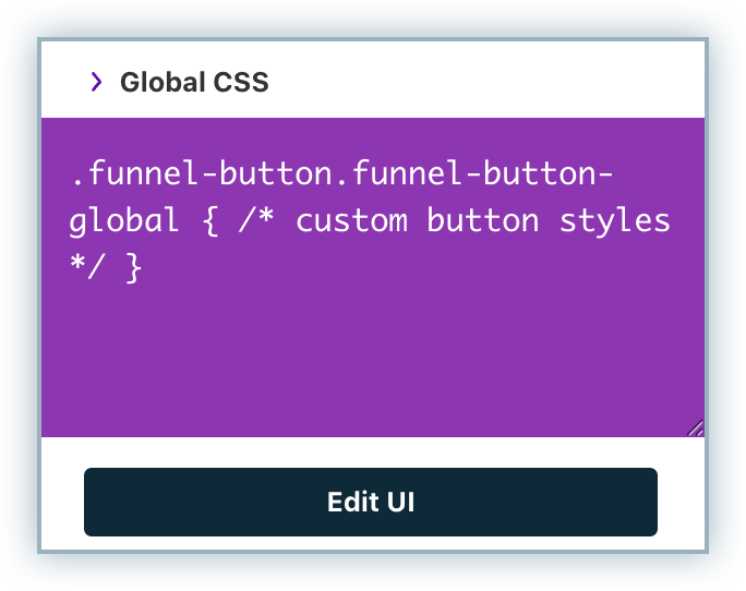
Custom CSS gives you maximum flexibility to fine-tune your Growth experiences while maintaining brand consistency. The possibilities to style your page are essentially limitless with Chargebee Growth Branding.
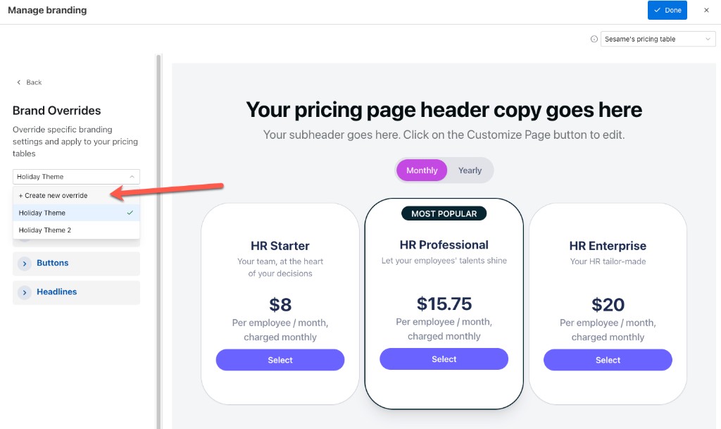
Brand overrides
Note
Brand overrides apply to pricing tables only.
A brand override is a set of branding settings, saved as a theme, that you apply to specific pricing tables. Use brand overrides when you want certain pricing tables to look different from the brand's default branding—for example, a seasonal theme or a distinct look for a sub-brand—without changing the default branding or affecting other surfaces such as cancel pages.
Overrides belong to the brand you create them under: on sites that use multiple brands, overrides are not shared across brands and apply only to the pricing tables within that brand.
Each brand starts with a Default Theme that reflects the brand's base branding. When you create a brand override, the new theme is created from the Default Theme, and you can then customize it.
Create a brand override
- In Chargebee Growth, navigate to Experiences
- Depending on your site configuration:
- If you have a single brand site: click Branding.
- If you have a multi-brand site: click Brands, then open the appropriate brand, and then click the Branding tab.
- Click the Pricing table tab to switch the preview to the pricing table surface. The preview shows the currently applied brand theme for the pricing table selected in the dropdown.
- Click the Edit branding button to open the branding editor. The preview shows the default brand theme applied to the pricing table.
- Select Brand Overrides from the left panel.
- Click Create your first brand override. To add more overrides later, select + Create new override from the theme dropdown.
- In the Create new theme dialog, enter a Theme name, then click Create theme.
- Customize the branding settings and click Done.
- Apply the brand override to the pricing table.
Customize a brand override
After you create a brand override, customize it using the options in the left panel. A brand override can change all branding settings except the logo:
The preview on the right updates in real time as you edit, so you can see how a pricing table looks with the override applied. Use the theme dropdown to switch between the Default Theme and your brand overrides. To preview how each of your published pricing tables looks with the override, use the pricing table dropdown in the top-right corner of the preview.
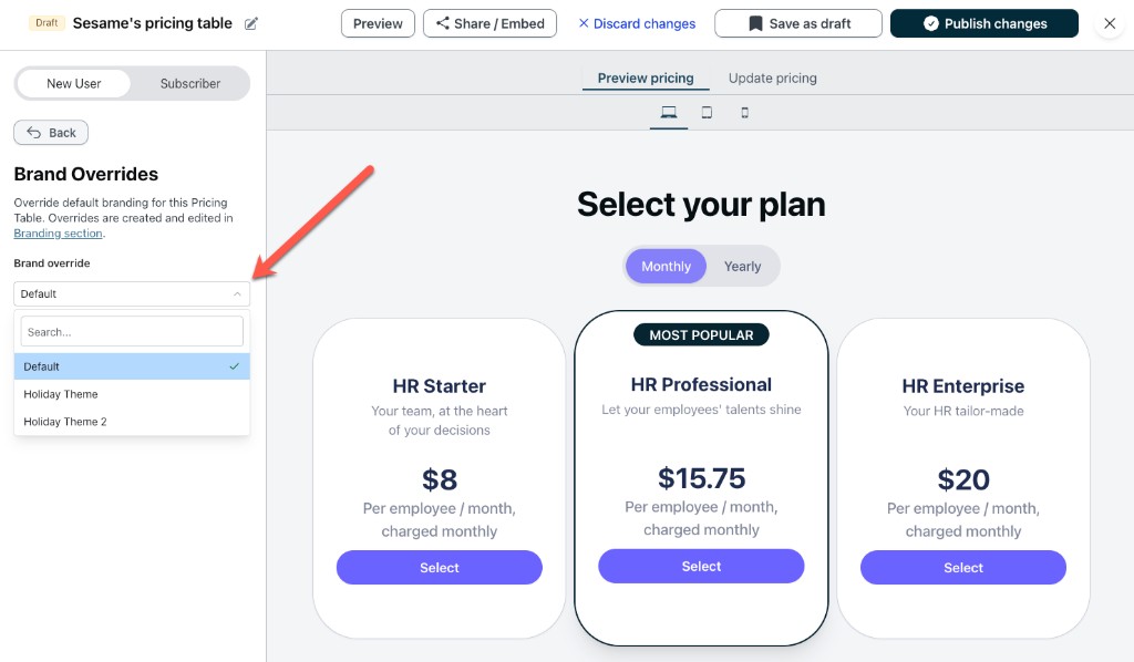
Apply a brand override to a pricing table
After you create and customize a brand override, you apply it to a pricing table so that the pricing table uses the override's branding instead of the brand's default branding. Follow these steps to apply a brand override to a pricing table:
- In Chargebee Growth, navigate to Offers > Pricing Tables
- Select the pricing table you want to apply the brand override to.
- On the left navigation, click Brand overrides.
- From the dropdown, select the brand override you want to apply to the pricing table.
- Click Save as draft to save the changes but not publish them to the pricing table. Alternatively, click Publish changes to publish the changes immediately.
Was this article helpful?