Minimum Viable UX: A Guide for SaaS Design
5 MIN READ
|
Updated on May 17, 2019
When you’re building a SaaS app, you’re probably thinking about features and, the target market, and making sure it’s not full of bugs.
While UX is vastly important these days — and can mean the difference between a failure and a success — it’s often overlooked.
Remember those on-site legacy software platforms people used? Bloated databases that looked like a prototype of Excel running on Windows 95. You won’t catch cutting-edge businesses doing anything but laugh at them these days. Why? Because they aren’t user friendly.
We got used to using sleek SaaS, even casually at first. We came round to the idea of Gmail and got rid of Outlook. We started using the beautifully optimized Trello, Dropbox and Asana. Over time, if it was any more of a hassle than it needed to be, it was phased out and replaced with UX-driven software because, ultimately, bad UX means the difference between a team taking one day or one week on a task.
It’s not just about a steep learning curve, it’s about things not working the way they were supposed to. I’ve used Microsoft as an example so far because even though they started out well, they have since ignored user testing, responded with weak fixes to big problems, and been outclassed by smaller companies who had to innovate because they didn’t have the luxury of having their tools bundled with the world’s most popular OS.
In this article, I’m going to outline a few key principles that your SaaS app should adhere to as its minimum viable UX optimization.
Here’re some of the things that are obvious friction to a new user before they can get into an app:
New users are in the mindset that they are going to get instant value, and if you’re asking more than you’re giving, you’ll suffer what Andrew Chen calls the ‘Product Death Cycle’:
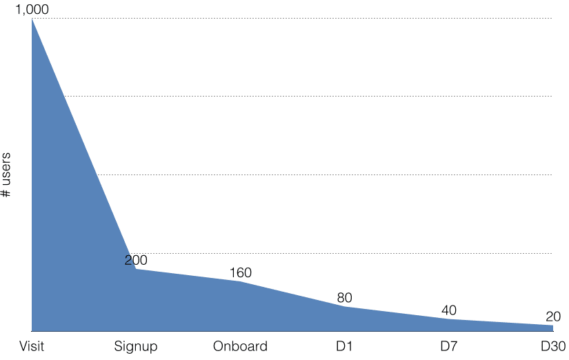
(Source)
The graph above depicts the funnel your users go through. Just like 80% of the people who see your headline don’t click through, 80% of people who visit your site don’t sign up. And, by the time they’ve interacted a few times with your product, the number of remaining users has dropped tenfold. Why is this?
Well, there are many books that could be written about this, but one of the most basic principles is that new users aren’t shown the value of your product quickly enough. It’s too much friction and not enough reward.
There are a few things you can try:
An app that does this remarkably well is Slack. You can see a full teardown of its onboarding flow here, but the essence of it is that it makes it a joy to register, complete your profile, log in, and learn.
The design time and thought that goes into reducing friction is astounding, even with things you’d never think of, like how it’s hard to type complex passwords on mobile. Slack beat this problem with Magic Links:
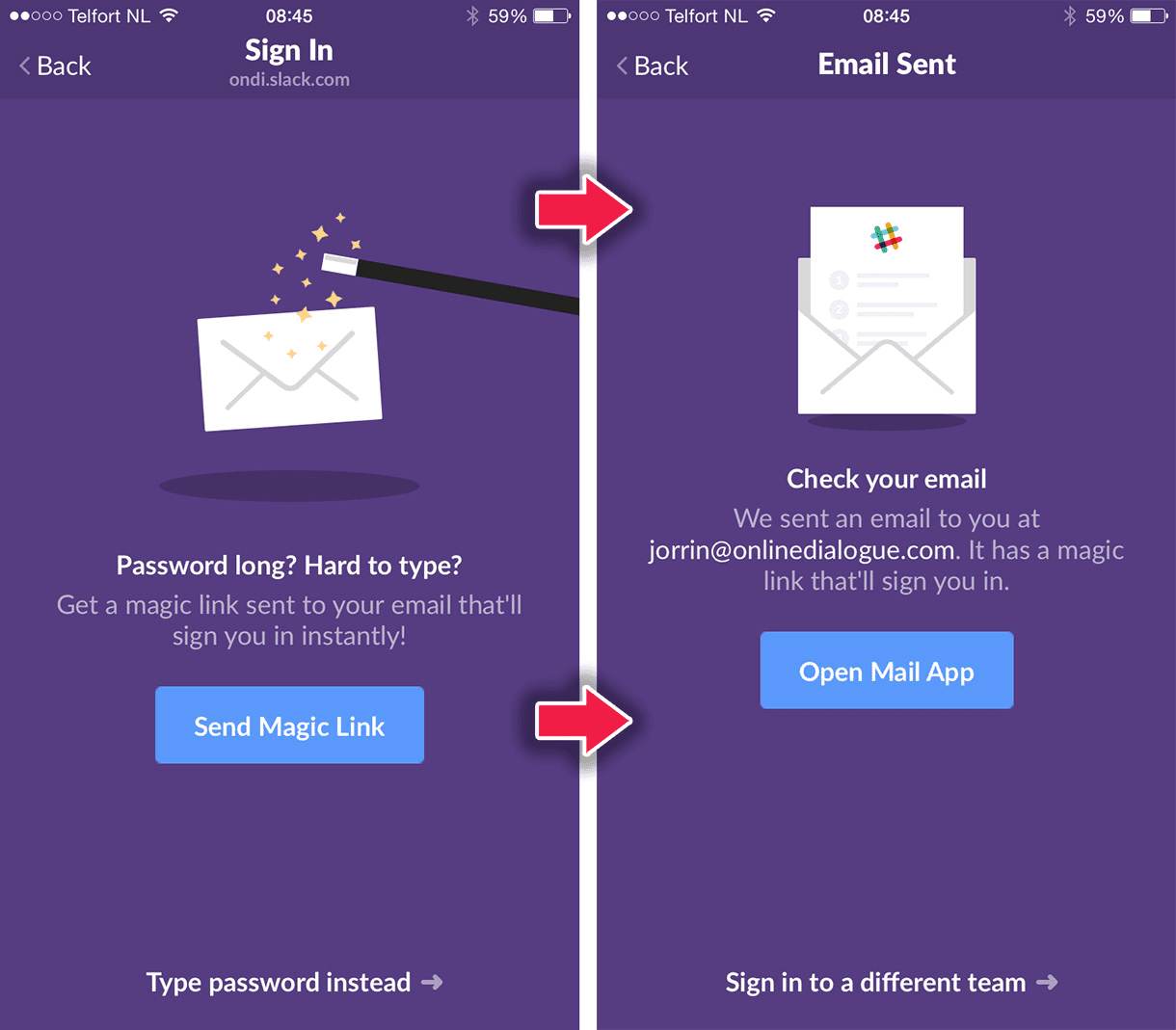
(Source)
This seems like an obvious one, but when I look to some apps, it needs say. I’m going to use Excel as an example because Microsoft is easy to pick on, and, unlike Apple, their software has never been thought to ‘just work’.
I recently cancelled my Office 365 subscription. I only really used it for Excel, but I came to find a huge UX oversight that wasted my time significantly. The problem was that it wouldn’t import CSV (comma separated values) files properly. In order to tell Excel that a CSV file was, indeed, comma separated, you either had to adjust the CSV in a text editor or use a wizard to import it.
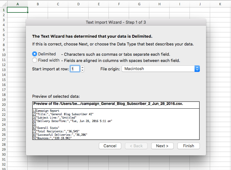
(Source)
There was no option to just click to open the file and have it display normally. So, I cancelled the subscription and went back to Google Sheets which is far less powerful. This is a good example of a customer churning because of UX, not features.
If you’ve got a common use case, you need to create shortcuts for it and not make the user jump through hoops to achieve what they expected to achieve in the first place.
It’s not always obvious what users are doing with your app, especially if it’s a tool that could be used for different purposes. This makes havinga great support process extremely important, and feature requests should be regularly parsed from tickets into a list the developers can work through on JIRA or Trello.

We’ve all been drawn in by awesome copy on SaaS landing pages and perfect design at one time or another. Most of the time, apps live up to the hype, but when they don’t, users can bounce instantly because they started to picture themselves getting value from the app but the app doesn’t convey the same image.
There’s a design rule called the Principle of Least Astonishment that states:

Basically, it means we expect a chair to look and function like a chair. If it doesn’t, it’s bad design because it astonishes the user.
Everything — from social media interaction, brand design, and screenshots — gives users an idea of what they’re going to see when they actually use your app and it contributes massively towards UX.
As well as making sure your marketing material is in key with your app’s experience, you can reduce astonishment by flattening the learning curve.
No matter what kind of app it is, users are going to have to learn how to use it. You can make this easier by adopting familiar design signals. It’s proven that recognizable icons, menus, and interactions make for an intuitive UI in the exact same way we know what to do with a cup or a sock when we see it.
While UX is important and some aspects are horribly overlooked, the well optimized apps are getting the attention they deserve while clunky software is fading out.
We’re still in a UX gray area — even 16 years after Jesse James Garrett formalized the field in his book, The Elements of User Experience Design. But it does seem like design pays off, and the new innovative SaaS designers have a fighting chance against the enterprise behemoths.
Keep these simple principles in mind, and go ahead and make something that ‘just works’.