Report Builder
RevenueStory comes with over 150 ready-made reports and dashboards that help you derive insights on New Sales, Payments collected, MRR, Activations, Churn, and so on. Report Builder is a powerful capability that allows you to create your own reports. The information in Chargebee is remodeled as data sources (tables), thereby enabling you to visualize any data that you want as insightful reports. Using this feature, you can transform raw data into actionable insights.
You can create Summary or Detailed Reports using the fields (columns) from different data sources.
Note
- RevenueStory is available only on the Performance and Enterprise plans. To know more, visit our plans and pricing page.
- RevenueStory Premium users will be able to use custom fields to filter data in the Report Builder.
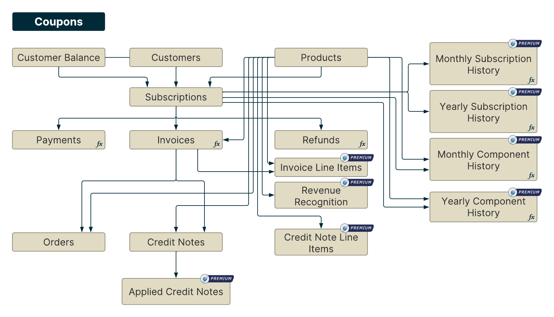
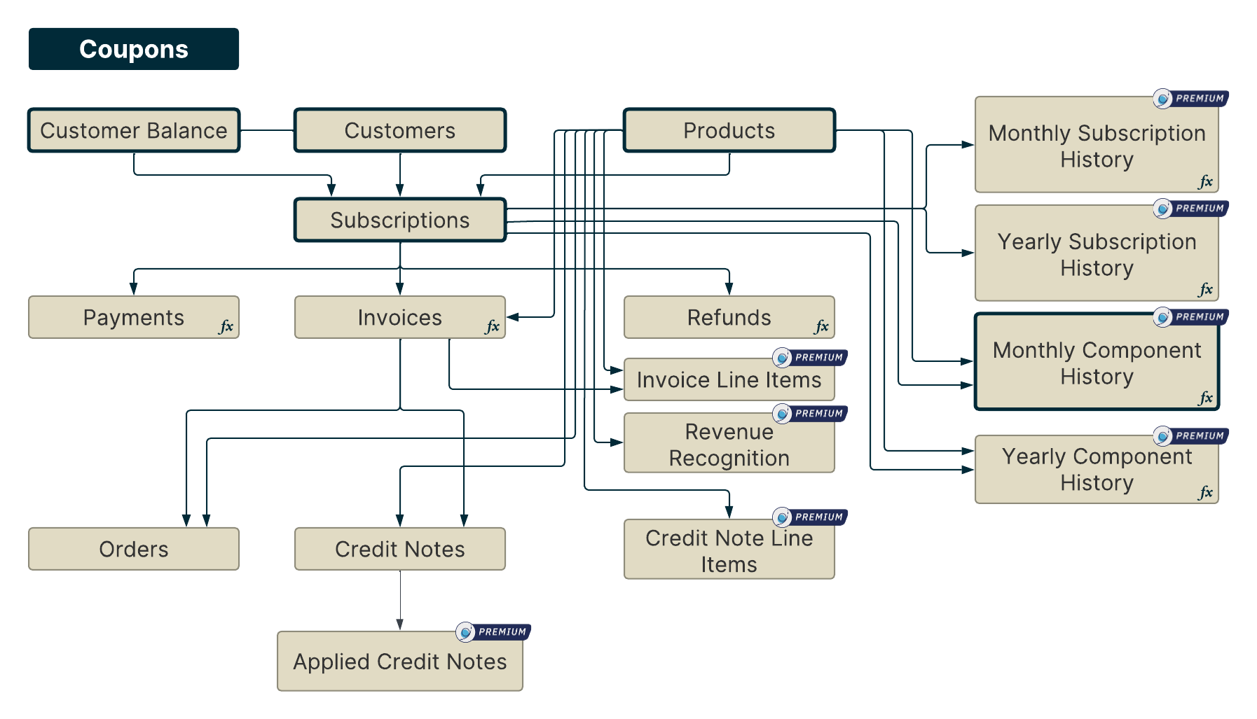
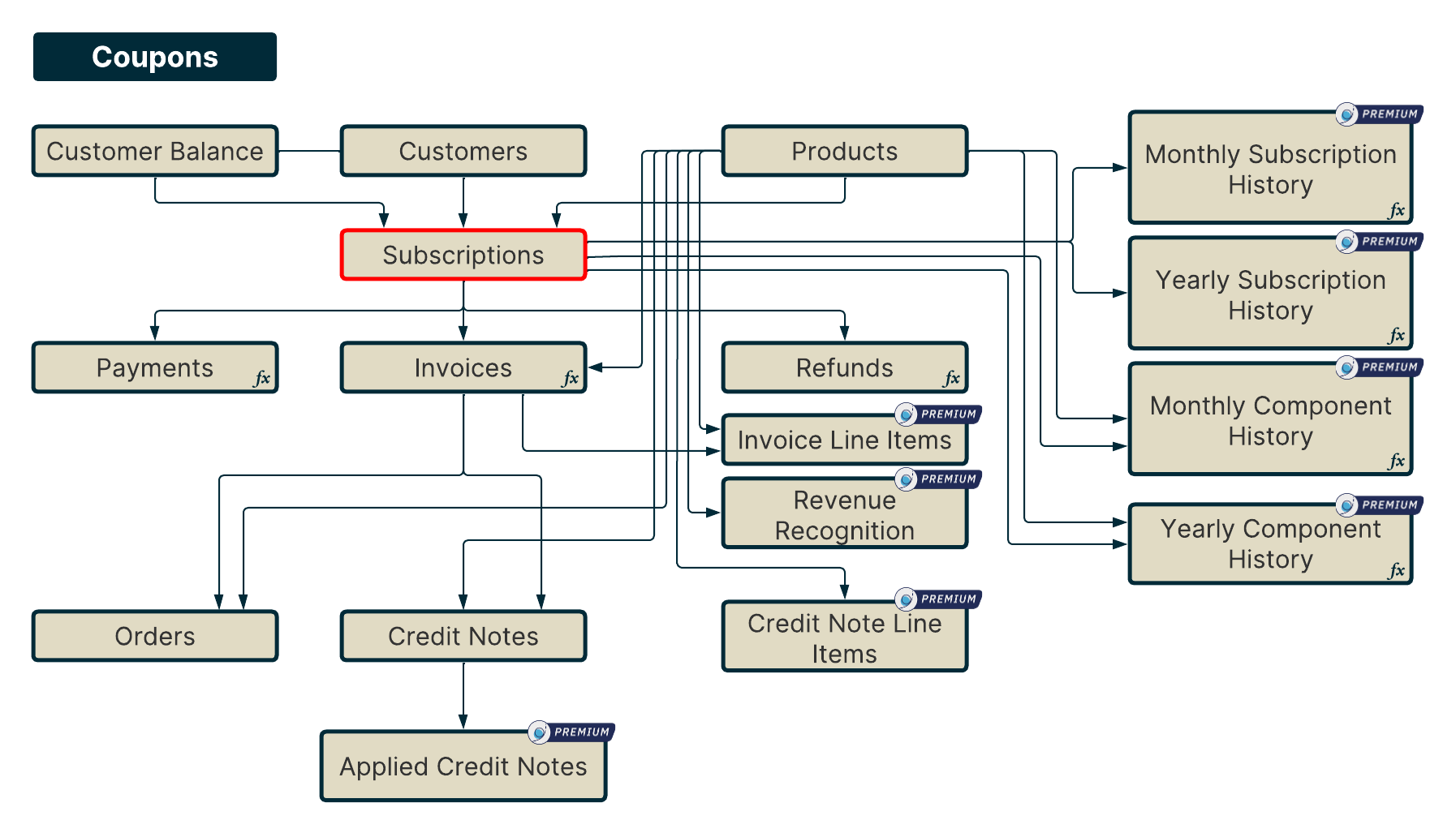
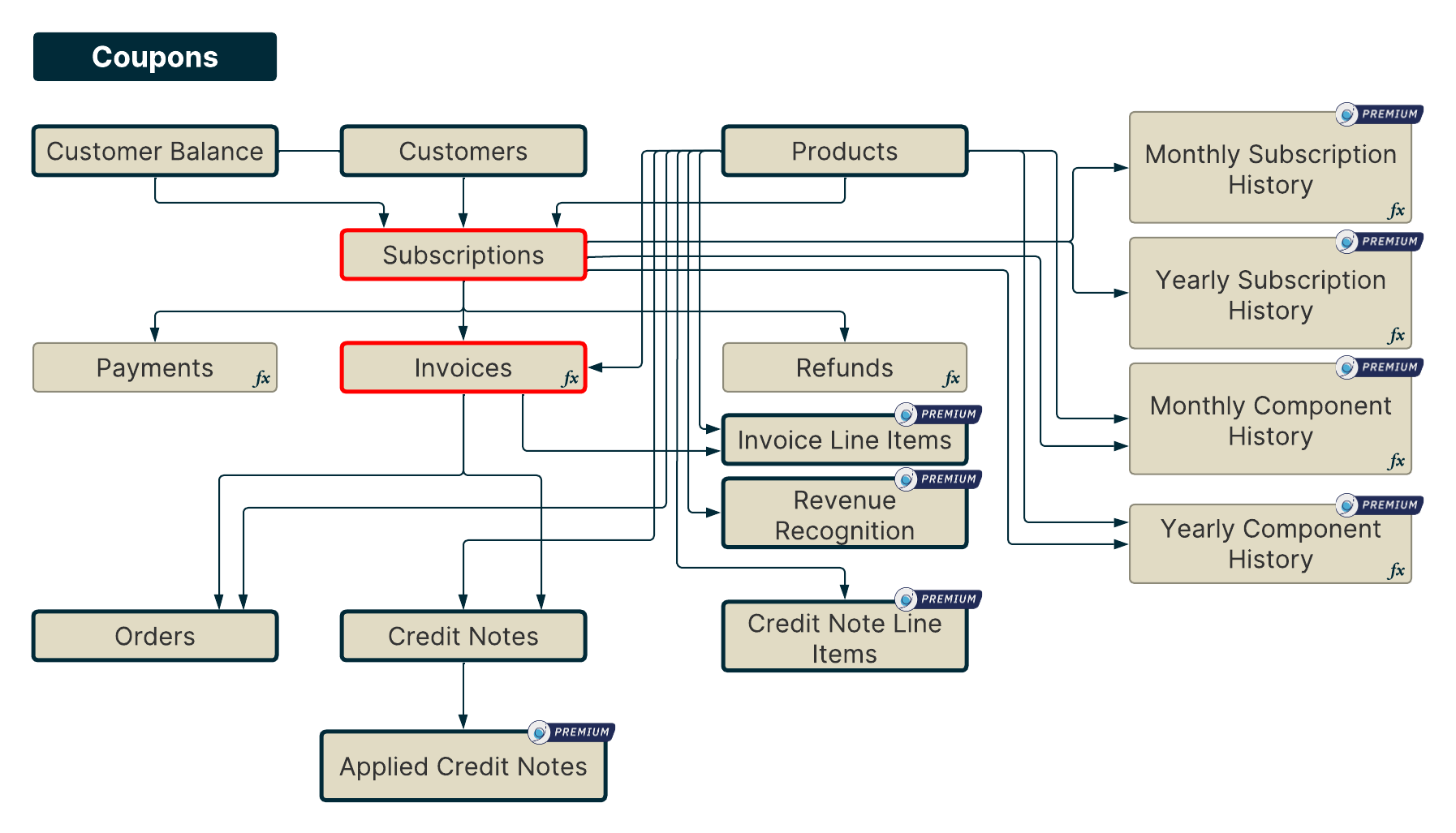
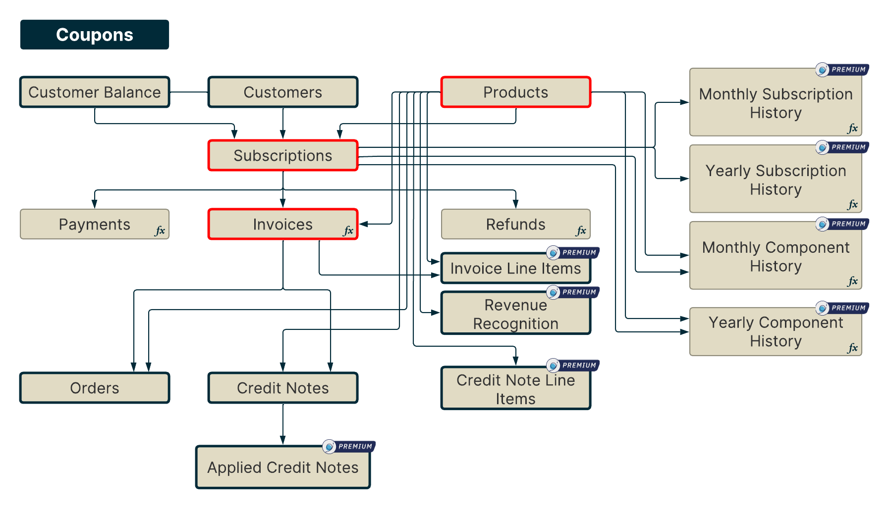
Understanding Data Sources
The data in Chargebee is remodeled and stored as data sources. Each data source has multiple fields through which you can create reports. Please refer to this page to see the list of available data sources.
Visual Report
A Visual Report is a graphical representation of your key business metrics with advanced visualization. You can build it by selecting fields from one or more data sources to view the report on various dimensions. Further, break the data according to your requirements and apply aggregation. View instant previews while building the report, without having to wait and generate the report to view it.
Visual Reports are similar to Business Intelligence reports with superior data visualizations. For example, you can build a visual report to view the Total MRR monthly trend by subscription currency, or to track the Active paid subscriptions across all months for specific customers.
Building Visual Reports Using Metrics
In addition to building reports based on data sources, you can build visual reports using various metrics. Metrics help you track key performance indicators driving your organization's revenue like active subscriptions, signups, activations, or churn. Creating a visual report using these metrics allows you to further analyze these metrics from other dimensions and do a deep dive into the data by breaking them or aggregating them on various parameters to derive key inferences.
The qualifier (fx) in the data model diagram represents which data sources have metrics.
Data Model Walkthrough with Examples for Visual Reports
A Visual Report is used to provide a concise and high-level overview of the data. This type of report is extremely useful when you want to visualize data by different dimensions to understand trends, anomalies, and so on.
Here is what a Visual Report would look like.
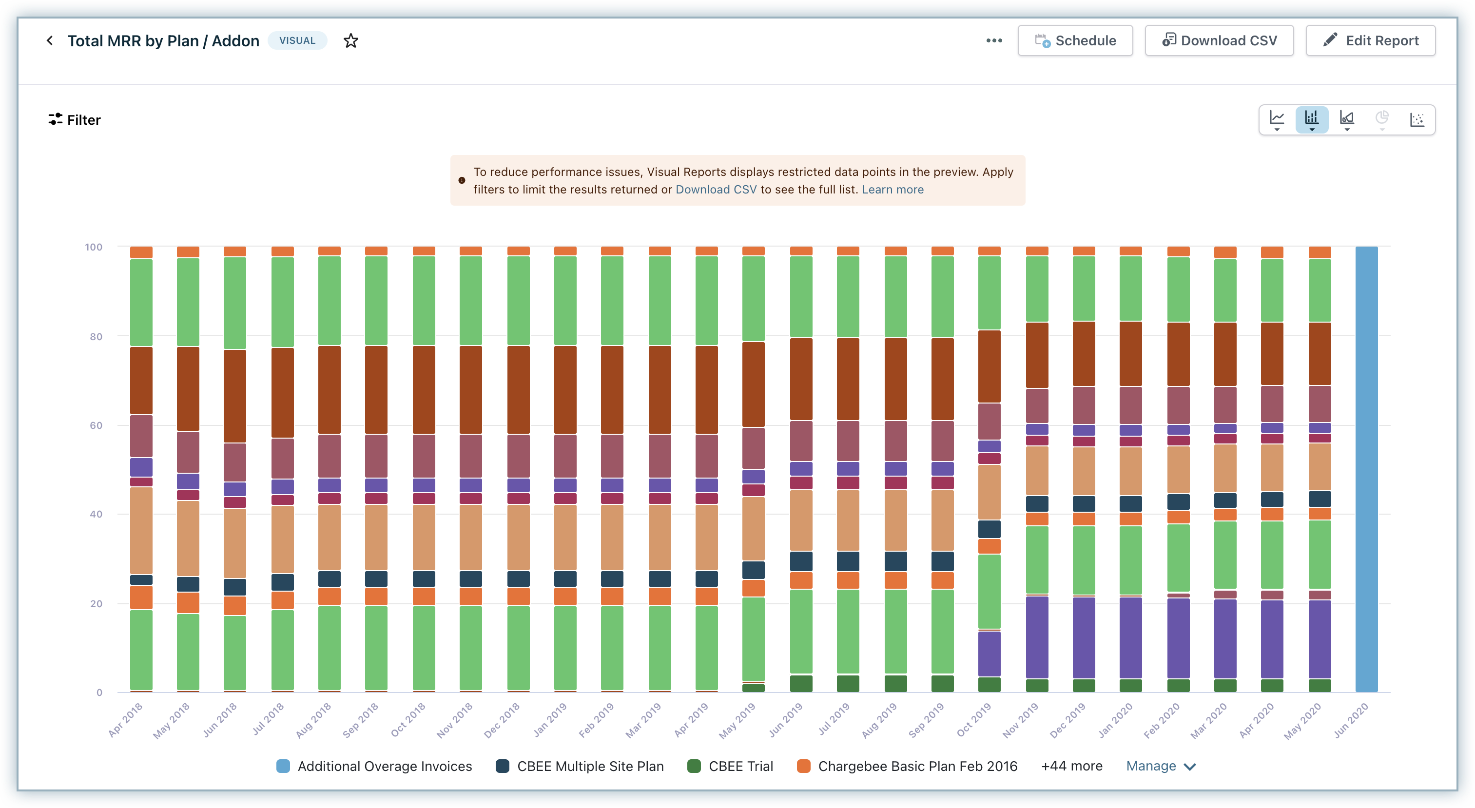
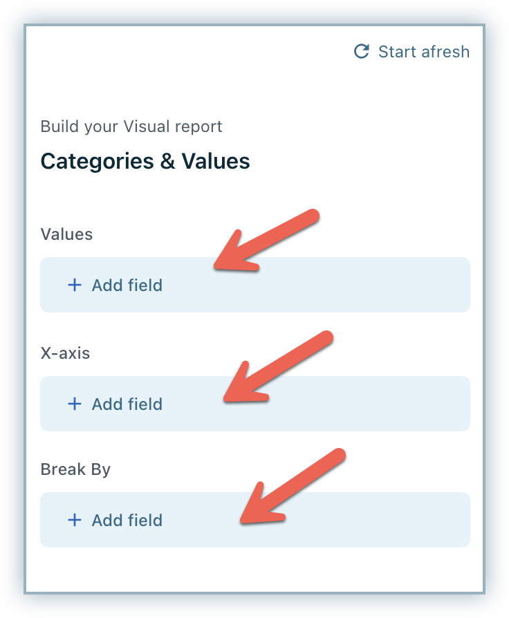
Visual reports have three components:
Value: Refers to the field that we are trying to aggregate. This can be a field in the raw data or a predefined function.
X-Axis: Refers to the field that we want to plot on the X-axis to categorize the data.
Break by: Refers to the field by which we want to additionally break down the data.
To create a Total MRR by Plan / Addon Visual report click +Add field under Values, and select the metric MRR from the Monthly Component History data source. Next, Under X-axis, select the field Change date from the Monthly Component History.
Select Product under Break by, and then Product Type and click Build Report. Click Filter > Add Filter to filter the report by Product type to break this report by Plans/Addons.
Creating a Visual Report
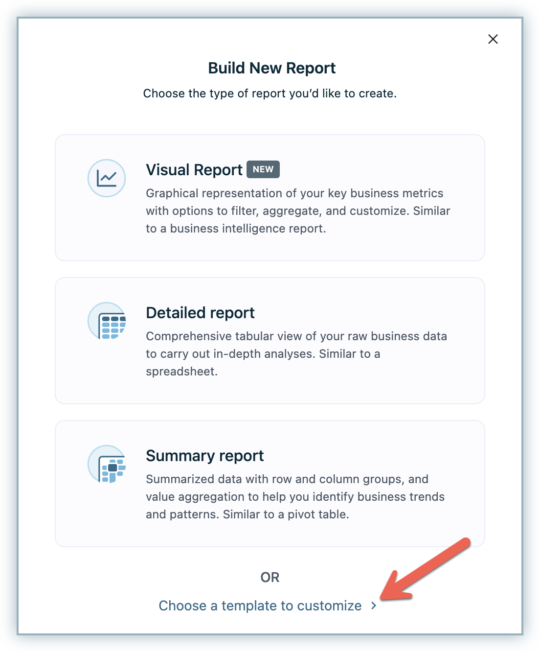
To create a visual report on your Chargebee site, follow the steps below:
-
Click RevenueStory > Report Builder.
-
Click Build New Report and click Visual Report to build a new report. You can also use an existing template by clicking Choose a template to customize and save time. Select a template that's closer to your required report, make changes to customize it, and save the report.
-
Click the +Add field under Values and select the data source using which you'd like to build the report. Then, select the fields from the selected data source.
In addition to the data sources, click the Metrics tab to view only Metrics and select from the available Metrics.
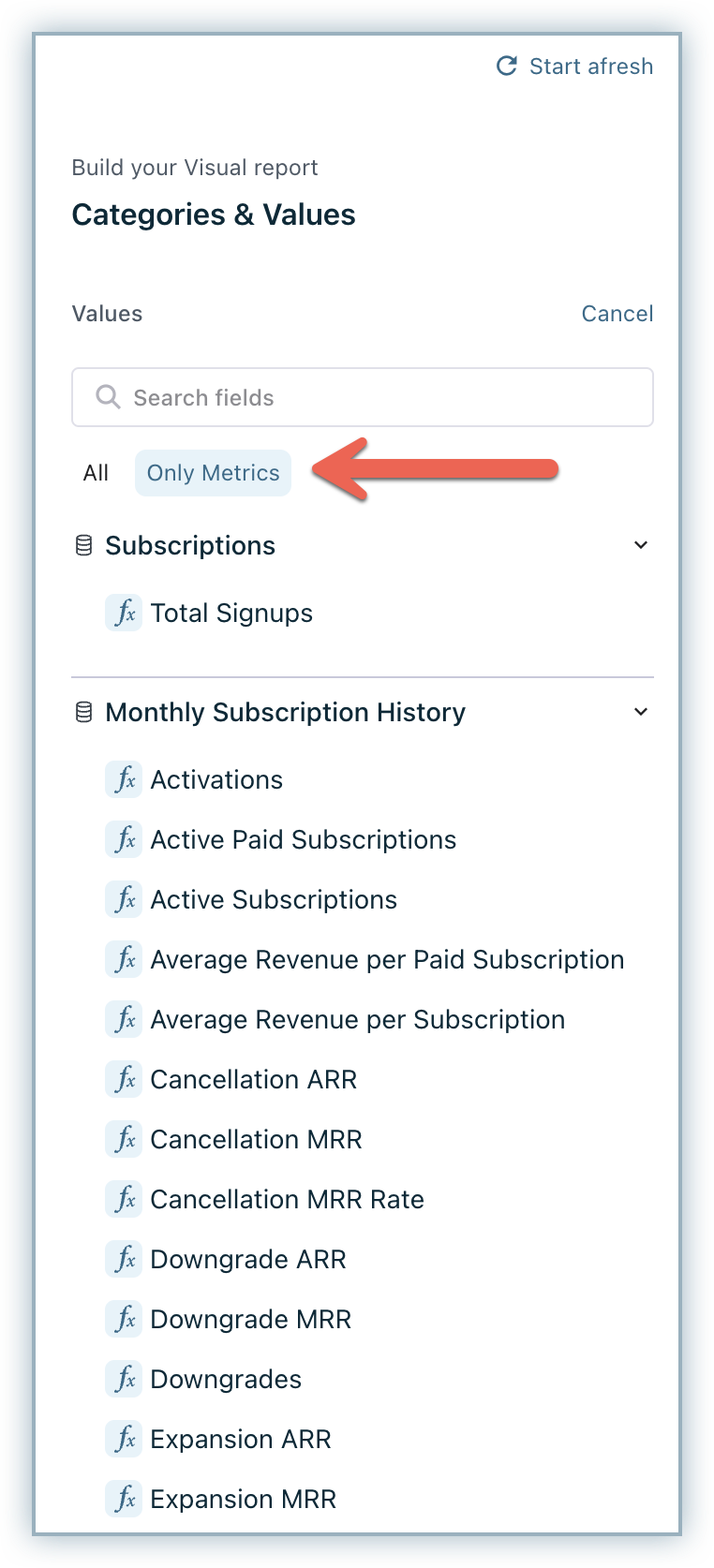
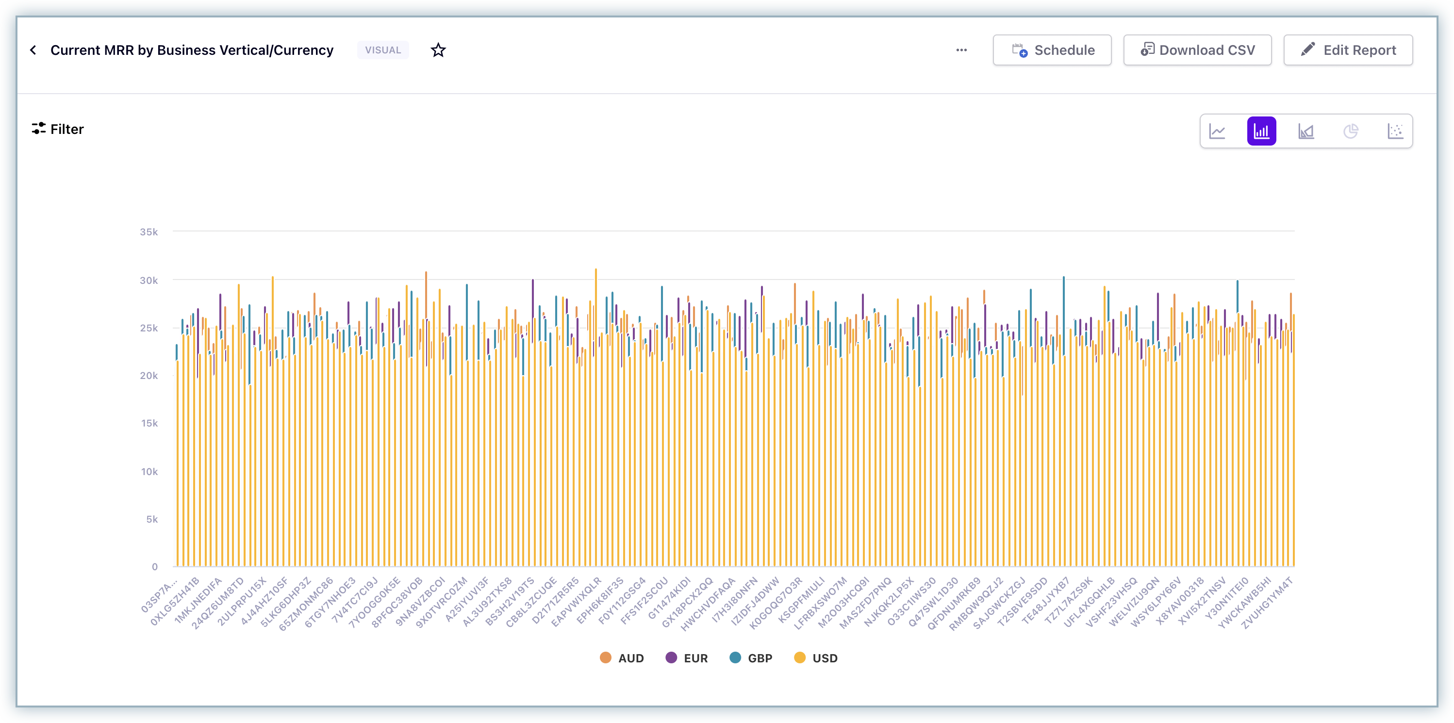
To build the report on the Current MRR by business verticals, select the data source Subscriptions and field Current MRR in values.
-
With each step, you can click the Preview Report on the preview pane to view the report structure changes.
-
Under X-axis, you can select a field for the other dimension of the report by which you want to categorize the data. This could be a list of values that can serve as categories or dates that help you see the trend of a metric in your report. To build the report on the Current MRR by business verticals, select the data source Customers and field Business vertical.
-
Under Break by, select how you want to break this data. For example, you can break this report by specific regions, currencies, or plans. The Report Builder will automatically select the best visualization type based on the fields selected, so users are aware of the changes that happen automatically.
-
You can change the visualization type to Line (Line/Spline), Bar (Bar/Stacked Bar/Stacked Bar 100%), Area (Area/Area Spline), Pie (Pie/Donut), or Scatter chart.
-
Click Filter > Add Filter to filter the report based on various attributes.
-
Set a Title to save the newly created visual report and click Build Report.
The following screenshot displays what the report would look like.
You can perform the following actions on the preview pane:
- Filter: You can filter the report using the fields in the data sources.
- Schedule: You can select the report and share it with the users added to your Chargebee site. When you schedule a report, the users you have added to the schedule will receive an email with the updated report.
- Download CSV: You can download the report that you have created as a CSV file.
- Edit Report: After you have created the report, you can edit it to include or remove fields.
- Visualization Types: You can change the visualization type to Line, Bar, Area, Pie, or Scatter chart.
Datamarks Restriction
While building a report by selecting high cardinality fields with a large set of values such as Subscription ID, Invoice ID, and so on, the report preview takes into account only a subset of values to display a limited set of data points. This limits performance issues and ensures an optimal experience for all users irrespective of their site's data volumes.
For example, consider the monthly trend of Subscription level MRR using visual reports. Suppose there are about 20,000 subscription records and associated history of the last 12 months. In this case, there are effectively 240,000 data points to be displayed.
When you try creating such a report in the visual report's editor, you will not see the entire data, and only limited data points will be displayed in the preview. It displays an error message when the data points are too large as shown below.
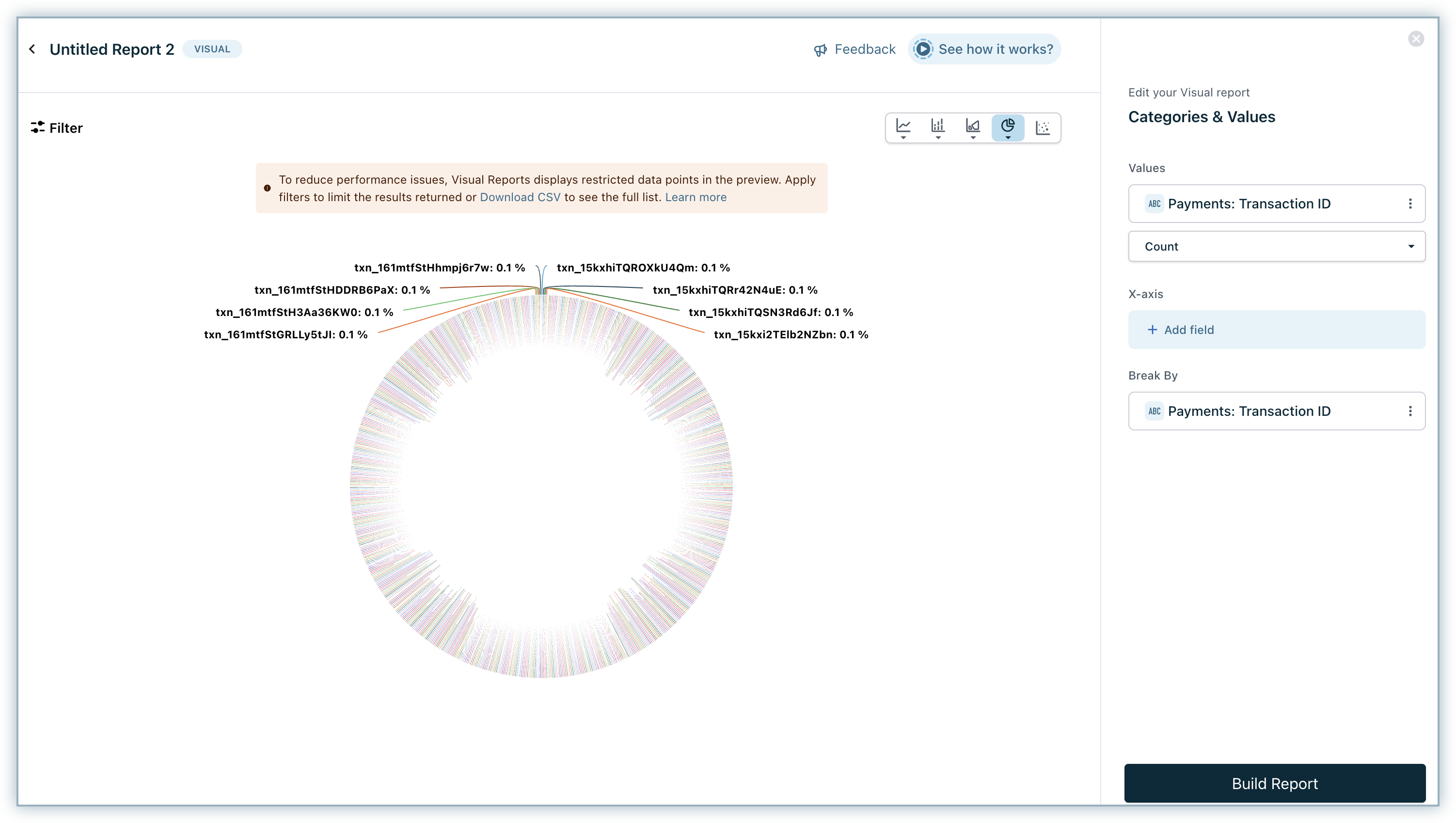
To view the desired data, try filtering out unnecessary records or use low cardinality fields with a small number of unique values in your report. You can also try downloading the data as CSV to view the entire data.
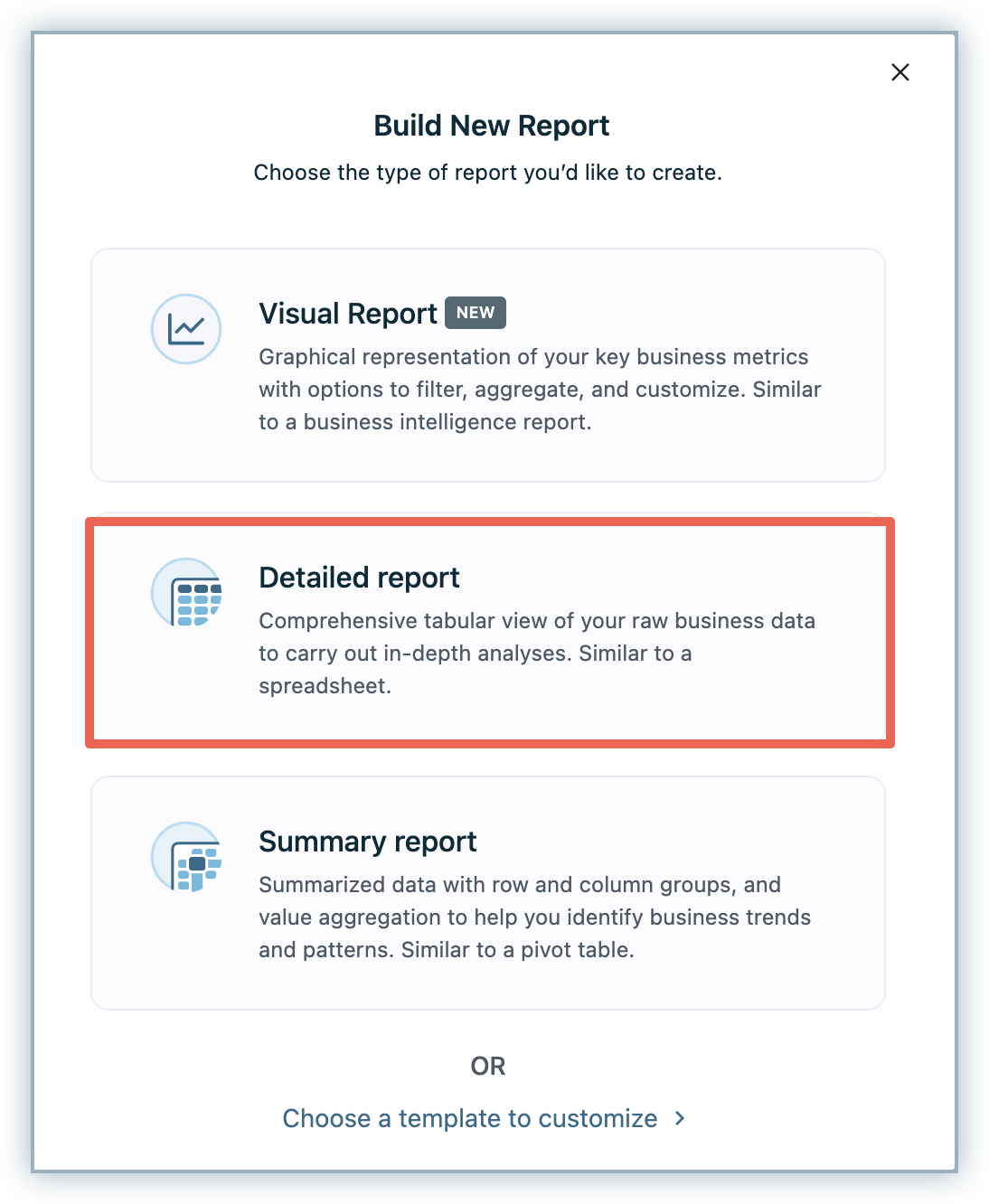
Detailed Report
A Detailed Report is a tabular report that contains records at an individual level. You can build it by selecting fields from one or more data sources.
This type of report is most useful when you want to view the underlying data in detail. For example, if you want to list all payment-due invoices by country or view the active subscriptions in a particular plan.
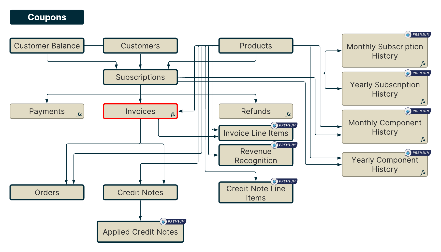
Like we discussed earlier, Chargebee has the following data sources that you can use to create this report.

Note
- Product is now available to join with additional data sources such as Invoices, Credit Notes, Orders, and so on.
- Subscriptions with Product can only be joined partially using the current plan handle.
- Data sources tagged as Premium will only be available with an RS premium license. Please reach out to Chargebee support for further information.
Coupons are not connected with any other data sources. Therefore, you can create reports only by using the corresponding fields.
If you select a data source, then you will be able to additionally select fields from all children and parents of the selected data source. If multiple data sources are selected, then you can only select fields from the common children and all available parents of the selected data sources. Report Builder implicitly joins data sources in the background as you go about selecting fields in your report.
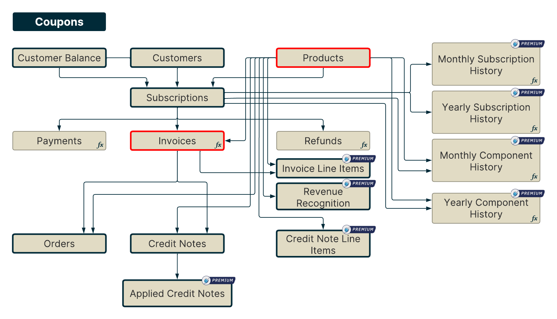
Example 1: Let us say that you select Subscriptions as your first data source.
Then, going by our example, you can further select all data sources except Coupons.
If you select Invoices as the next data source then you can additionally select the fields from all data sources except Coupons, Payments, Subscription Histories, and Refunds since they are neither a parent nor a common child of either Subscriptions or Invoices.
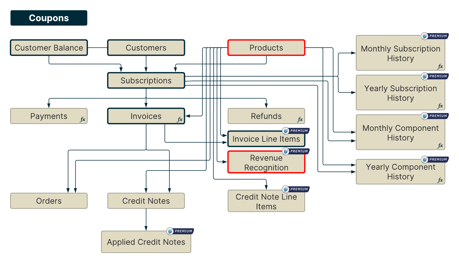
If you select Products as the next data source then you can additionally select the fields from all data sources except Coupons, Payments, Subscription Histories, and Refunds since they are neither a parent nor a common child of either Subscriptions or Invoices or Products.
Creating a Detailed Report
-
Click RevenueStory > Report Builder.
-
Choose Create a Detailed Report.
-
Choose the data sources using which you'd like to create the report. Then, select the fields you need from each of the selected data sources. To build the report shown in our example, select Country from Customers data source, Invoice ID, Due Date, Amount Due, and Status from the Invoices data source, and Subscription ID from Subscriptions data source.
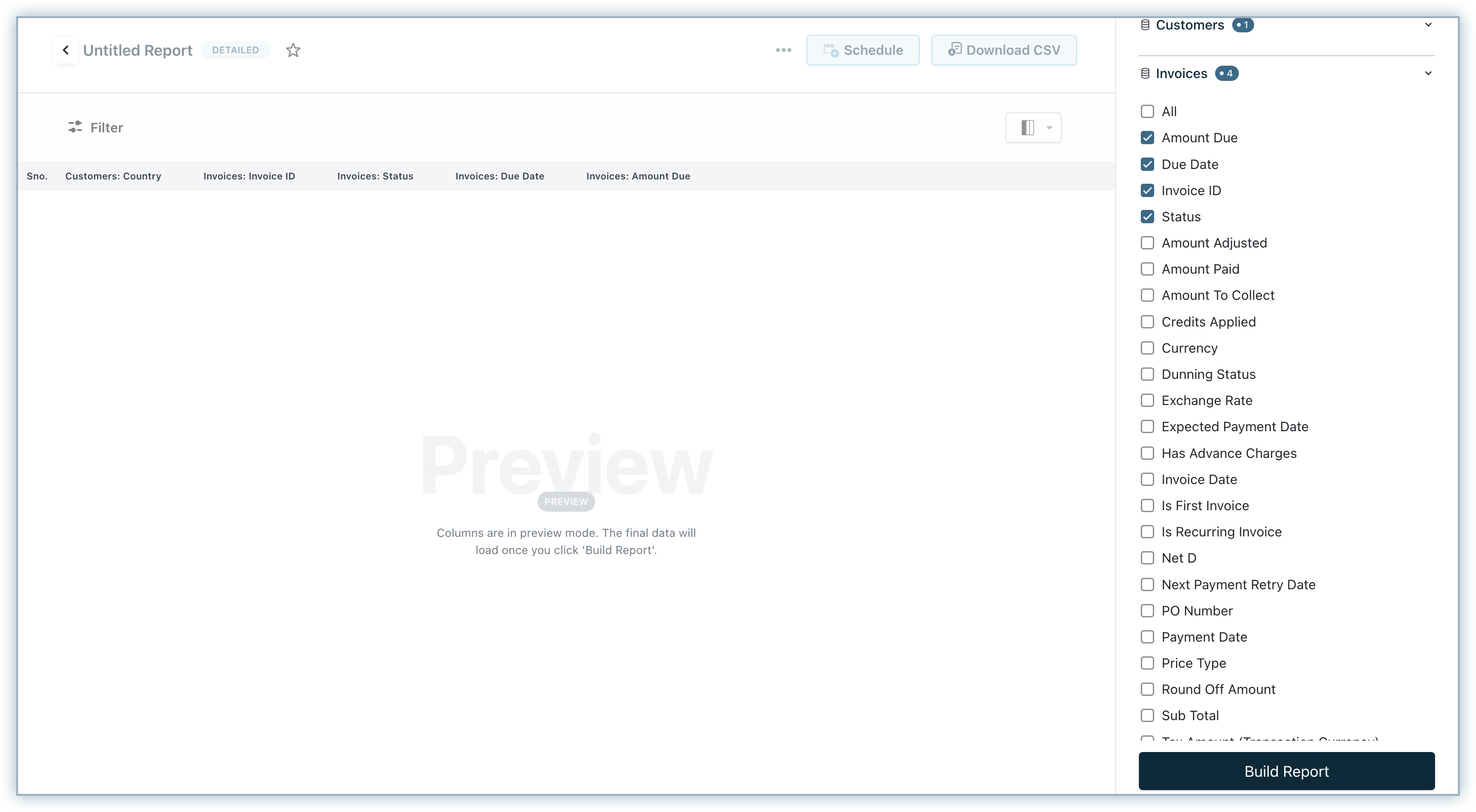
-
Click Build Report.
-
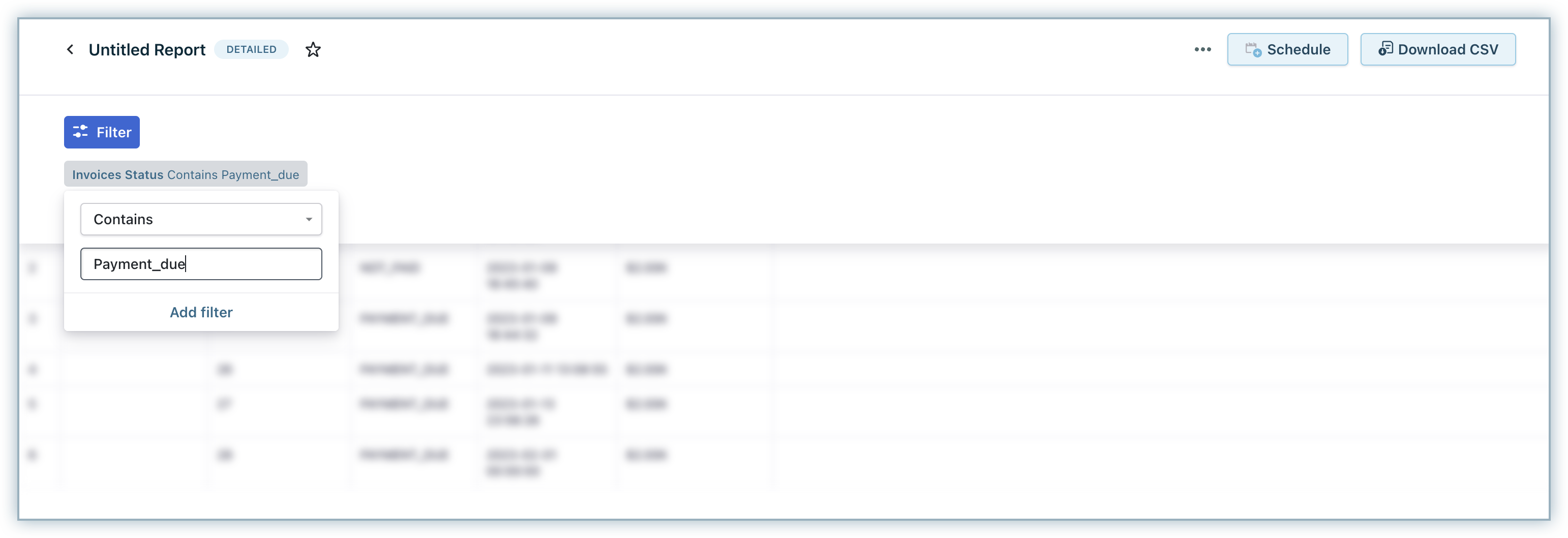
Here, we have a report that displays data with different invoice statuses. We need the report to just display "Payment Due" Invoices. We can achieve this using the Filters option. Click Filter and select Invoice Status. Add the filter as shown in the image below and click Add Filter.
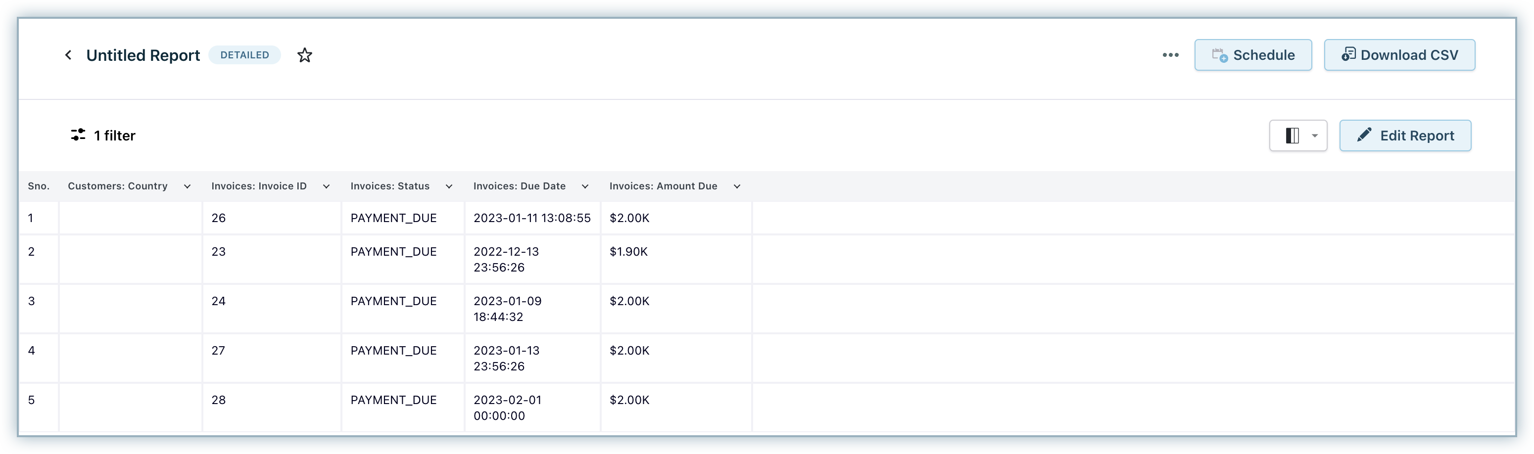
This is how the report would look like. The data in the report will be updated when the sync happens (that is, once in 4-5 hours).
Summary Report
A Summary Report is used to provide a concise and high-level overview of the data. In Summary reports the data are grouped by specific attributes (such as status, type etc.) This type of report is extremely useful when you want to look at data by different dimensions to understand trends, anomalies, and so on.
Here is how a Summary Report would look like.
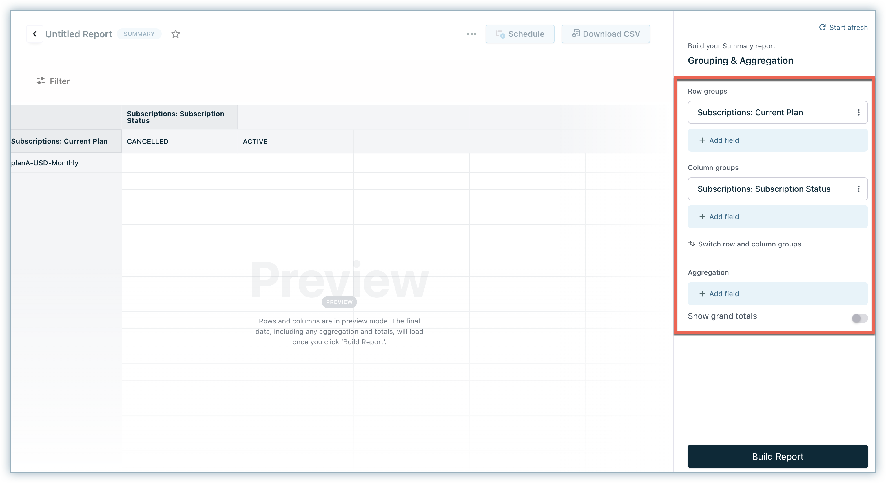
Any Summary Report will have row groups, column groups, and aggregation. You can additionally choose to enable Summary Totals before you build the summary report.
The field selection for row and column groups works similar to that for a detailed report. If you select the fields of any data source as row or column groups, you can go ahead and additionally select the fields of all children and parents of the selected data source. If multiple data sources are selected as row or column groups the fields only from common children and all available parents of the selected data sources are additionally available for adding a column or row group.
You can group the data in the report by columns or rows. It helps in organizing a view for the report.
For example: If you select Invoices as a row header then you can also select the fields from all data sources except Coupons, Payments, Subscription Histories, and Refunds since they are neither a parent nor a common child of either Subscriptions or Invoices.
If you select Products as the second row header then you can select fields from all data sources except Coupons, Payments, Subscription Histories, and Refunds since they are neither a parent nor a common child of either Invoices or Products.
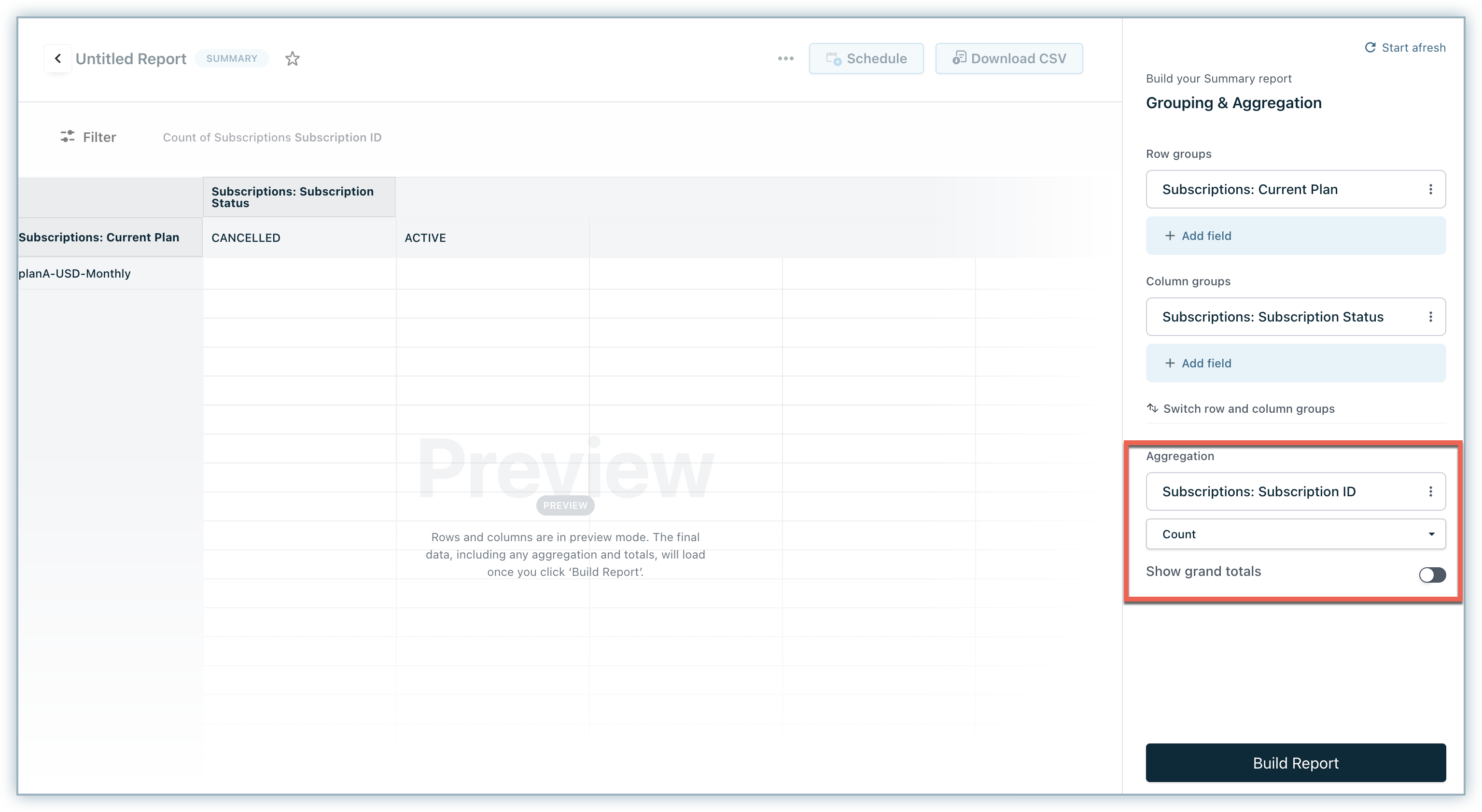
Another key aspect of Summary Reports is aggregation. Aggregation is a function where the values of multiple rows are grouped together to form a single summary value. You can apply summary functions such as Sum, Average, Count, Count Distinct, Min, and Max to aggregate the data.
Note
You can only select the common children of the selected data sources in the header groups as the aggregation data source.
In the example below, Revenue Recognition has been selected as a data source for Aggregation.
Creating a Summary Report
-
Click RevenueStory > Report Builder.
-
Choose Create a Summary Report.
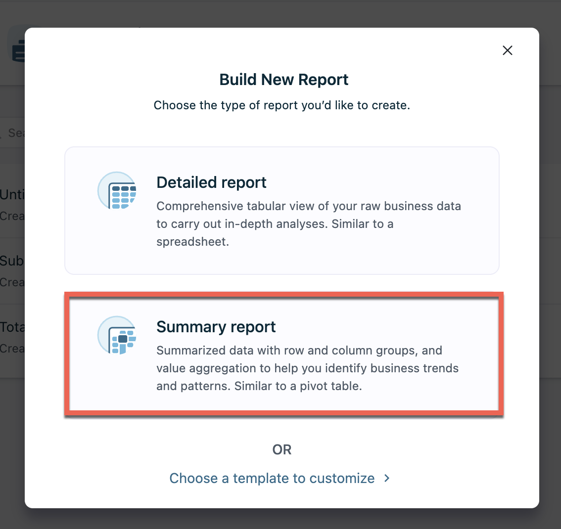
-
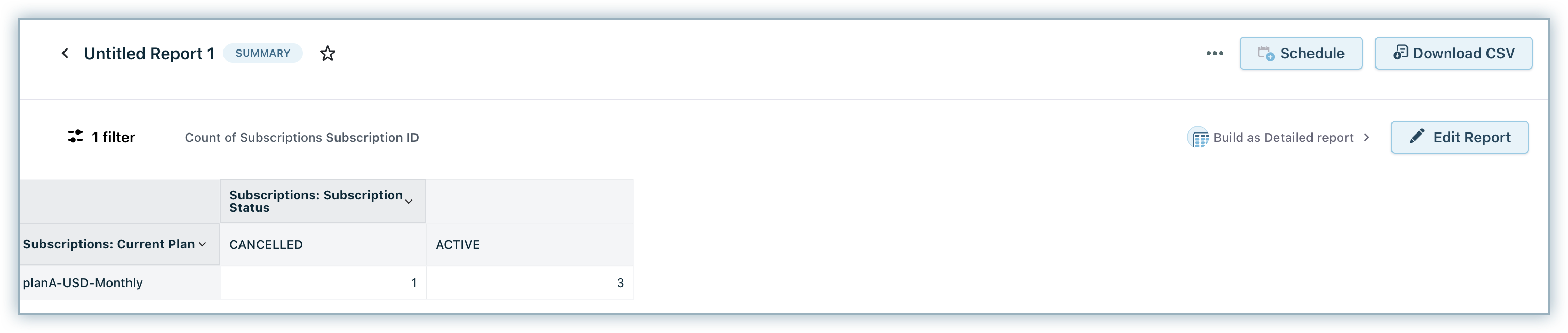
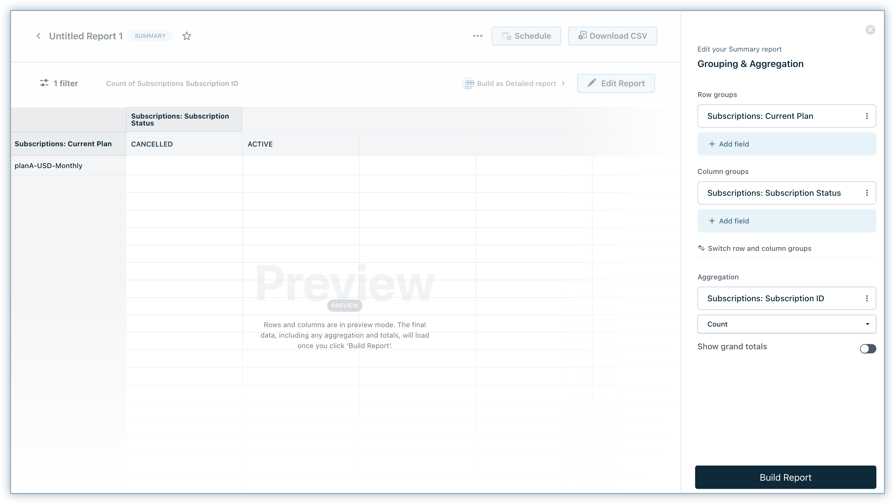
Choose the primary Data Source using which you'd like to create the report. We are going to see how to create a report to view the total number of active, cancelled, paused and trial users in each plan. To do this, select the Subscriptions data source.
-
Select the Data source and Field for Row and Column grouping. You can select a maximum of 2 rows and 2 columns. Select the subscription status field from the Subscriptions data source for column grouping. And, the current plan field from the subscriptions data source for Row grouping.
-
Select the fields from the field dropdown and then select how you want to aggregate the data from the selected field. The operations (aggregation) that can be performed on the selected field will be displayed in the aggregation dropdown. Here, we are applying the count operation on the Subscription ID field (from Subscriptions). Click Build Report.
Note
- Use apply aggregation only on a single field.
- Grand totals are not available in the downloaded/scheduled report.
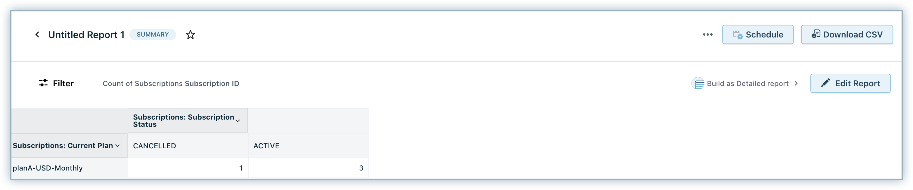
This is how the report would look like. The data in the report will be updated when the sync happens every 2-3 hours. However, delays may occur if a high volume of data sync happens.
Click here to view more examples of reports created using report builder.
Was this article helpful?